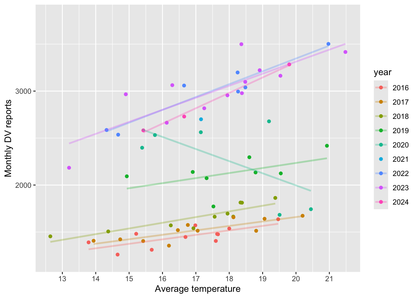
Here, I plot the total count of dv reports per month per year, together with a linear fit. Two facts emerge from the plots (with the exception of 2020 pandemic year)
The number of DV cases increases over time (vertical shift upwards)
Temperature tends to increase over the year (horizontal shift to the right).
So, if I naively relate temperatures and DV cases, the positive relationship might be explained by the fact that 2019 was a warmer year than 2018, and also recorded more DV cases. This is one of the reasons I will include year fixed effects in my analysis. The year FE will shift the intercept.
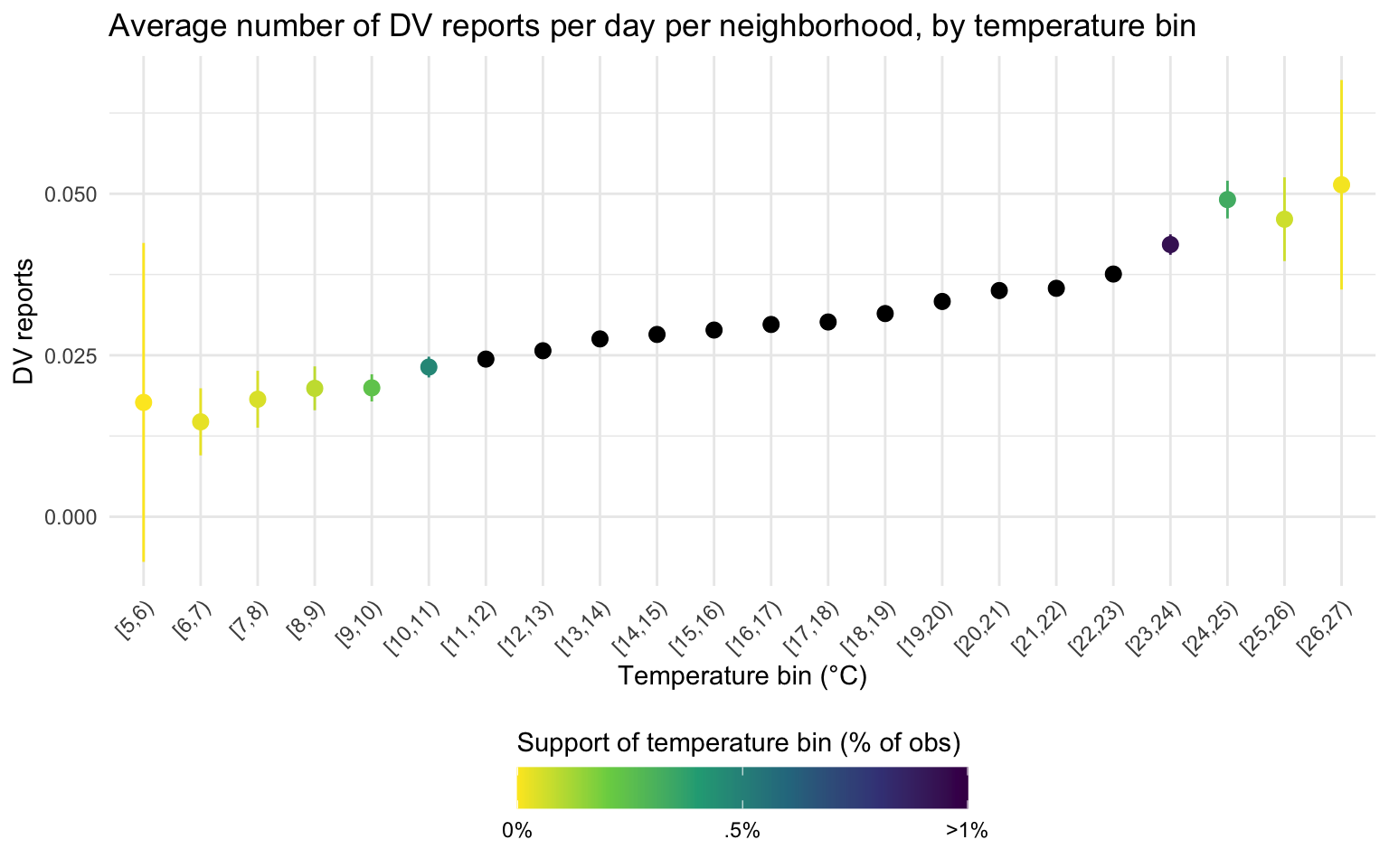
Now, I get to the unit of analysis of the paper: day per AGEB I first to plot the average number of DV cases per day per AGEB, for days that fall into a certain 1°C temperature bin.
This plot shows that, for example, that observations (neighborhood days) that fall in the 11-12°C bin record on average 0.025 reports for domestic violence. The plot shows that warmer day record warmer DV cases, but the extreme bins are very noisy.
data_reports %>%filter(!is.na(tmean)) %>%group_by(bins_tmean_one =cut_width(tmean, width =1, center = .5, closed ="left")) %>%summarise(mean_dv =mean(reports_dv),count =n(),sd =sd(reports_dv),se = sd /sqrt(count)) %>%filter(mean_dv >0) %>%#to compute the CI, I need at least 1 crimemutate(prop_in_pc =100*count/sum(count)) %>%mutate(lower_ci = mean_dv -qt(0.975, count-1) * se, upper_ci = mean_dv +qt(0.975, count-1) * se) %>%ggplot(aes(bins_tmean_one, mean_dv, color = prop_in_pc)) +geom_point(stat ="identity", size =2.5) +geom_pointrange(aes(ymin = lower_ci, ymax = upper_ci)) +scale_x_discrete(guide =guide_axis(n.dodge =1, angle =45)) +scale_colour_viridis_c(option ="D", direction =-1,limits =c(0, 1),na.value ="black",breaks =c(0, .5, 1),labels =c("0%", ".5%", ">1%")) +labs(title ="Average number of DV reports per day per neighborhood, by temperature bin",x ="Temperature bin (°C)", y ="DV reports", color ="Support of temperature bin (% of obs)") +theme_light() +theme(legend.position ="bottom") +guides(colour =guide_colourbar(title.position="top",barwidth=13))
As is clear from the graph above, the support of each temperature bin is very unequal. The color of the points represents the proportion of day/neighborhood that fall in that temperature bin i.e the support of the distribution in my data. The darker the color, the higher the proportion of days that fall in that temperature bin. The black points all have a support higher than 1% (up to 18% of observations for the 18-19 degrees bin). However, less than 1% of observations fall in all the degrees bin below [11,12) or above [22,23), as indicated by lighter colors, resulting in large confidence intervals. Very few day/neighborhood observations fall in the most extreme bins, and those observations sum 0 DV reports (so, also no CI).
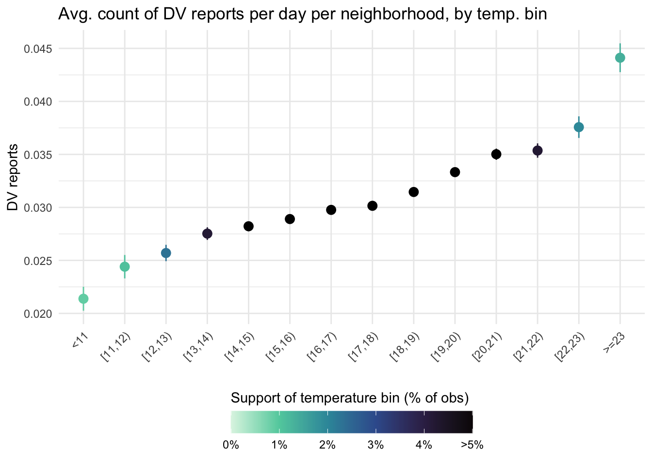
There are two ways to go around this. First, I plot the same graph, by lumping the most extreme bins together, so that each bin contains at least 1pc of the observations.
data_reports %>%filter(!is.na(tmean)) %>%group_by(bins_tmean_one) %>%summarise(mean_dv =mean(reports_dv),count =n(),sd =sd(reports_dv),se = sd /sqrt(count)) %>%#filter(mean_dv > 0) %>% #to compute the CI, I need at least 1 crimemutate(prop_in_pc =100*count/sum(count)) %>%mutate(lower_ci = mean_dv -qt(0.975, count-1) * se, upper_ci = mean_dv +qt(0.975, count-1) * se) %>%ggplot(aes(bins_tmean_one, mean_dv, color = prop_in_pc)) +geom_point(stat ="identity", size =3) +geom_linerange(aes(ymin = lower_ci, ymax = upper_ci)) +scale_x_discrete(guide =guide_axis(n.dodge =1, angle =45)) +scale_colour_viridis_c(option ="G", direction =-1,limits =c(0, 5),na.value ="black",breaks =c(0, 1, 2, 3, 4, 5),labels =c("0%", "1%", "2%", "3%", "4%", ">5%")) +labs(title ="Avg. count of DV reports per day per neighborhood, by temp. bin",x =element_blank(), y ="DV reports", color ="Support of temperature bin (% of obs)") +theme_light() +theme(legend.position ="bottom") +guides(colour =guide_colourbar(title.position ="top",barwidth =13))
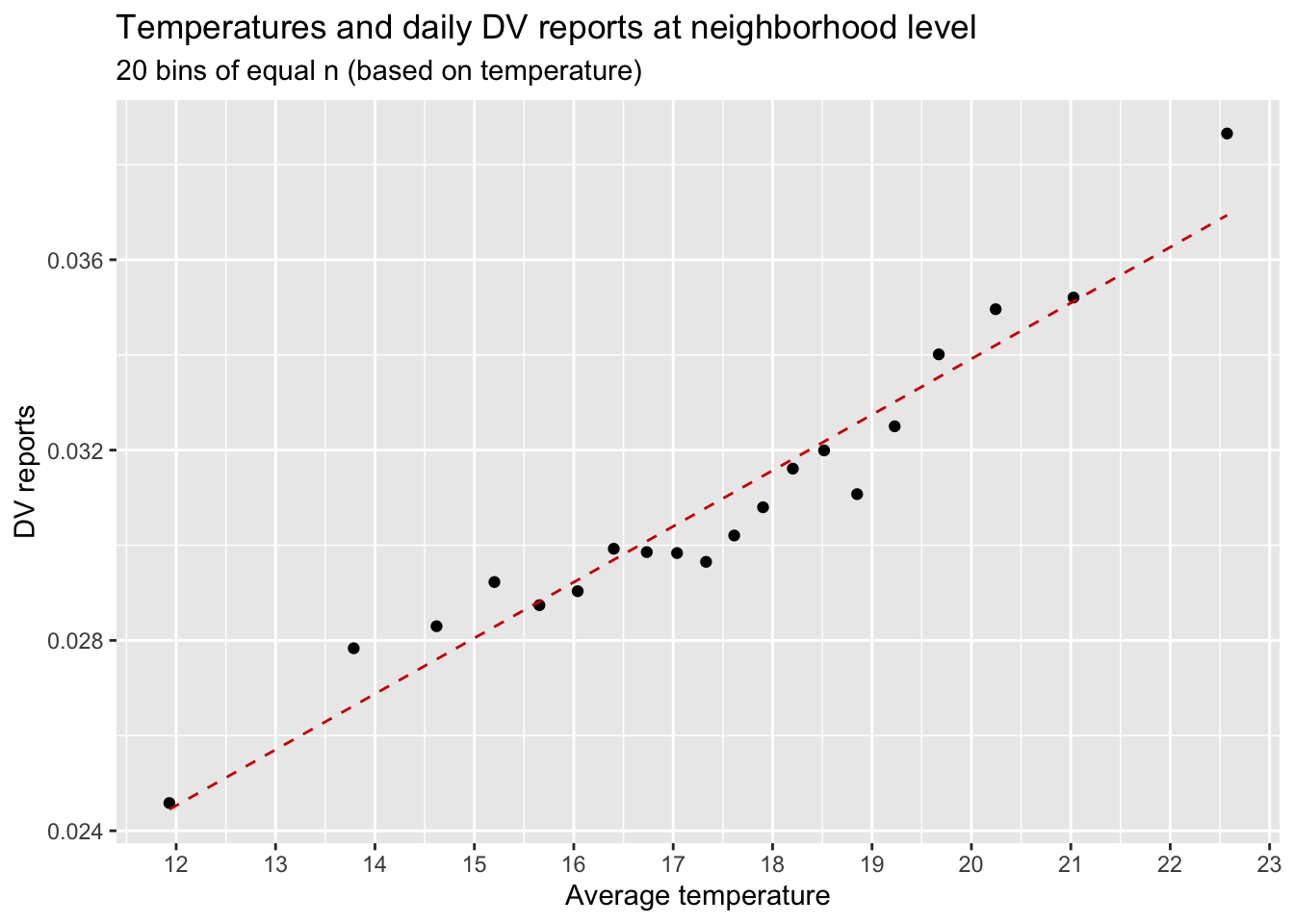
Another way is to construct temperature bins that contain the same number of observations. Here, I construct 20 bins of equal size based on temperature. The dots represent the average temperature and the average number of DV reports per day per neighborhood for each bin. The dashed line shows the predicted relationship based on an OLS estimation for the underlying data.
data_reports %>%mutate(bins_temps_equal_size =cut_number(tmean, 20)) %>%# I can do the same with many more bins, for example 200:# mutate(bins_temps_equal_size = cut_number(temp, 20)) %>% summarise(mean_dv =mean(reports_dv),mean_temp =mean(tmean),.by ="bins_temps_equal_size") %>%#arrange(mean_temp) %>% print(n=100) %>% drop_na() %>%ggplot(aes(mean_temp, mean_dv)) +geom_point() +geom_smooth(method ="lm", se = F, linetype ="dashed", color ="red3", size = .5) +scale_x_continuous(breaks =seq(7, 24, 1)) +labs(title ="Temperatures and daily DV reports at neighborhood level",subtitle ="20 bins of equal n (based on temperature)",x ="Average temperature",y ="DV reports")
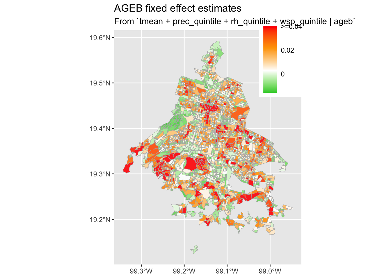
There is substantial spatial variation in domestic violence crime across AGEB of Mexico City, which may result from many factors. To account for this spatial variation in DV crime, I include AGEB fixed effects. These fixed effects ensure that the model is estimated on deviations from neighborhood averages rather than on cross-sectional differences in temperature. Intuitively, the implication of this modelling choice is that the estimates represent a weighted average of within-neighborhood comparisons, i.e., the difference in domestic violence in a particular neighborhood of Mexico City, on a warmer day versus a colder day, for example.
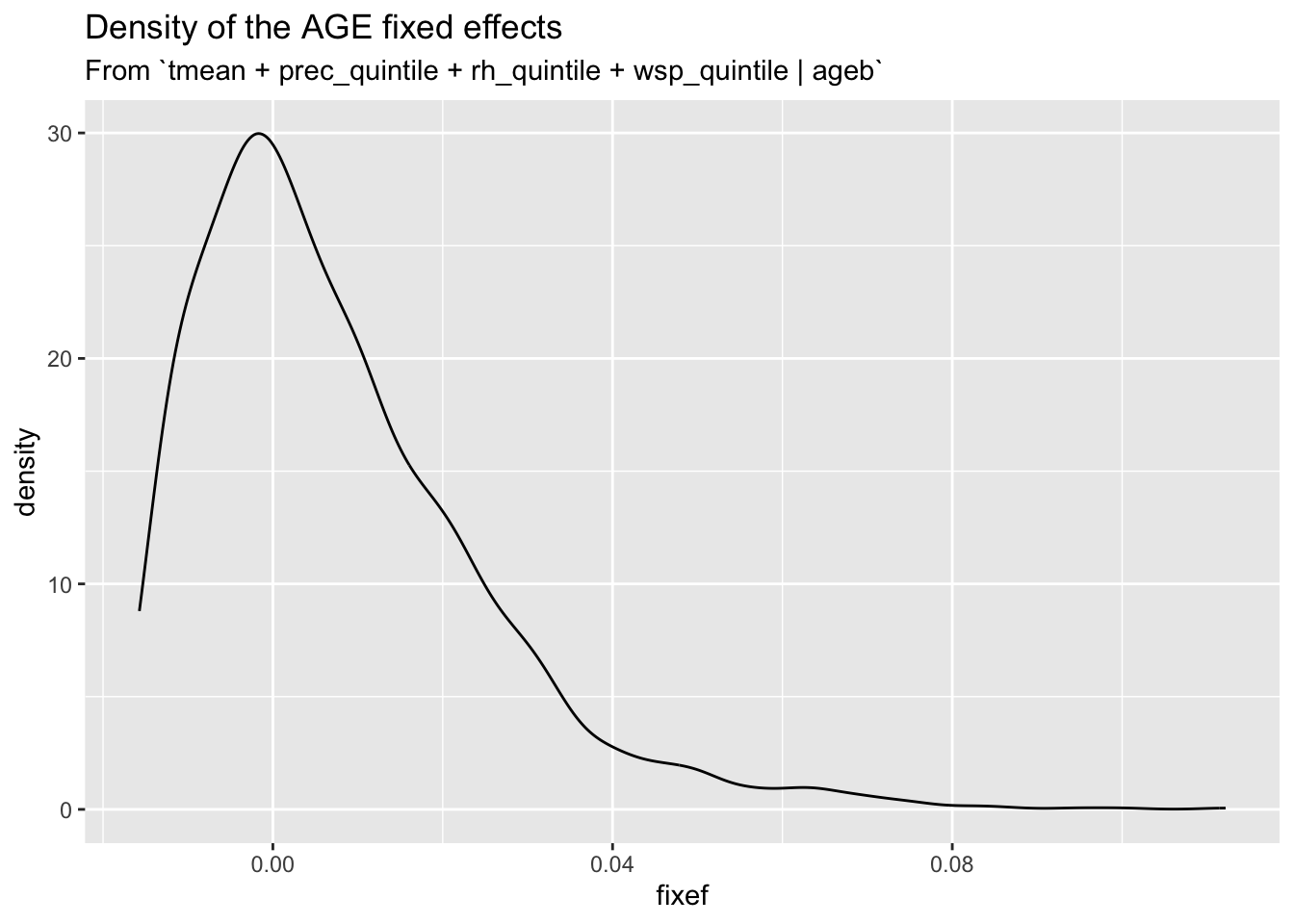
I extract the estimate for each FE of AGEB. No large tails and modest spatial heterogeneity.
#extract the fe from the modelcol_fe <-fixef(reg_col_fe)$ageb %>%enframe(name ="ageb", value ="fixef") %>%mutate(fixef_maxxed =case_when(fixef > .04~ .04,TRUE~ fixef))# plot density of the fixed effectsggplot(col_fe) +geom_density(aes(fixef)) +labs(title ="Density of the AGE fixed effects",subtitle ="From `tmean + prec_quintile + rh_quintile + wsp_quintile | ageb`")
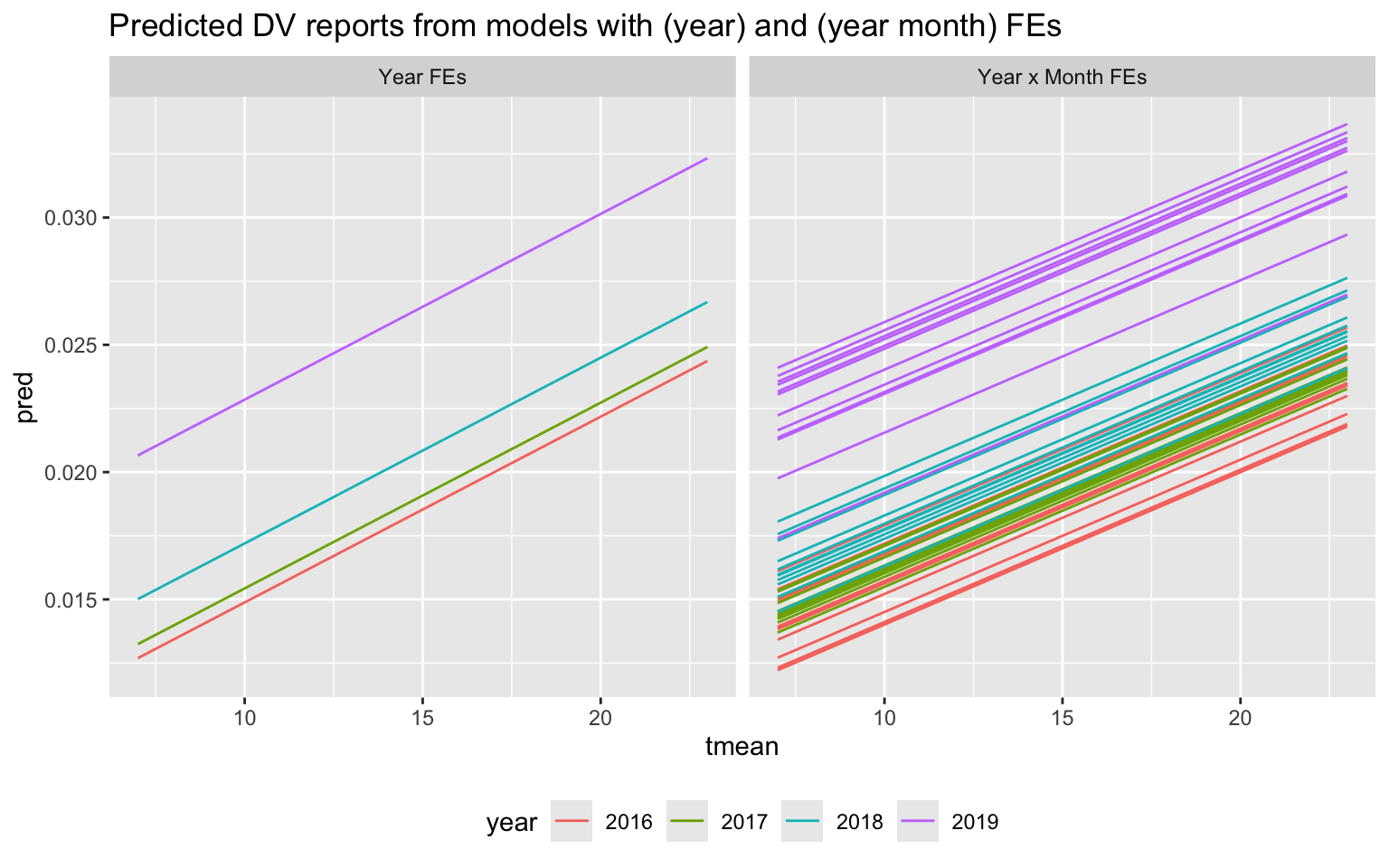
My identification strategy also addresses the seasonality of both domestic violence and temperature. I include year-by-month fixed effects in the model. Intuitively, this choice of fixed effects implies that the model coefficients represent an average of the differences in domestic violence on hot days versus cold days within a particular neighborhood and month of a certain year.
I can plot the fitted values from these models over the temperature support of the data.
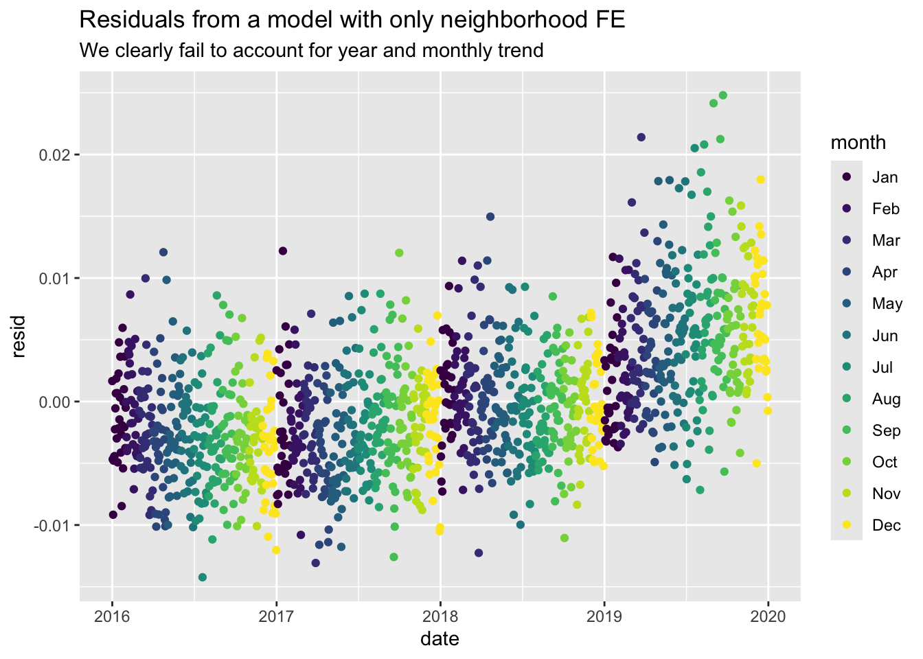
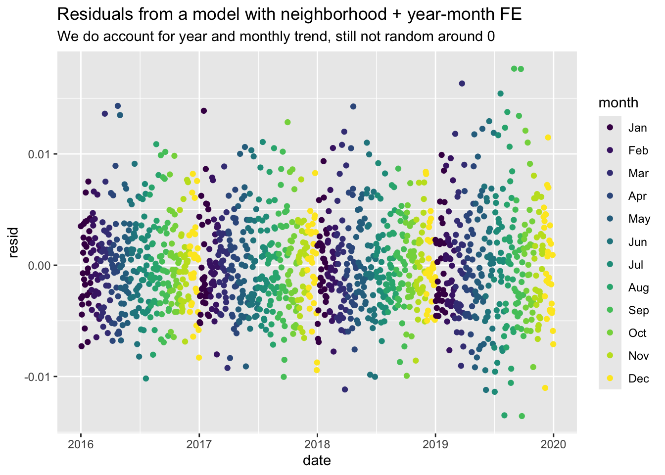
I can also plot the residuals from the model with only neighborhood fixed-effects, and then with year-month fixed-effects. The apparent patterns suggest that we fail to account for year and monthly trend in the simple model. Ideally, residuals should be randomly distributed without patterns when plotted over time.
data_reports %>%mutate(resid =resid(reg_col_fe), .after ="reports_dv") %>%filter(#year == 2018,#month %in% c("Mar", "Apr") ) %>%group_by(date, day_of_week, month) %>%summarise(resid =mean(resid)) %>%ggplot(aes(x = date, y = resid, color = month)) +geom_point() +labs(title ="Residuals from a model with only neighborhood FE",subtitle ="We clearly fail to account for year and monthly trend")data_reports %>%mutate(resid =resid(reg_fe_year_month), .after ="reports_dv") %>%filter(#year == 2018,#month %in% c("Mar", "Apr") ) %>%group_by(date, day_of_week, month) %>%summarise(resid =mean(resid)) %>%ggplot(aes(x = date, y = resid, color = month)) +geom_point() +labs(title ="Residuals from a model with neighborhood + year-month FE",subtitle ="We do account for year and monthly trend, still not random around 0")
Day of week
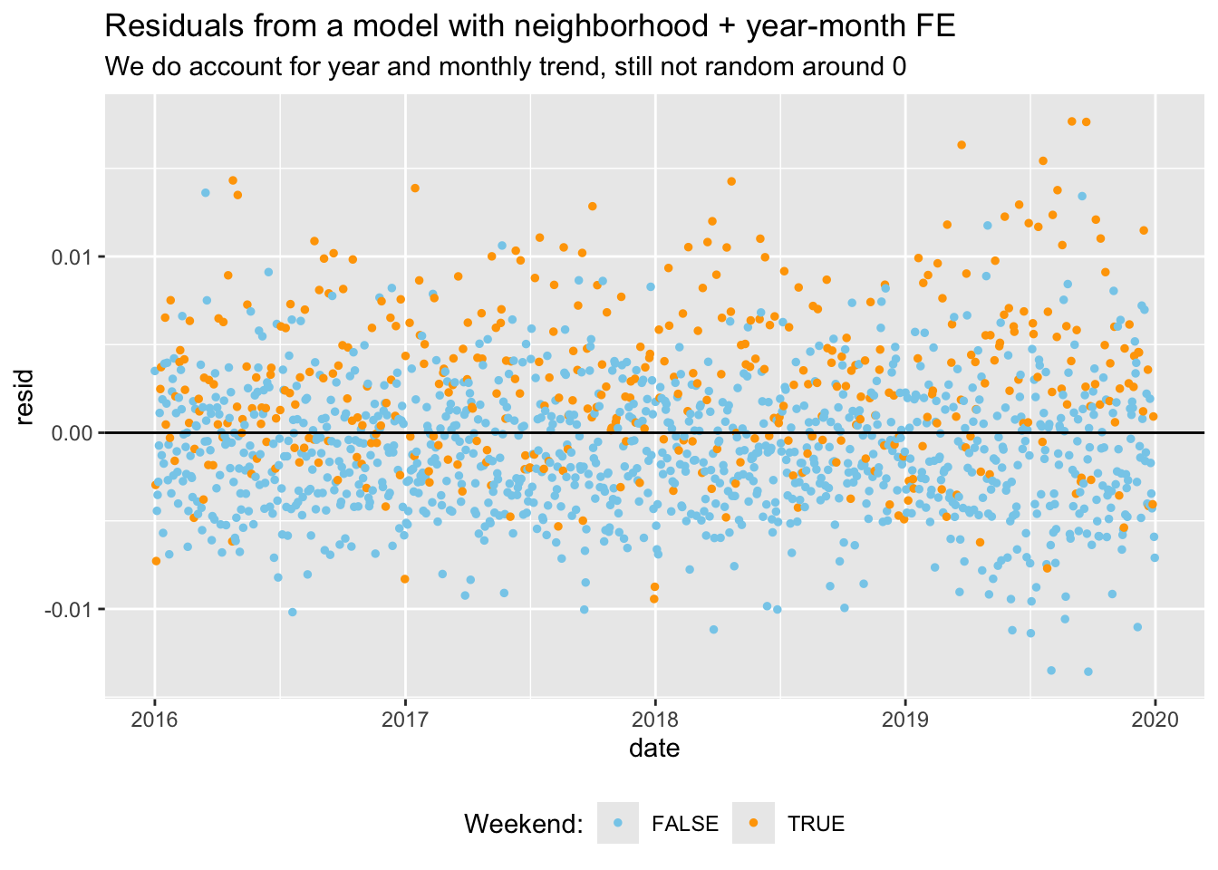
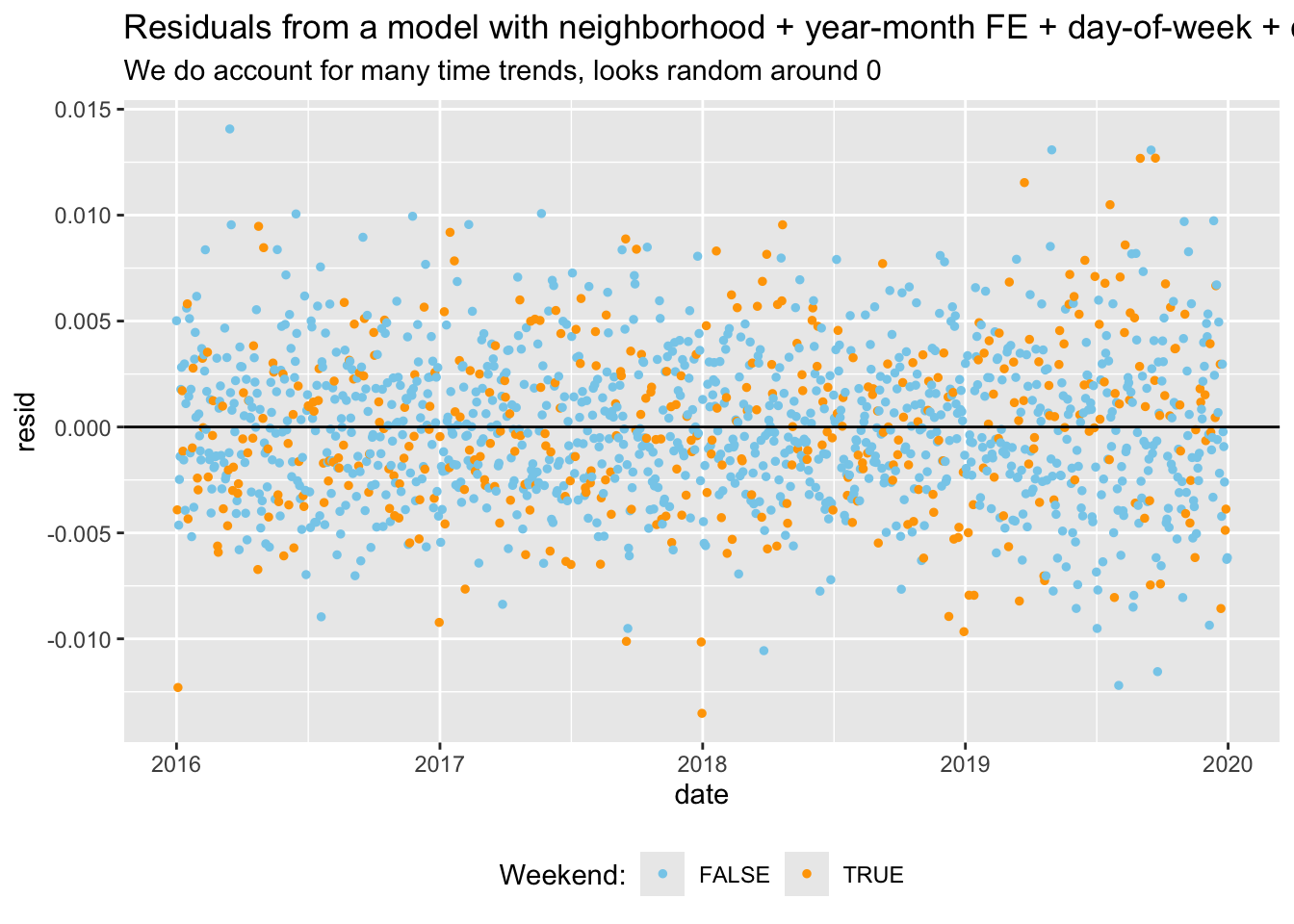
Below, I plot the residuals from a model with and without day of week fixed effects. This makes it very clear that we fail to account for the trend in crime over the week if we do not include those FE.
data_reports %>%mutate(resid =resid(reg_fe_year_month), .after ="reports_dv") %>%group_by(date, day_of_week, month) %>%summarise(resid =mean(resid)) %>%ggplot(aes(x = date, y = resid, color = day_of_week %in%c("Sat", "Sun"))) +geom_point(size =1) +geom_hline(yintercept =0) +scale_color_manual(values =c("skyblue", "orange"), name ="Weekend:") +labs(title ="Residuals from a model with neighborhood + year-month FE",subtitle ="We do account for year and monthly trend, still not random around 0") +theme(legend.position ="bottom")data_reports %>%mutate(resid =resid(reg_fe_dow), .after ="reports_dv") %>%group_by(date, day_of_week, month) %>%summarise(resid =mean(resid)) %>%ggplot(aes(x = date, y = resid, color = day_of_week %in%c("Sat", "Sun"))) +geom_point(size =1) +geom_hline(yintercept =0)+scale_color_manual(values =c("skyblue", "orange"), name ="Weekend:") +labs(title ="Residuals from a model with neighborhood + year-month FE + day-of-week + calendar days",subtitle ="We do account for many time trends, looks random around 0") +theme(legend.position ="bottom")
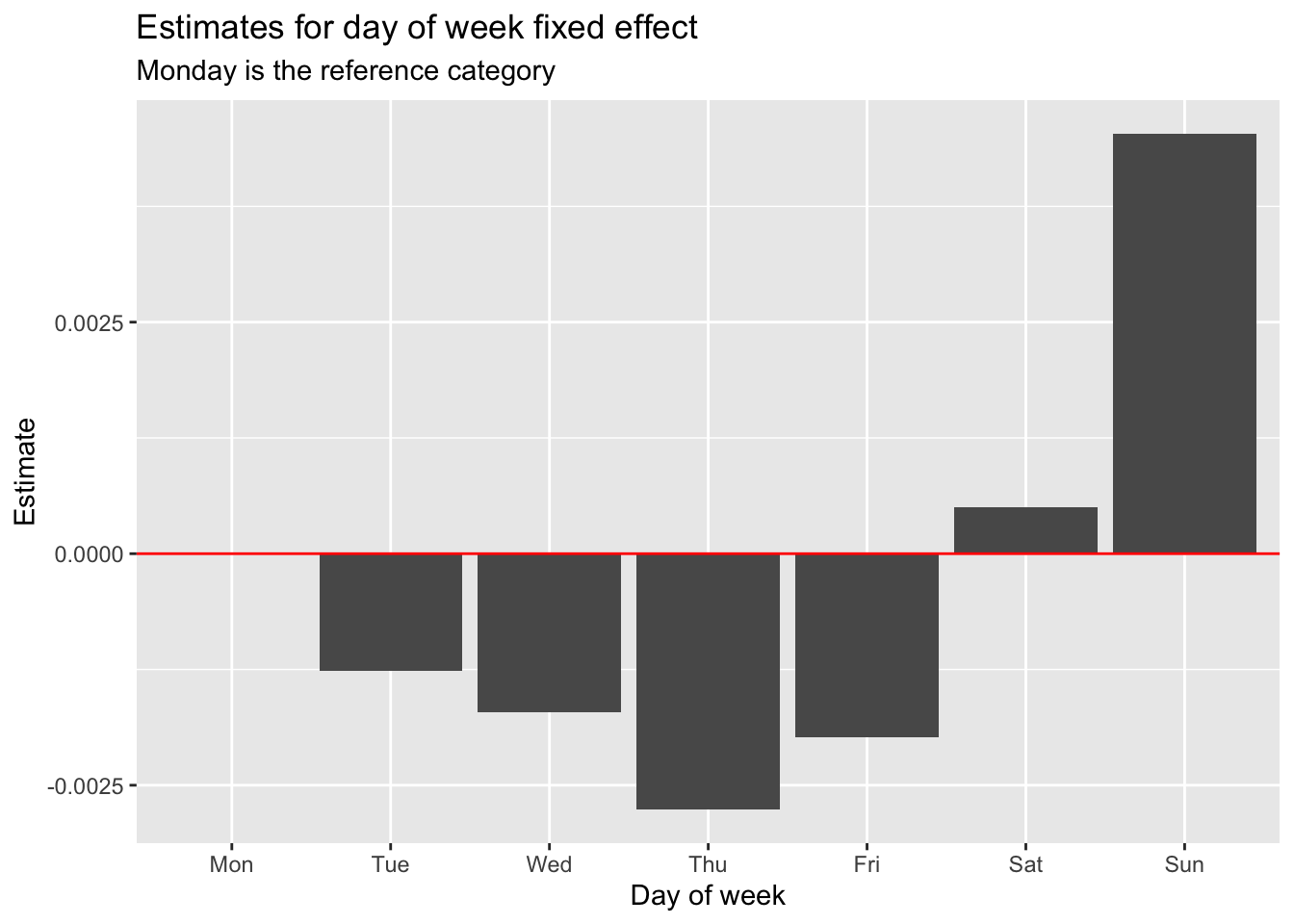
I estimate the model by further adding day of week fixed effect. I show the estimates for the day of week fixed effects, with Monday as the reference category. DV crime is higher on the weekend than during the week.
#restimate with day of week as control, to be able to set monday as ref categoryreg_fe_dow <-feols(reports_dv ~ tmean + prec +i(day_of_week, ref="Mon") | ageb + year^month,cluster =~ ageb, data = data_reports)dow_fe <-iplot(reg_fe_dow, only.params = T)$prms %>%as_tibble() %>%mutate(order =if_else(x ==1, 8, x)) %>%arrange(order) ggplot(dow_fe, aes(x =reorder(estimate_names, order), y = estimate)) +geom_col() +labs(title ="Estimates for day of week fixed effect",subtitle ="Monday is the reference category") +geom_hline(yintercept =0, color ="red") +labs(x ="Day of week", y ="Estimate")
rm(dow_fe)
Day of year and holidays FE
I also want to include day-of-year fixed effects to absorb patterns of domestic violence that are related to calendar effects, such as pay-day effects or holidays, or potential misreporting of the DV data on the first of each month for example.
I include a day of year variable in my estimations. I show below a table with the estimates for the day of year fixed effects. First of each month appears very clearly: probably measurement error. Other dates appear: for example, September 16 – which is the highest estimates of all dates – corresponds to Independence Day.
I can instead include a dummy for public holiday days. I do so below to compare. I could also include a dummy for school holidays (find the data). But I would fail to control for the first of the month, so I eventually decide to control for calendar days.
Fixed effects for year, calendar month, and day of the week preclude bias from day-specific heterogeneity and flexibly control for long-term trends and seasonality common to all neighborhoods. To exclude further possible biases, I can interact the time fixed effects for year, calendar month, and day of the week with the neighborhood dummies. The interactions allow for neighborhood-specific differences in patterns over months and over days of the week.
However, I am not overfitting the model? From the regression table, it is hard to see anything.
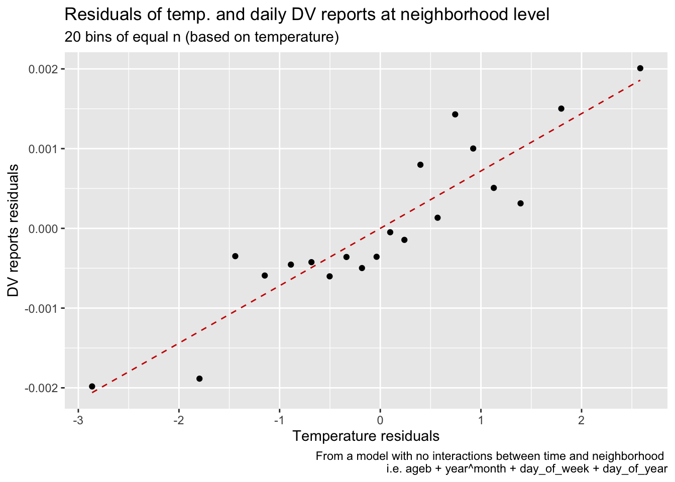
I can plot the residualized data from an OLS estimation of DV reports on tmean and all those FE, at the neighborhood x day level. This suggests that the relationship between temperature and DV reports is still positive, even after controlling for all these factors. Can I interpret anything from those two plots? Anyways, I think this is too mant FE, and I should not include the full interaction.
#follow wooldridge p337reports_dv_detrend <-feols(reports_dv ~1| ageb + year^month + day_of_week + day_of_year,cluster =~ ageb, data = data_reports)temp_detrend <-feols(tmean ~1| ageb + year^month + day_of_week + day_of_year,cluster =~ ageb, data = data_reports)prec_detrend <-feols(prec ~1| ageb + year^month + day_of_week + day_of_year,cluster =~ ageb, data = data_reports)data_reports <- data_reports %>%mutate(resid_temp =resid(temp_detrend),resid_dv =resid(reports_dv_detrend),resid_prec =resid(prec_detrend))#by regressing the residuals, I obtain the same coefficients as with the original model# etable(# feols(reports_dv ~ tmean + prec | ageb + year^month + day_of_week + day_of_year,# cluster = ~ ageb, data = data),# feols(resid_dv ~ resid_temp + resid_prec,# cluster = ~ ageb, data = data)# )data_reports %>%mutate(bins_temps_equal_size =cut_number(resid_temp, 20)) %>%summarise(mean_resid_dv =mean(resid_dv),mean_resid_temp =mean(resid_temp), .by ="bins_temps_equal_size") %>%ggplot(aes(mean_resid_temp, mean_resid_dv)) +geom_point() +geom_smooth(method ="lm", se = F, linetype ="dashed", color ="red3", size = .5) +labs(title ="Residuals of temp. and daily DV reports at neighborhood level",subtitle ="20 bins of equal n (based on temperature)",caption ="From a model with no interactions between time and neighborhood \n i.e. ageb + year^month + day_of_week + day_of_year",x ="Temperature residuals",y ="DV reports residuals")
#follow wooldridge p337reports_dv_detrend <-feols(reports_dv ~1| ageb + year^month + day_of_week + day_of_year + year^month^ageb + day_of_week^ageb,cluster =~ ageb, data = data_reports)temp_detrend <-feols(tmean ~1| ageb + year^month + day_of_week + day_of_year + year^month^ageb + day_of_week^ageb,cluster =~ ageb, data = data_reports)prec_detrend <-feols(prec ~1| ageb + year^month + day_of_week + day_of_year + year^month^ageb + day_of_week^ageb,cluster =~ ageb, data = data_reports)data_reports <- data_reports %>%mutate(resid_temp =resid(temp_detrend),resid_dv =resid(reports_dv_detrend),resid_prec =resid(prec_detrend))#by regressing the residuals, I obtain the same coefficients as with the original model# etable(# feols(reports_dv ~ tmean + prec | ageb + year^month + day_of_week + day_of_year,# cluster = ~ ageb, data = data),# feols(resid_dv ~ resid_temp + resid_prec,# cluster = ~ ageb, data = data)# )data_reports %>%mutate(bins_temps_equal_size =cut_number(resid_temp, 20)) %>%summarise(mean_resid_dv =mean(resid_dv),mean_resid_temp =mean(resid_temp), .by ="bins_temps_equal_size") %>%ggplot(aes(mean_resid_temp, mean_resid_dv)) +geom_point() +geom_smooth(method ="lm", se = F, linetype ="dashed", color ="red3", size = .5) +labs(title ="Residuals of temp. and daily DV reports at neighborhood level",subtitle ="20 bins of equal n (based on temperature)",caption ="From a model with full interactions between time and neighborhood \n i.e. ageb + year^month + day_of_week + day_of_year + year^month^ageb + day_of_week^ageb",x ="Temperature residuals",y ="DV reports residuals")
rm(list =ls(pattern ="detrend"))
OLS results of adding all the fixed effects incrementally
Finally, I show the results of the different regressions in the table below, in which I add the FE incrementally.
OLS results without any FE in column (1) are overestimating the effect of temperature. When I control only the seasonality in (2), the estimate is even larger. However, as soon as I control for neighborhood in (3), the estimate for temperature gets to its stable level. Controls for seasonality and neighborhood (4) seem to be enough to stabilize the coefficient estimate on temperature. I add day of the week in (5) and day of the year in (6), but the coefficient on temperature does not change much. Finally, I control for a holidays dummy in (7) instead of the day of year FE, but the coefficient on temperature remains stable.
My preferred specification is that of column (6). The identifying variation in that specification using fixed effects can be characterized as within-neighborhood, within-year, within-month, and within-day of the week.
Adding all those FE maximizes the control for confounding variation and focuses on the most granular level of time-variant changes in temperature within neighborhoods. However, I could be left with too little variation for identification, and the estimation could be sensitive to measurement error in temperature or crime counts… Signal to noise ratio…
Specifying temperatures flexibly
I can estimate the same specifications as in the big table above, but with a flexible specification for temperature. I use bins of 1 degree, to be able to detect non-linearities in the effect of temperature on crime, but also, and more importantly at this point, to detect if the inclusion of all those fixed effects leads to a loss in precision (the more bins, the more precision I would need).
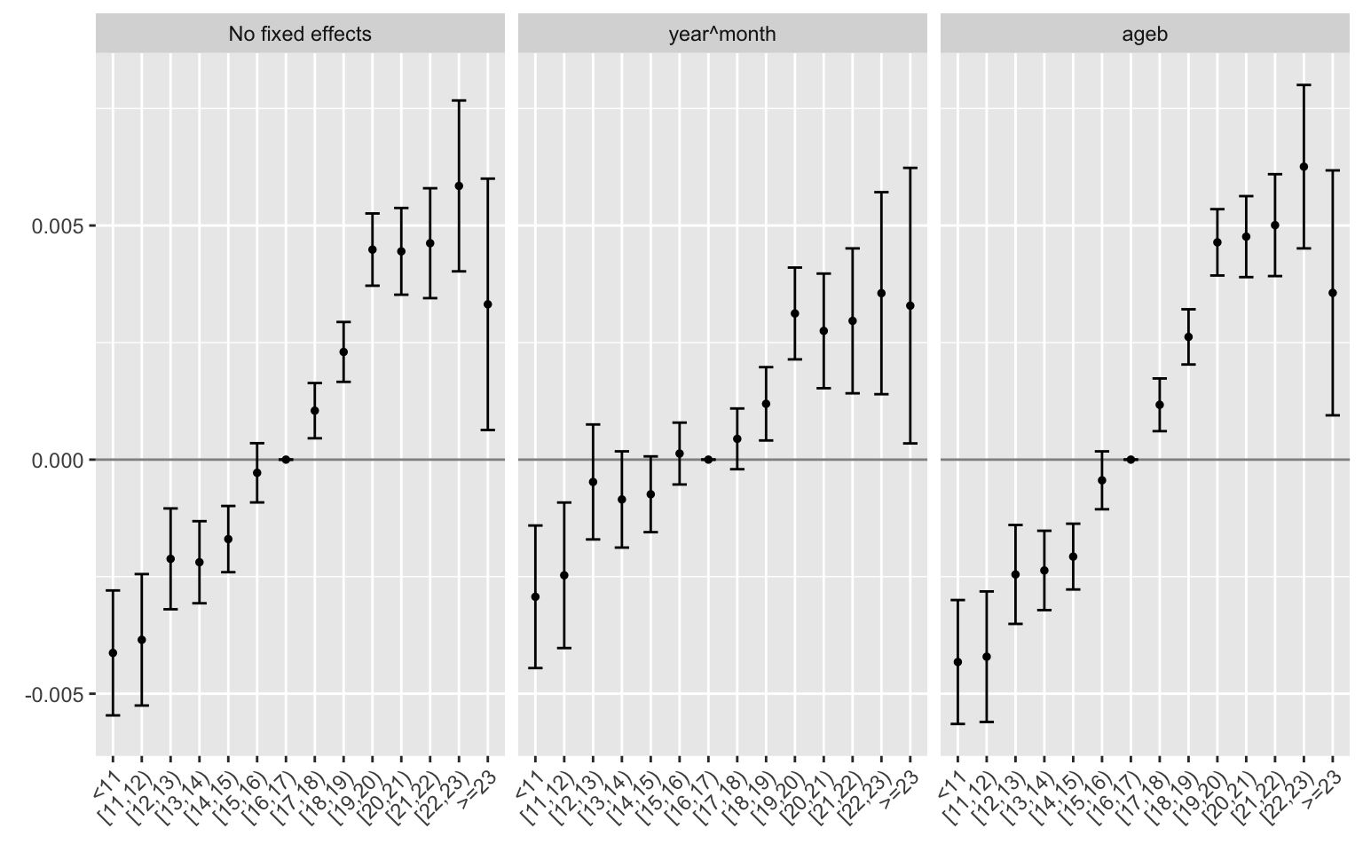
I first plot the estimates for specifications with corresponding to columns 1 to 3. As in the big table above, it is clear that controlling for neighborhood is crucial and is enough to capture estimates reasonably close in magnitude to the final ones.
Flexible specification: bins of 1 deg width, with different fixed effects
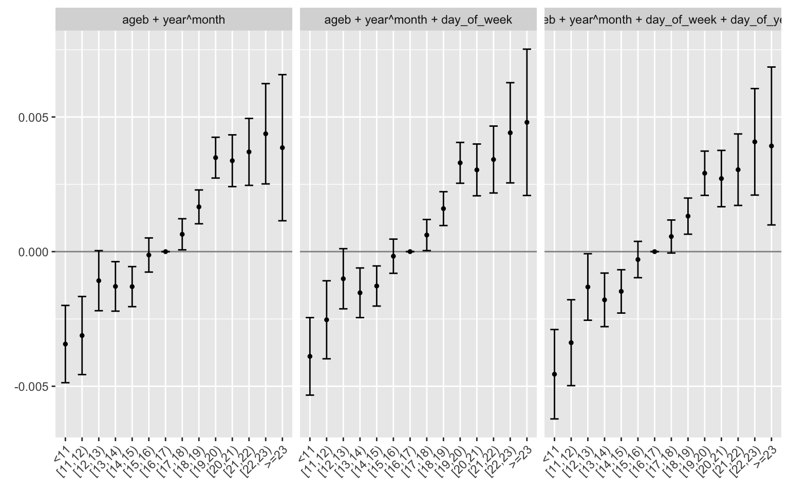
Then, I plot col 4-6. The coefficients are surprisingly stable. The inclusion of neighborhood and seasonality seems to be enough to capture the effect of temperature on crime. Adding day of the week and day of the year does not change the estimates much.
Flexible specification: bins of 1 deg width, with different fixed effects
rm(estimates)
Now that we have a good overview of the fixed effects, let us move to the modelling. As of now, I estimate simple OLS, but this is clearly not optimal given the nature of the data.