start_time <- Sys.time()

library(tidyverse)
library(here) # path control
library(fixest) # estimations with fixed effects
library(knitr)
library(patchwork)
library(tictoc)
tic("Total render time")Main linear regressions
Note
In this file I run the main regressions with the different measures of temperature and reports data.
- I export “Table 1”
- I save the plots with the estimates for the quintiles of precipitation, humidity and windspeed.
data <-
  read_rds(here("..", "output", "data_reports.rds")) %>%
  filter(covid_phase == "Pre-pandemic")

# quintiles are computed last minute, on the selected period
data <- data %>%
  mutate(prec_quintile = ntile(prec, 5),
         rh_quintile = ntile(rh, 5),
         wsp_quintile = ntile(wsp, 5))

data <- data %>%
  left_join(
    read_rds(here("..", "output", "temporary_data",
                  "tmp_hourly_ageb.rds"))
  )
Run the regressions
Tmean
First, run the baseline regression with tmean, 24-hour mean of temperature
reg_linear_reports <- data %>%
  fepois(reports_dv ~ tmean |
           prec_quintile + rh_quintile + wsp_quintile +
           ageb + year^month + day_of_week + day_of_year,
         cluster = ~ ageb)
Tmin and Tmax
Use tmin and tmax instead
reg_min <- data %>%
  fepois(reports_dv ~ tmin |
           prec_quintile + rh_quintile + wsp_quintile +
           ageb + year^month + day_of_week + day_of_year,
         cluster = ~ ageb)

reg_max <- data %>%
  fepois(reports_dv ~ tmax |
           prec_quintile + rh_quintile + wsp_quintile +
           ageb + year^month + day_of_week + day_of_year,
         cluster = ~ ageb)
Or both in the same reg:
reg_min_max <- data %>%
  fepois(reports_dv ~ tmin + tmax |
           prec_quintile + rh_quintile + wsp_quintile +
           ageb + year^month + day_of_week + day_of_year,
         cluster = ~ ageb)
Day and night temperatures
Max temperature is usually reached at 4-5pm
# max hour is always during the daytime
data %>%
  filter(!is.na(tmax)) %>%
  select(ageb, date, tmp_hourly) %>%
  # indicator for which hour is the min in a day
  mutate(max_hour = map_dbl(tmp_hourly, ~ which.max(.x))) %>%
  ggplot() +
  geom_histogram(aes(x = max_hour), bins = 24)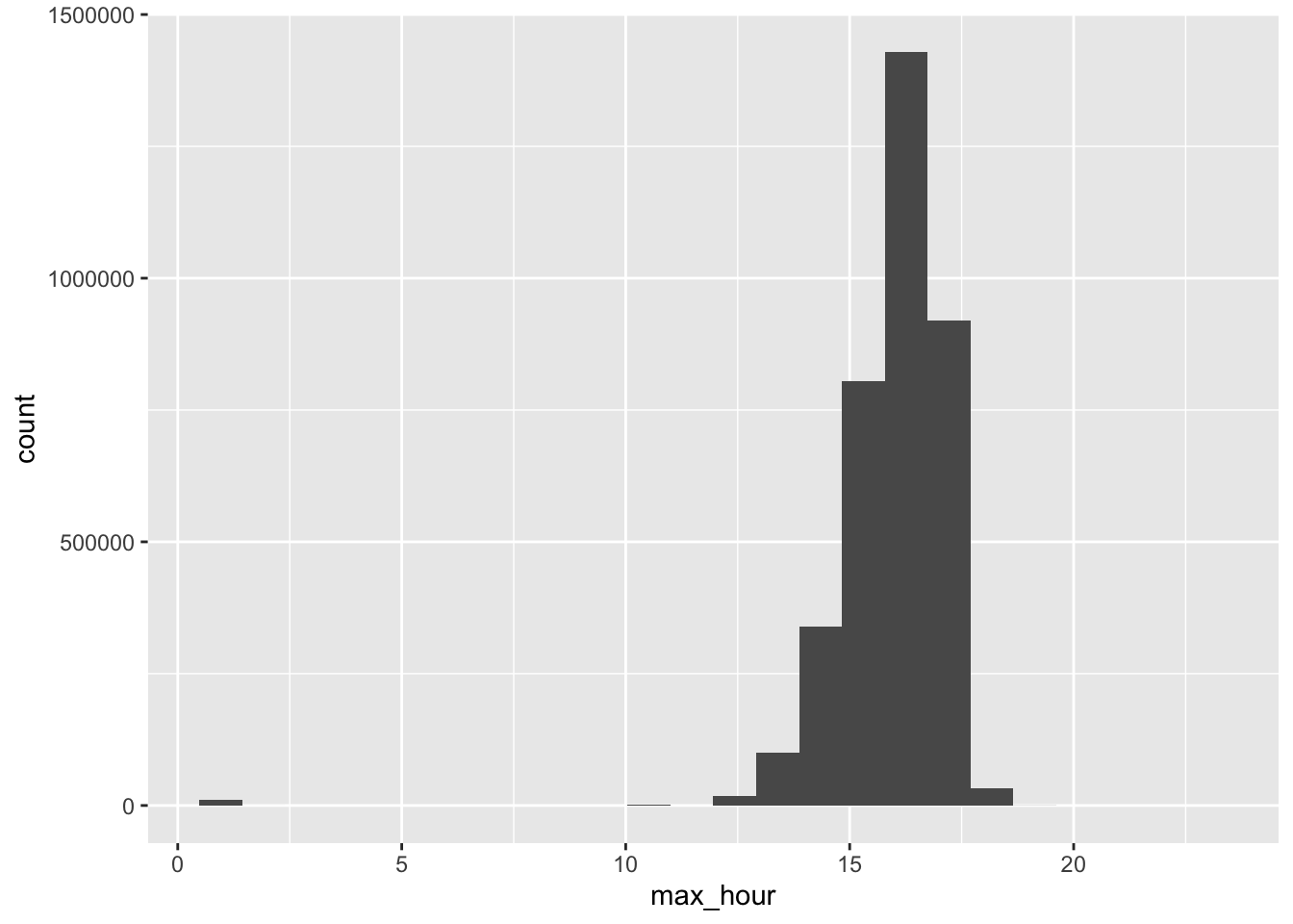
Min temperature is usually reached at hour 7, i.e from 06:00 to 06:59.
# hour in which the temp reaches its min is sometimes during daytime (hour 8, from 07:00 to 07:59)
data %>%
  filter(!is.na(tmin)) %>%
  select(ageb, date, tmp_hourly) %>%
  # indicator for which hour is the min in a day
  mutate(min_hour = map_dbl(tmp_hourly, ~ which.min(.x))) %>%
  ggplot() +
  geom_histogram(aes(x = min_hour), bins = 24)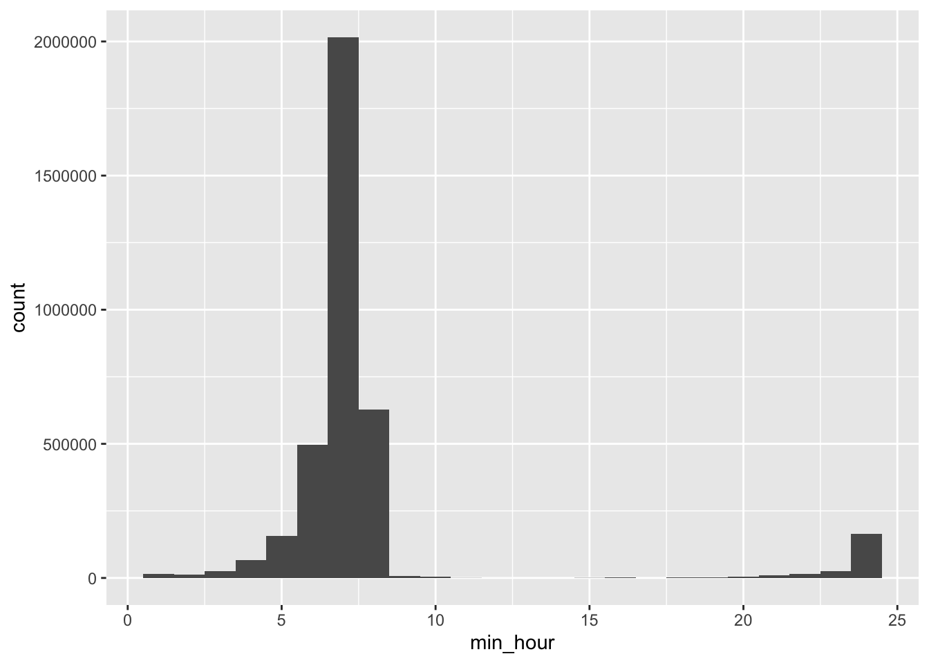
Since we have hourly measurements of temperature, we can calculate the average temperature during the day and during the night.
I define
- day temperature from 07:00 (hour 8) to 19:59 (hour 20)
- night temperature from 20:00 (hour 21) (the day before!) to 06:59 (hour 7)
So, there are 13 hours in a day, and 11 hours in the night
# I want to account for a different definition of night.
# now if i want the night to be LAGGED NIGHT TEMPERATURE:
# For a crime on Monday, night temperatures reflect Sunday 8:00 PM to Monday 6:59 AM.
data <- data %>%
  mutate(tmean_day = map_dbl(tmp_hourly, ~ mean(.x[8:20])),
         #this would be the "wrong i.e. not lagged" definition of night
         #tmean_night = map_dbl(tmp_hourly, ~ mean(c(.x[21:24], .x[1:7]))),
         tmean_lagged_night = map2_dbl(
           lag(tmp_hourly, default = list(rep(NA, 24))),  # Provide a default list of NAs
           tmp_hourly,
           ~ if (!all(is.na(.x))) mean(c(.x[21:24], .y[1:7])) else NA_real_)
  )
Here’s the distribution of day and night temperatures.
data %>%
  ggplot() +
  geom_density(aes(x = tmean_day), color = "orange") +
  geom_density(aes(x = tmean_lagged_night), color = "darkblue") +
  theme_light()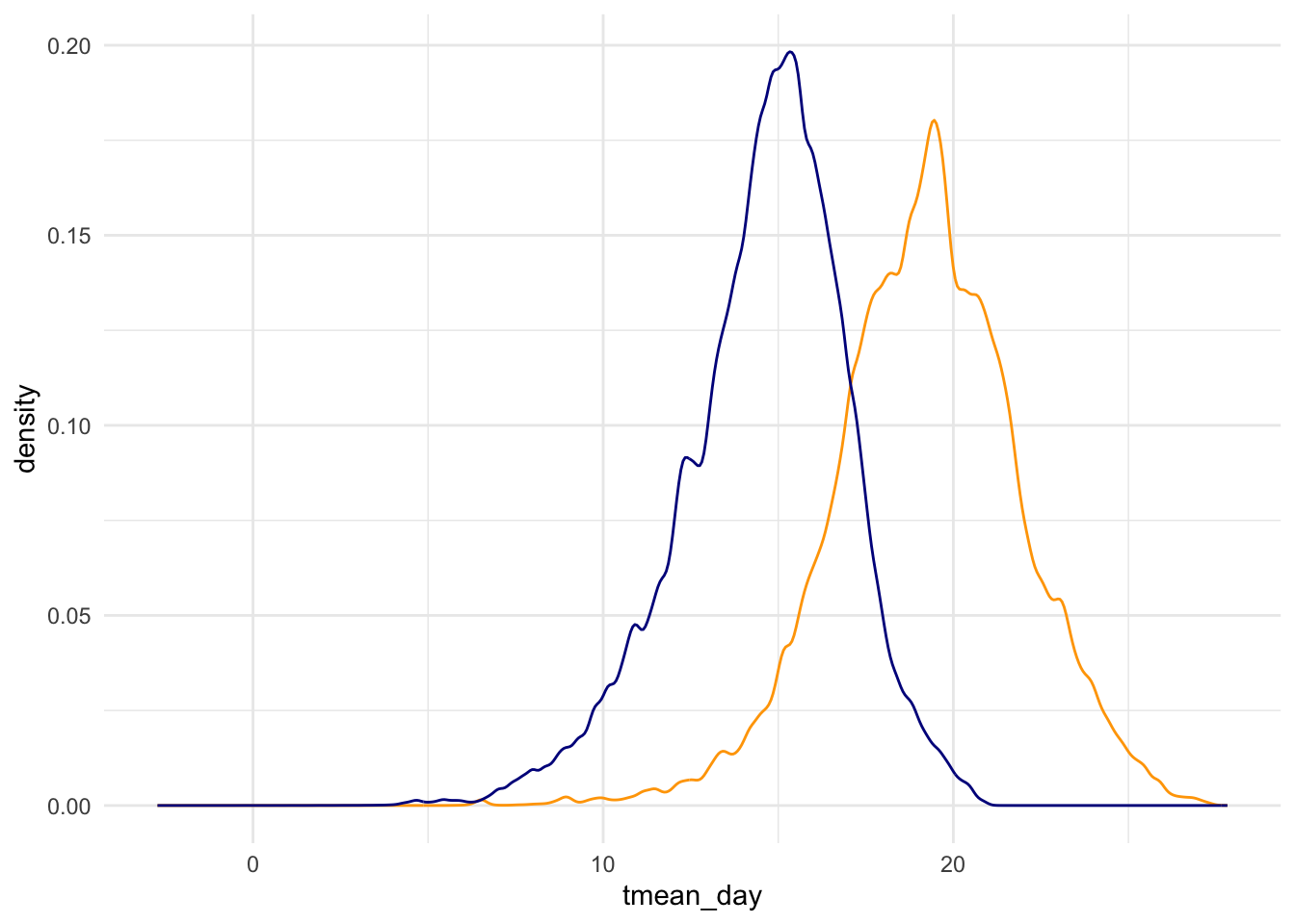
Now i can run the regs, separately for day and night temperatures, and jointly.
reg_day <- data %>%
  fepois(reports_dv ~ tmean_day |
          prec_quintile + rh_quintile + wsp_quintile +
          ageb + year^month + day_of_week + day_of_year,
        cluster = ~ ageb)

reg_night <- data %>%
  fepois(reports_dv ~ tmean_lagged_night |
          prec_quintile + rh_quintile + wsp_quintile +
          ageb + year^month + day_of_week + day_of_year,
        cluster = ~ ageb)

reg_day_night <- data %>%
  fepois(reports_dv ~ tmean_day + tmean_lagged_night |
          prec_quintile + rh_quintile + wsp_quintile +
          ageb + year^month + day_of_week + day_of_year,
        cluster = ~ ageb)
Midnight temperature
Just to try, but doesnt add much
reg_midnight <- data %>%
  mutate(midnight_temp = map_dbl(tmp_hourly, ~ .x[1])) %>%
  fepois(reports_dv ~ midnight_temp |
           prec_quintile + rh_quintile + wsp_quintile +
           ageb + year^month + day_of_week + day_of_year,
         cluster = ~ ageb)
Export Table 1
These are the results we want to export:
etable(reg_linear_reports,
       reg_day, reg_night, reg_day_night,
       reg_max, reg_min, reg_min_max) %>%
kable()| reg_linear_reports | reg_day | reg_night | reg_day_night | reg_max | reg_min | reg_min_max | |
|---|---|---|---|---|---|---|---|
| Dependent Var.: | reports_dv | reports_dv | reports_dv | reports_dv | reports_dv | reports_dv | reports_dv |
| tmean | 0.0274*** (0.0034) | ||||||
| tmean_day | 0.0246*** (0.0030) | 0.0220*** (0.0041) | |||||
| tmean_lagged_night | 0.0188*** (0.0031) | 0.0039 (0.0042) | |||||
| tmax | 0.0198*** (0.0026) | 0.0159*** (0.0030) | |||||
| tmin | 0.0178*** (0.0029) | 0.0097** (0.0034) | |||||
| Fixed-Effects: | —————— | —————— | —————— | —————— | —————— | —————— | —————— |
| prec_quintile | Yes | Yes | Yes | Yes | Yes | Yes | Yes |
| rh_quintile | Yes | Yes | Yes | Yes | Yes | Yes | Yes |
| wsp_quintile | Yes | Yes | Yes | Yes | Yes | Yes | Yes |
| ageb | Yes | Yes | Yes | Yes | Yes | Yes | Yes |
| year-month | Yes | Yes | Yes | Yes | Yes | Yes | Yes |
| day_of_week | Yes | Yes | Yes | Yes | Yes | Yes | Yes |
| day_of_year | Yes | Yes | Yes | Yes | Yes | Yes | Yes |
| __________________ | __________________ | __________________ | __________________ | __________________ | __________________ | __________________ | __________________ |
| S.E.: Clustered | by: ageb | by: ageb | by: ageb | by: ageb | by: ageb | by: ageb | by: ageb |
| Observations | 3,624,826 | 3,624,815 | 3,624,809 | 3,624,797 | 3,624,826 | 3,624,826 | 3,624,826 |
| Squared Cor. | 0.01333 | 0.01333 | 0.01332 | 0.01333 | 0.01333 | 0.01332 | 0.01333 |
| Pseudo R2 | 0.05612 | 0.05612 | 0.05609 | 0.05612 | 0.05611 | 0.05609 | 0.05612 |
| BIC | 804,221.2 | 804,221.6 | 804,250.0 | 804,235.2 | 804,231.2 | 804,252.7 | 804,237.2 |
Export a latex with options. I have to reformat that table manually.
source(here("fixest_etable_options.R"))

etable(reg_linear_reports,
       reg_day, reg_night, reg_day_night,
       reg_max, reg_min, reg_min_max,
       file = here("..", "output", "tables", "reg_diff_temperature_measures.tex"), replace = T,
       adjustbox = TRUE, float = T,
       title = "The Effect of Temperature on Reported DV",
       label = "reg_diff_temperature_measures",
       notes = "Standard errors clustered by neighborhood in parentheses. * denotes significance at the 10% level, ** at the 5% level, and *** at the 1% level. Panel A presents estimates from the baseline specification (Equation~\ref{eq_main_spec}), where temperature is measured as the mean of 24 hourly readings. Panel B replaces mean temperature with daytime (7:00–20:00) and nighttime (21:00–7:00) temperatures. Column (i) includes only daytime temperature; Column (ii) includes only nighttime temperature; Column (iii) includes both jointly. Panel C adopts the same approach using the minimum and maximum of the 24 hourly readings instead. The dependent variable is the count of reported domestic violence incidents per neighborhood per day."
)
Plots for the quintiles of prec, hum, wsp
Now, we want to see the estimates for the quintiles. A table would be too cumbersome, so I do some plots:
reg_for_the_quintiles <- data %>%
  fepois(reports_dv ~ tmean +
           i(prec_quintile) + i(rh_quintile) + i(wsp_quintile) |
           ageb + year^month + day_of_week + day_of_year,
         cluster = ~ ageb)

prec_plot <-
  iplot(reg_for_the_quintiles, only.params = T, i.select = 1)$prms %>%
  ggplot(aes(x = estimate_names, y = estimate, ymin = ci_low, ymax = ci_high, group = 1)) +
  geom_point(color = "black", size = 2) + geom_errorbar(color = "black", width = .2) +
  geom_hline(yintercept = 0, alpha = .5) +
  theme_light() +
  labs(x = "Precipitation quintile", y = "Estimate and 95% CI")

hum_plot <-
  iplot(reg_for_the_quintiles, only.params = T, i.select = 2)$prms %>%
  ggplot(aes(x = estimate_names, y = estimate, ymin = ci_low, ymax = ci_high, group = 1)) +
  geom_point(color = "black", size = 2) + geom_errorbar(color = "black", width = .2) +
  geom_hline(yintercept = 0, alpha = .5) +
  theme_light() +
  labs(x = "Humidity quintile", y = NULL)

wsp_plot <-
  iplot(reg_for_the_quintiles, only.params = T, i.select = 3)$prms %>%
  ggplot(aes(x = estimate_names, y = estimate, ymin = ci_low, ymax = ci_high, group = 1)) +
  geom_point(color = "black", size = 2) + geom_errorbar(color = "black", width = .2) +
  geom_hline(yintercept = 0, alpha = .5) +
  theme_light() +
  labs(x = "Windspeed quintile", y = NULL)

prec_plot + hum_plot + wsp_plot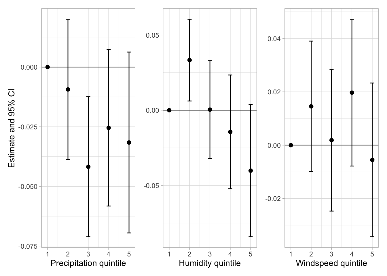
ggsave(path = here("..", "output", "figures"),
       filename = "reg_quintiles.png",
       width = 7, height = 2.3)
Rendered on: 2025-07-27 01:21:38Total render time: 401.474 sec elapsed