ageb_attributes <-
  read_rds(here("..",
               "output",
               "ageb_attributes.rds"))

weather <-
  read_rds(here(
    "..",
    "output",
    "temporary_data",
    "weather",
"weather_cdmx.rds"))Describe weather
Import the data
Look at missings
Quick look at data coverage:
weather %>% filter(!is.na(tmean)) %>%
  pull(date) %>% summary()
Min. 1st Qu. Median Mean 3rd Qu. Max.
"2016-01-01" "2018-03-02" "2020-05-01" "2020-05-01" "2022-07-01" "2024-08-31" weather %>% filter(!is.na(prec)) %>%
pull(date) %>% summary() Min. 1st Qu. Median Mean 3rd Qu. Max.
"2016-01-01" "2018-04-15" "2020-07-28" "2020-07-28" "2022-11-10" "2025-02-25" weather %>% filter(!is.na(pm25_mean)) %>%
pull(date) %>% summary() Min. 1st Qu. Median Mean 3rd Qu. Max.
"2016-01-01" "2018-03-02" "2020-05-01" "2020-05-01" "2022-07-01" "2024-08-31" Look at the share of missing values per day.
For some reason, we have no windspeed in 2023…
weather_long <- weather %>%
  select(-contains("_above_"), -any_of(c("tmp_hourly", "pm25_hourly", "pm10_hourly"))) %>%
  select(tmean, tmax, tmin, rh, wdr, wsp, prec, pm25_mean, pm10_mean, date, ageb) %>%
  pivot_longer(cols = -c("ageb", "date"), names_to = "variable", values_to = "value")

missings_date <- weather_long %>%
  group_by(date, variable) %>%
  summarise(total = n(),
            count_missing = sum(is.na(value)),
            share_missing = count_missing/total,
            .groups = "drop")

# we have very few missing values for pm, and none for the rest of variables
missings_date %>%
  ggplot(aes(x = date, y = share_missing, color = as_factor(year(date)))) +
  geom_line(linewidth = 1) +
  labs(title = "Share of missing values in the weather (redmet), pollution (rama) and prec (conagua) data",
       x = "Date",
       y = "Share of AGEB with missing values") +
  facet_wrap(~variable) +
  theme_light()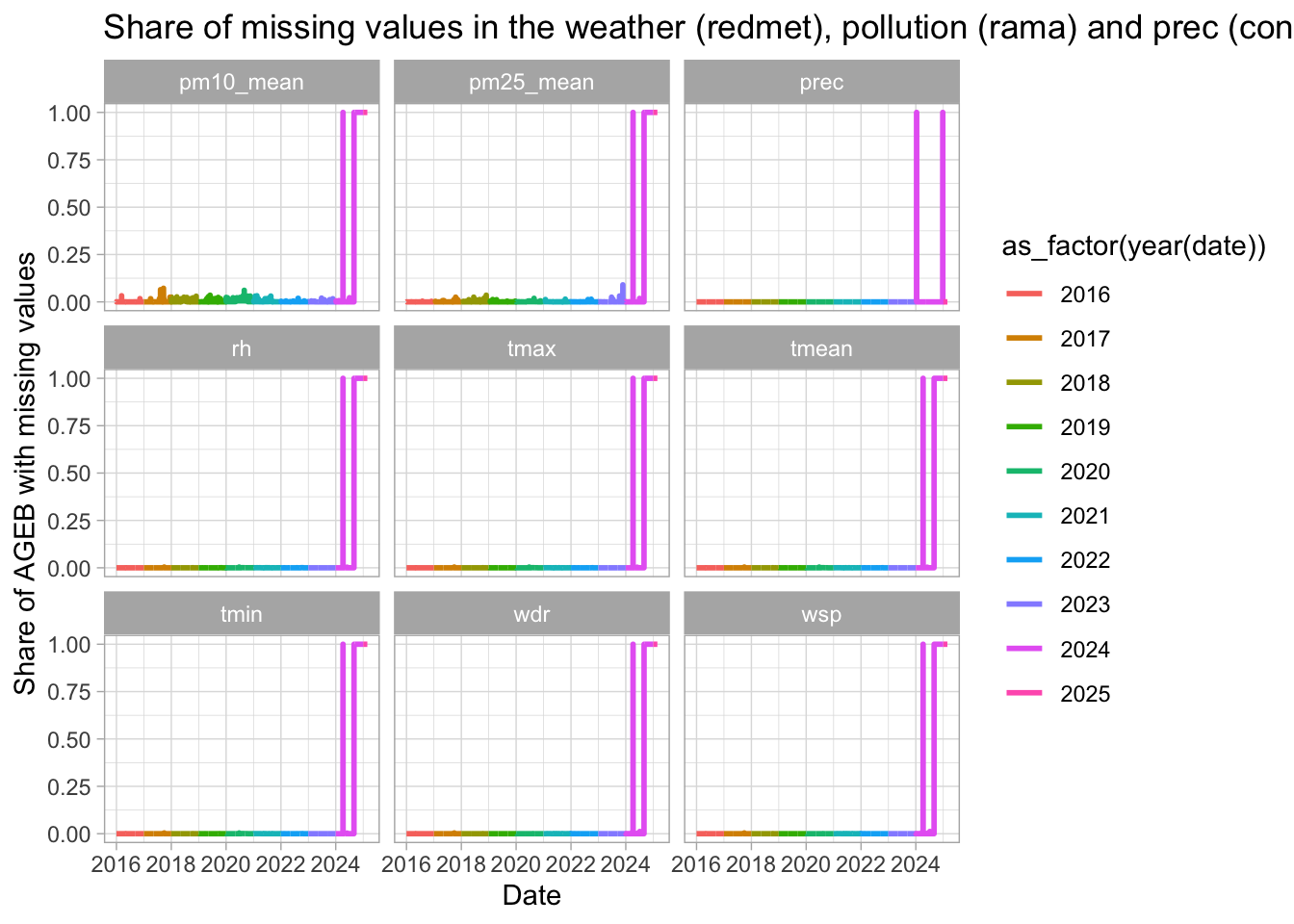
# zoom on 2024
missings_date %>%
  #filter(variable == "tmean") %>%
  filter(year(date) %in% 2024:2025) %>%
  ggplot(aes(x = date, y = share_missing, color = as_factor(year(date)))) +
  geom_line(linewidth = 1) +
  labs(title = "Share of missing values in the weather (redmet), pollution (rama) and prec (conagua) data",
       x = "Date",
       y = "Share of AGEB with missing values") +
  facet_wrap(~variable) +
  theme_light()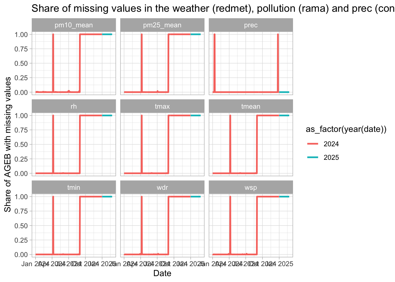
# one day in april is missing, then data goes blank starting september 2024 included
missings_date %>%
  filter(variable == "tmean") %>%
  filter(year(date) %in% 2024) %>%
  filter(share_missing > 0.1) %>%
  select(date, variable, share_missing) %>%
  arrange(date, variable) %>%
  head() %>%
kable()| date | variable | share_missing |
|---|---|---|
| 2024-04-07 | tmean | 1 |
| 2024-09-01 | tmean | 1 |
| 2024-09-02 | tmean | 1 |
| 2024-09-03 | tmean | 1 |
| 2024-09-04 | tmean | 1 |
| 2024-09-05 | tmean | 1 |
Plot the data
I first want to get a single measure per day for Mexico City as a whole. In other words, I go from neighborhood per day level to day level. I average the weather variables for each day by weighting the observations by the population of each neighborhood.
weather <- weather %>%
  left_join(ageb_attributes)

weather_daily <- weather %>%
  group_by(date, year, month) %>%
  summarise(#temp = weighted.mean(temp, pobtot, na.rm = TRUE),
            tmean = weighted.mean(tmean, pobtot, na.rm = TRUE),
            tmin = weighted.mean(tmin, pobtot, na.rm = TRUE),
            tmax = weighted.mean(tmax, pobtot, na.rm = TRUE),
            prec = weighted.mean(prec, pobtot, na.rm = TRUE)) %>%
ungroup()source(here("fun_dynamic_bins.R"))
weather_daily <- weather_daily %>% ungroup()
#2 degree wide
weather_daily <- weather_daily %>%
mutate(#bins_temp_two = create_dynamic_bins(temp, 2, threshold_percentage = 0.01),
bins_tmax_two = create_dynamic_bins(tmax, 2, threshold_percentage = 0.01),
bins_tmin_two = create_dynamic_bins(tmin, 2, threshold_percentage = 0.01),
bins_tmean_two = create_dynamic_bins(tmean, 2, threshold_percentage = 0.01),
)
#and 1 degree wide
weather_daily <- weather_daily %>%
mutate(#bins_temp_one = create_dynamic_bins(temp, 1, threshold_percentage = 0.005),
bins_tmax_one = create_dynamic_bins(tmax, 1, threshold_percentage = 0.005),
bins_tmin_one = create_dynamic_bins(tmin, 1, threshold_percentage = 0.005),
bins_tmean_one = create_dynamic_bins(tmean,1, threshold_percentage = 0.005)
)Daily temperatures
Let us first look at daily temperatures. I plot the distribution of daily temperatures per year. Yearly average in 2016, 2017, and 2018 is 17.4°C while 2019 is a much warmer year on average (18.2°C), with less very cold day, and many more warm days.
weather_daily %>%
  mutate(date = ymd(date),
         year = year(date)) %>%
  mutate(avg_year = mean(tmean), .by = year) %>%
  ggplot(aes(x = 1, y = tmean)) +
  ggbeeswarm::geom_quasirandom(shape = 21, alpha = 0.8, size = 2,
                               fill = "purple", color = "gray") +
  geom_hline(aes(yintercept = avg_year)) +
  scale_x_continuous(breaks = NULL) +
  scale_y_continuous(breaks = seq(0, 30, 1), minor_breaks = NULL) +
  geom_text(aes(x = 1, y = avg_year+.75, label = round(avg_year, 1)),
            check_overlap = TRUE,
            fontface = "bold", color = "white") +
  labs(x = element_blank(), y = "Temperature (in C)",
       title = "Daily average temperature",
       subtitle = "Each point is one day",
       caption = "Temperature is simple average of daily min and max temperatures") +
  facet_grid(~year)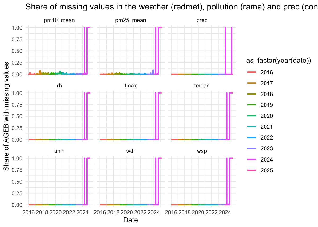
I can also plot the same for tmin and tmax.
weather_daily %>%
  select(date, tmin, tmax, year) %>%
  pivot_longer(c(tmin, tmax), names_to = "temp_type", values_to = "temp") %>%
  mutate(avg_year = mean(temp), .by = c(temp_type, year)) %>%
  ggplot(aes(x = 1, y = temp)) +
  ggbeeswarm::geom_quasirandom(shape = 21, alpha = 0.8, size = 1, color = "white",
                               aes(fill = temp_type),
                               dodge.width = 1) +
  geom_hline(aes(yintercept = avg_year, color = temp_type),
             linetype = "dashed") +
  geom_text(aes(x = rep(c( 1.25, .75), nrow(weather_daily)),
                y = avg_year,
                label = round(avg_year, 1)),
            check_overlap = TRUE, fontface = "bold") +
  scale_x_continuous(breaks = NULL) +
  scale_y_continuous(breaks = seq(0, 30, 5), minor_breaks = seq(0, 40, 1)) +
  labs(x = "", y = "Temperature",
       title = "Average daily min. and max. temperature by year") +
  facet_grid(~year) +
  theme(legend.position="")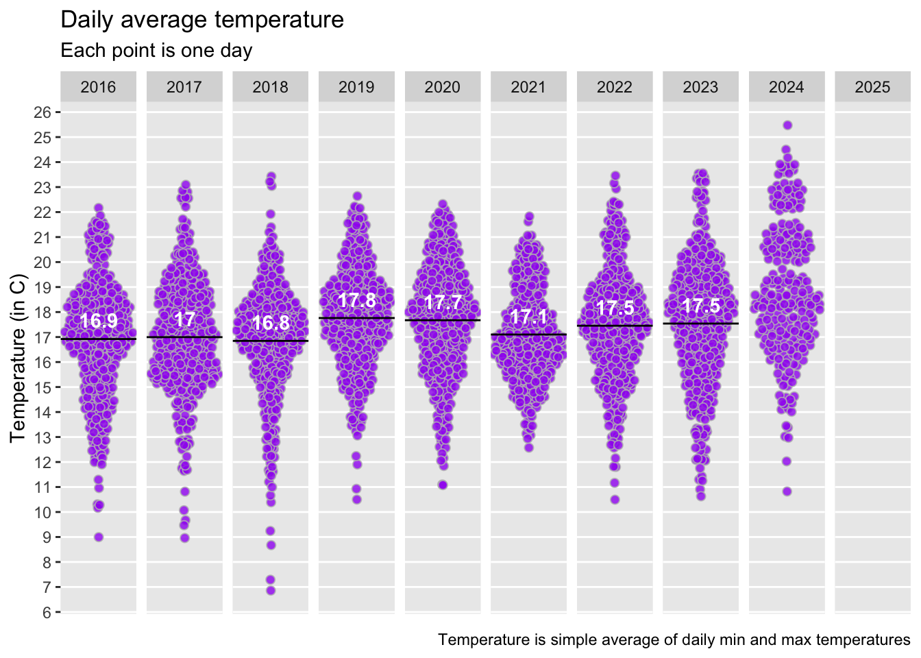
Or simple densities:
weather_daily %>%
  mutate(avg_year = mean(tmean, na.rm = T), .by = year) %>%
  distinct(date, .keep_all = TRUE) %>%
  mutate(year = paste0(year, "\n(avg: ", round(avg_year, 1), "°C)")) %>%
  ggplot(aes(tmean, fill = year, colour = year)) +
  geom_density(alpha = 0.1) +
  theme(legend.position = "bottom",
        legend.title = element_blank()) +
  labs(title = "Density of daily average (tmin tmax) temperature in Mexico City",
       subtitle = "Temperature is simple average of daily min and max temperatures")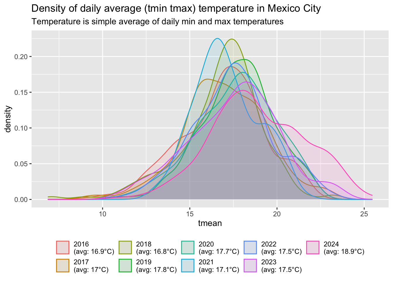
weather_daily %>%
  mutate(avg_year = mean(tmean, na.rm = T), .by = year) %>%
  distinct(date, .keep_all = TRUE) %>%
  mutate(year = paste0(year, "\n(avg: ", round(avg_year, 1), "°C)")) %>%
  ggplot(aes(tmean, fill = year, colour = year)) +
  geom_density(alpha = 0.1) +
  theme(legend.position = "bottom",
        legend.title = element_blank()) +
  labs(title = "Density of daily 24h average temperature in Mexico City",
       subtitle = "Temperature is simple average of daily min and max temperatures")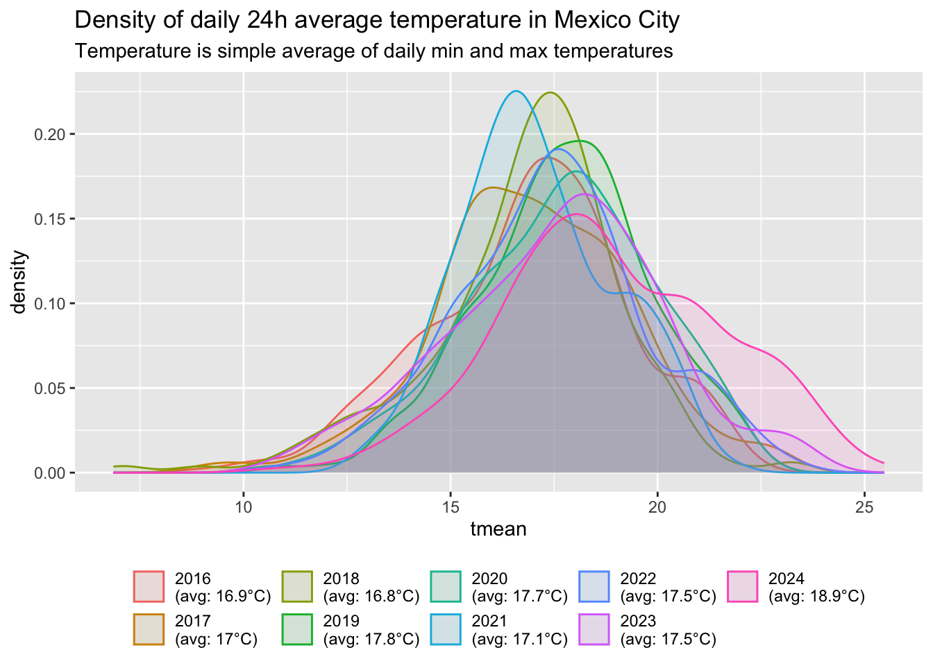
Monthly averages
Monthly average of temperatures (avg, tmin and tamx), 2016-2022
#https://public.wmo.int/en/bulletin/air-quality-weather-and-climate-mexico-city
#Aside from air pollution, the Mexico City Metropolitan Area has an ideal climate: a cool dry season from November to February, followed by a warm dry season until April and a rainy season from May to October. Temperatures are moderate and humidity is low.
#https://tcktcktck.org/mexico/mexico-city

weather_daily %>%
  group_by(month) %>%
  summarise(temp = mean(tmean, na.rm = T),
            tmax = mean(tmax, na.rm = T),
            tmin = mean(tmin,  na.rm = T)) %>%
  ggplot() +
  geom_col(aes(month, temp), fill = "aquamarine3", alpha = 0.7) +
  geom_point(aes(month, tmax), group = 1,
            size = 1.5, color = "red", alpha = 0.7) +
  geom_point(aes(month, tmin), group = 1,
            size = 1.5, color = "blue", alpha = 0.7) +
  labs(x = element_blank(),
       y = element_blank(),
       title = "Monthly tmin, tmax, and avg (tmin + tmax)")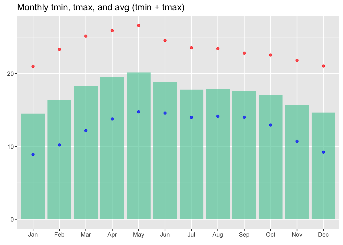
weather_daily %>%
  group_by(month) %>%
  summarise(tmean = mean(tmean, na.rm = T),
            tmax = mean(tmax, na.rm = T),
            tmin = mean(tmin,  na.rm = T)) %>%
  ggplot() +
  geom_col(aes(month, tmean), fill = "aquamarine3", alpha = 0.7) +
  geom_point(aes(month, tmax), group = 1,
            size = 1.5, color = "red", alpha = 0.7) +
  geom_point(aes(month, tmin), group = 1,
            size = 1.5, color = "blue", alpha = 0.7) +
  labs(x = element_blank(),
       y = element_blank(),
       title = "Monthly tmin, tmax, and avg 24h")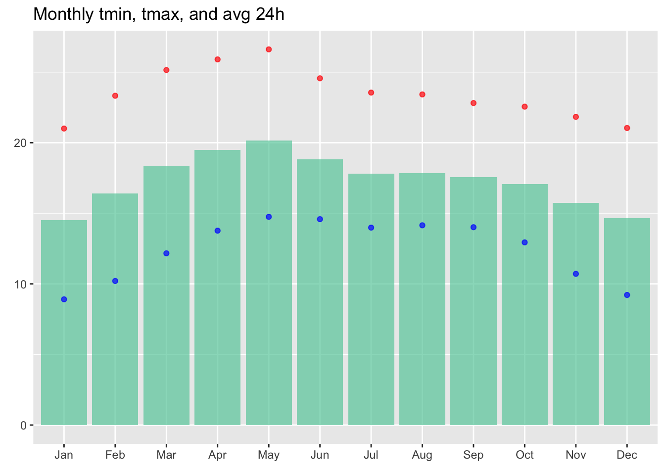
Monthly average of total monthly precipitation, 2016-2023
weather %>%
  filter(year %in% 2016:2023) %>%
  group_by(year = year(date), date) %>%
  summarise(prec = mean(prec)) %>% #daily avg of prec by day-year
  group_by(year, month = lubridate::month(date, label = T)) %>%
  summarise(prec = sum(prec)) %>% #monthly total prec by month-year
  group_by(month) %>%
  summarise(prec = mean(prec)) %>% #avg of monthly total prec by month
  ggplot(aes(month, prec)) +
  geom_col(fill = "azure4") +
  labs(x = element_blank(),
       y = element_blank())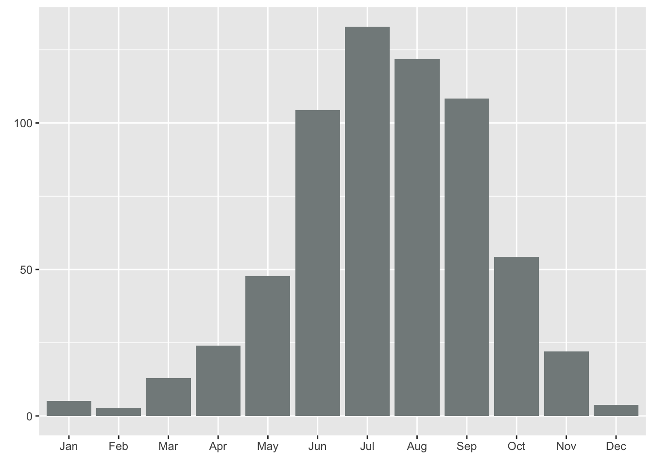
Number of days per year falling in temperature bins
On average, for years 2016-2023
Population-Weighted Number of Days per Year Falling within Each Temperature Bin (in °C)
weather_daily %>%
  filter(year %in% 2016:2023) %>%
  rename(bins = bins_tmean_two) %>%
  group_by(bins) %>%
  summarise(count = n()) %>%
  mutate(freq = count/sum(count),
         days_per_year = freq * 365) %>%
  ggplot(aes(bins, days_per_year)) +
  geom_col(fill = "aquamarine3") +
  labs(x = element_blank(),
       y = "Average number of days per year")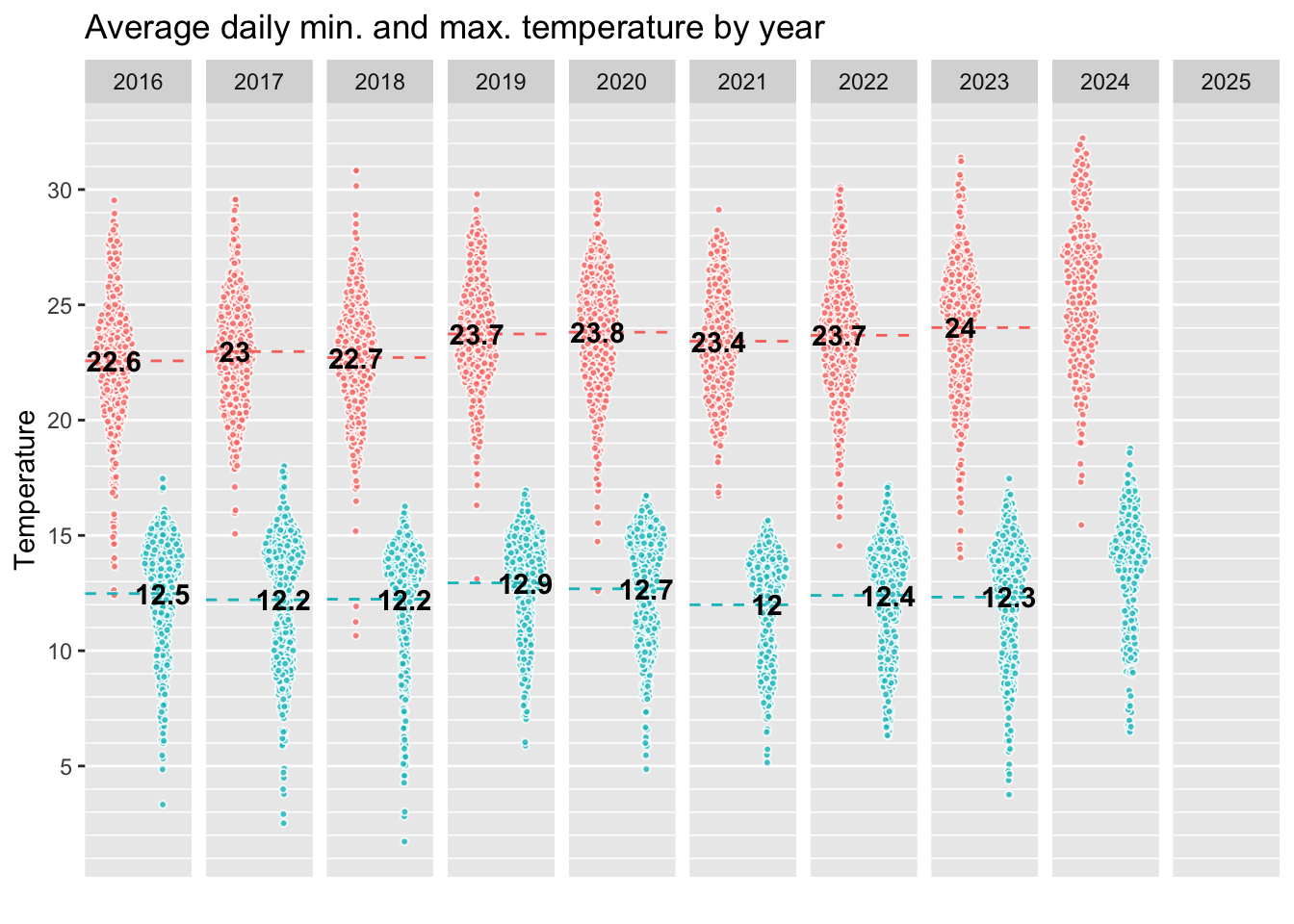
weather_daily %>%
    filter(year %in% 2016:2023) %>%
  rename(bins = bins_tmean_one) %>%
  group_by(bins) %>%
  summarise(count = n()) %>%
  mutate(freq = count/sum(count),
         days_per_year = freq * 365) %>%
  ggplot(aes(bins, days_per_year)) +
  geom_col(fill = "aquamarine3") +
  labs(x = element_blank(),
       y = "Average number of days per year") +
  guides(x =  guide_axis(angle = 45))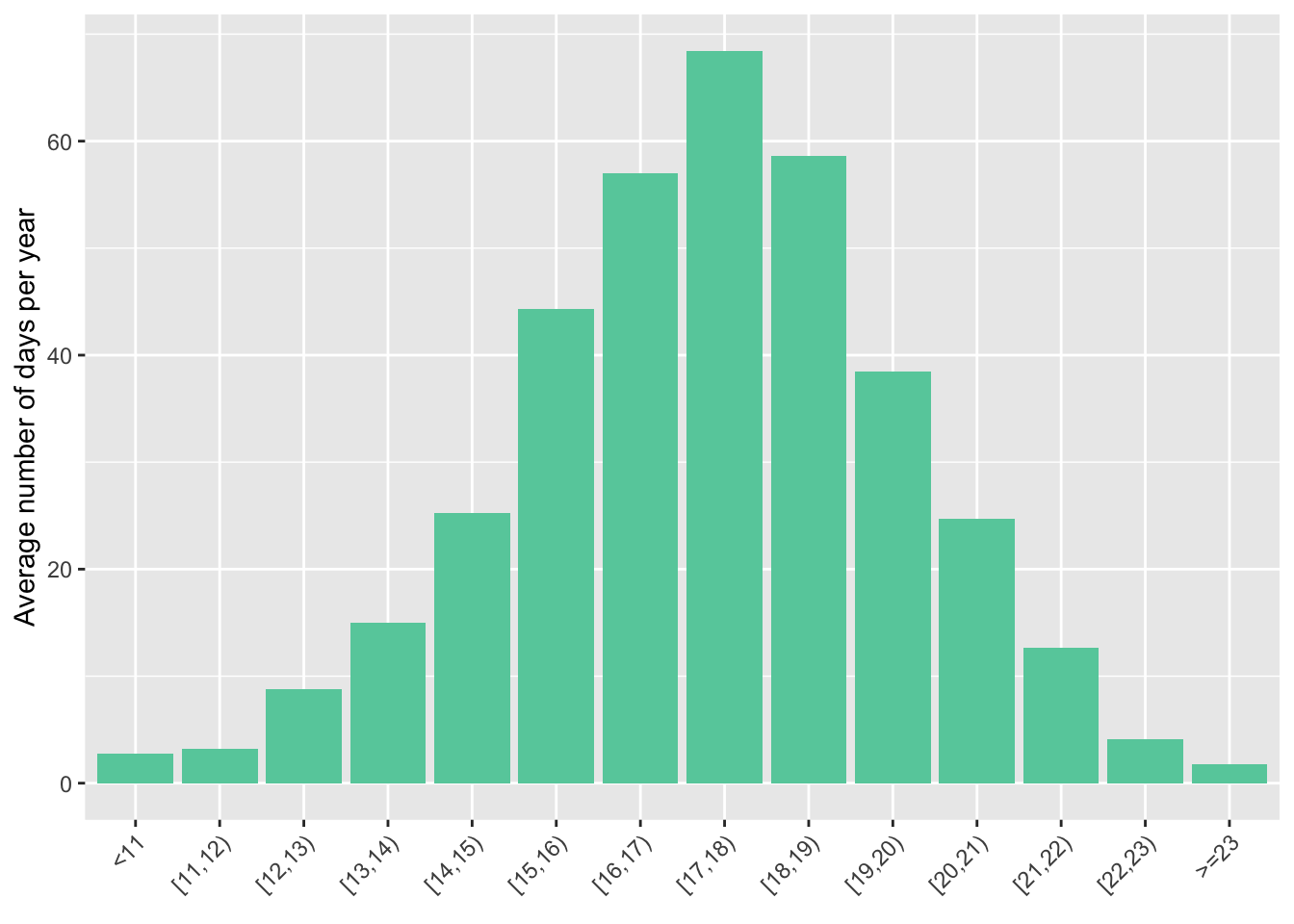
Notes: The figure shows the annual distribution of daily average temperatures (in °C) represented by the average number of days per year in each temperature bin. City wide averages have been weighted by total population in each neighborhood
Tmin and Tmax
Same figure now but with min and max temperatures:
weather_daily_full <- weather_daily %>%
  filter(year %in% 2016:2023) %>%
  select(-starts_with("bins")) %>%
  #create full set of bins
  mutate(bins_tmax_two = cut_width(tmax, width = 2, center = 1, closed = "left"),
         bins_tmin_two = cut_width(tmin, width = 2, center = 1, closed = "left"))

tmin <- weather_daily_full %>%
  group_by(bins = bins_tmin_two) %>%
  summarise(count = n()) %>%
  mutate(freq = count/sum(count),
         days_per_year_tmin = freq * 365) %>%
  mutate(bins = str_replace_all(as.character(bins), "\\]", ")"),
         bins = as_factor(bins))

tmax <- weather_daily_full %>%
  group_by(bins = bins_tmax_two) %>%
  summarise(count = n()) %>%
  mutate(freq = count/sum(count),
         days_per_year_tmax = freq * 365) %>%
  mutate(bins = str_replace_all(as.character(bins), "\\]", ")"),
         bins = as_factor(bins))

full_join(tmin, tmax, by = "bins") %>%
  select(-starts_with("count"), -starts_with("freq")) %>%
  pivot_longer(cols = c("days_per_year_tmin", "days_per_year_tmax"),
               names_to = "variable",
               values_to = "value",
               names_prefix = "days_per_year_") %>%
  ggplot(aes(x = bins, y = value, fill = variable)) +
  geom_col(position = position_identity(),
           alpha = 0.5) +
  scale_fill_manual("legend", values = c("tmin" = "blue1","tmax" = "brown1")) +
  xlab("") +
  ylab("Average number of days per year") +
  scale_x_discrete(guide = guide_axis(angle = 45)) +
  theme(legend.position = "bottom",
        legend.title = element_blank())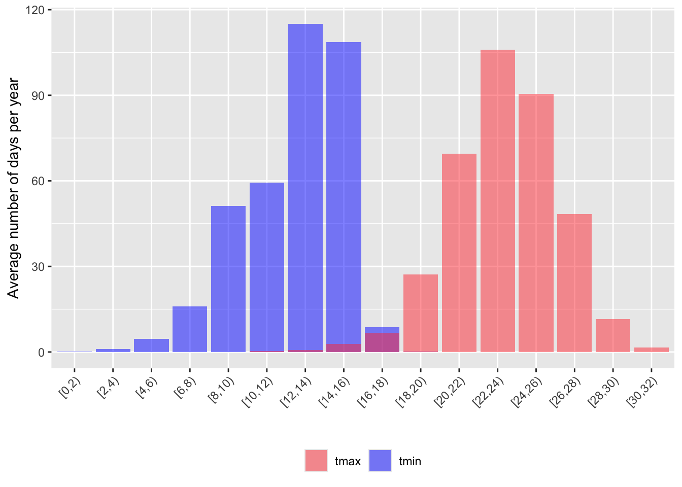
rm(weather_daily_full, tmin, tmax)weather_daily_rounded <- weather_daily %>%
filter(year %in% 2016:2023) %>%
select(date, tmean, tmin, tmax) %>%
mutate(tmean = round(tmean, 0),
tmin = round(tmin, 0),
tmax = round(tmax, 0))
tmin <- weather_daily_rounded %>%
count(temp = tmin) %>%
mutate(days_per_year_tmin = n/sum(n) * 365, .keep = "unused")
tmax <- weather_daily_rounded %>%
count(temp = tmax) %>%
mutate(days_per_year_tmax = n/sum(n) * 365, .keep = "unused")
tmean <- weather_daily_rounded %>%
count(temp = tmean) %>%
mutate(days_per_year_tmean = n/sum(n) * 365, .keep = "unused")
full_join(tmin, tmax) %>%
full_join(tmean) %>%
arrange(temp) %>%
ggplot(aes(x = temp)) +
geom_col(aes(y = days_per_year_tmin), fill = "blue1", alpha = 0.5) +
geom_col(aes(y = days_per_year_tmax), fill = "brown1", alpha = 0.5) +
#geom_col(aes(y = days_per_year_tmean), fill = "violet", alpha = 1) +
xlab("Temperature") +
ylab("Average number of days per year") +
scale_x_continuous(breaks = seq(0, 30, 2))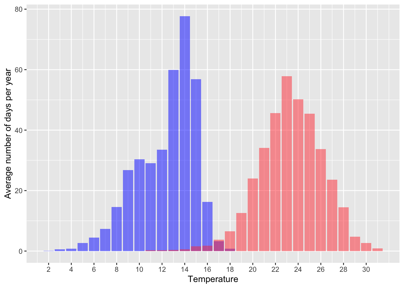
tmean %>%
  arrange(temp) %>%
  ggplot(aes(x = temp)) +
  geom_col(aes(y = days_per_year_tmean), fill = "aquamarine3", alpha = 1) +
  xlab("Temperature") +
  ylab("Average number of days per year") +
  scale_x_continuous(breaks = seq(0, 30, 1))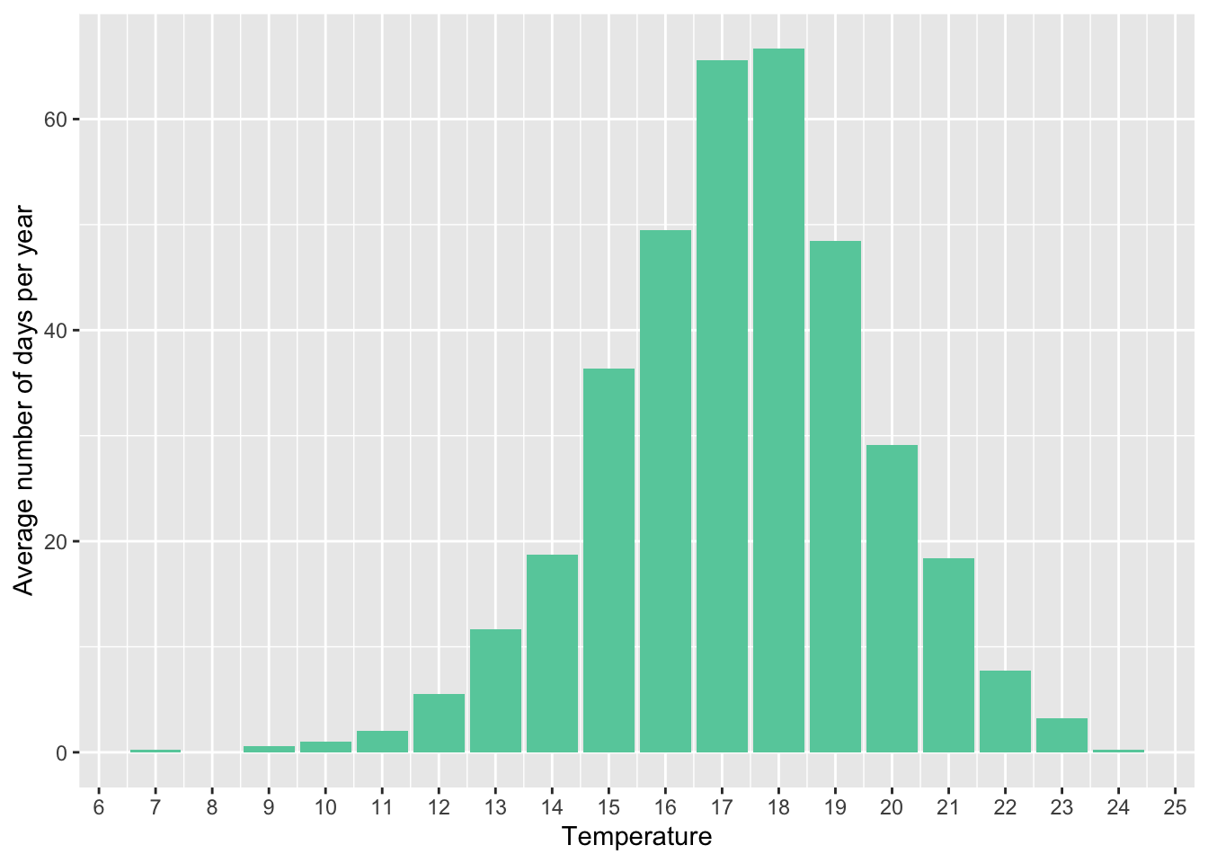
rm(tmean, tmax, tmin, weather_daily_rounded)Compared to historical data for Mexico City
Cohen and Dechezleprêtre (2022) show a similar figure for historical data (1998–2017) for the whole of Mexico. I compare my data for Mexico City to the historical average for the country.
# weather_daily %>%
#   mutate(bins = create_dynamic_bins(temp, 4, threshold_percentage = 0.01)) %>%
#   group_by(bins) %>%
#   summarise(count = n()) %>%
#   mutate(freq = count/sum(count),
#          days_per_year = freq * 365)

# the data is from their graph directly.

tribble(
  ~bins_temp, ~days_per_year_MX, ~days_per_year,
  "<12", 17.4, 4.14,
  "12-16", 72.4, 70.7,
  "16-20", 111.8, 229,
  "20-24", 75, 61.1,
  "24-28", 55.6, 0,
  "28-32", 29.8, 0,
  ">32", 2.6, 0,
) %>%
  ggplot(aes(as_factor(bins_temp))) +
  geom_col(aes(y = days_per_year), fill = "aquamarine3") +
  geom_col(aes(y = days_per_year_MX), fill = "red", width = .20) +
  scale_x_discrete(guide = guide_axis(angle = 45)) +
  labs(x = element_blank(),
y = "Average number of days per year") 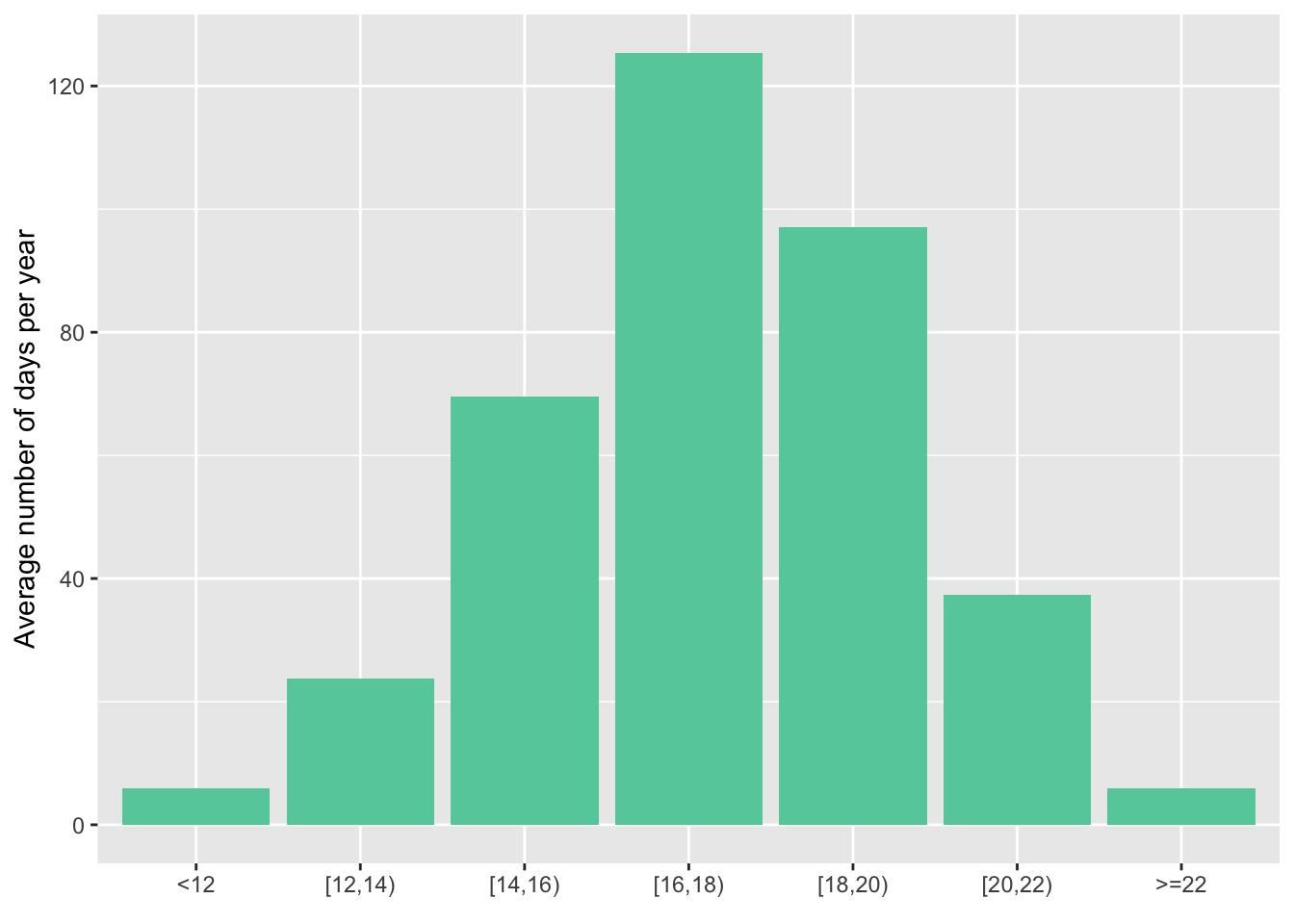
This shows how much milder the climate in CDMX is compared to the rest of the country. There are much less cold days, and no days with an average temperature above 24°C.
Variation between years
Same as above, but year by year, and compared to the average over 2016-2022:
weather_daily %>%
    filter(year %in% 2016:2023) %>%
  rename(bins = bins_tmean_one) %>%
  group_by(bins, year) %>%
  summarise(days_per_year = n()) %>%
  mutate(avg = mean(days_per_year)) %>%
  ggplot(aes(bins, days_per_year)) +
  geom_col(fill = "aquamarine3") +
  geom_point(aes(y = avg, group =1),
             colour = "red",
             shape = 3) +
  labs(x = element_blank(),
       y = "Average number of days per year") +
  guides(x =  guide_axis(angle = 45)) +
  facet_wrap( . ~ year)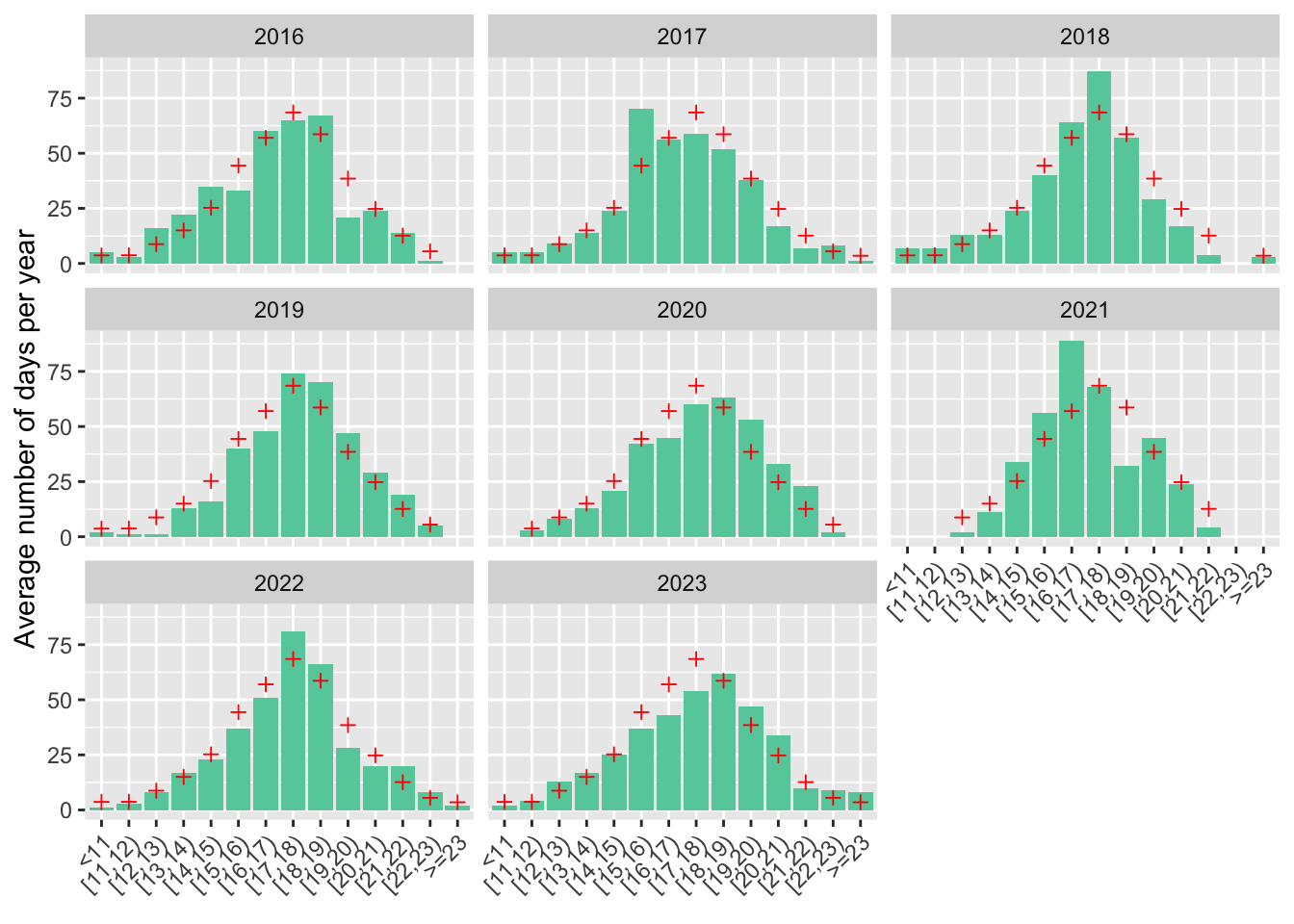
Notes: The figure shows the annual distribution of daily average temperatures (in °C) represented by the average number of days per year in each temperature bin. The red crosses represent the average over 2016-2022. For example, 2019 and 2020 were warmer than average, and 2017 was colder than average.
Another way to plot the same thing, using bins of width 2 so declutter:
weather_daily %>%
      filter(year %in% 2016:2023) %>%
  rename(bins = bins_tmean_two) %>%
  group_by(bins, year) %>%
  summarise(days_per_year = n()) %>%
  mutate(avg = mean(days_per_year),
         year = factor(year)) %>%
  ggplot(aes(bins, days_per_year, fill = year)) +
  geom_col(position = position_dodge2(padding = 0.2)) +
  geom_tile(aes(y = avg),
            colour = "black",
            height = 0,
            width = .9,
            linetype = "solid",
            linewidth = .8) +
  scale_fill_brewer(palette = "Set3")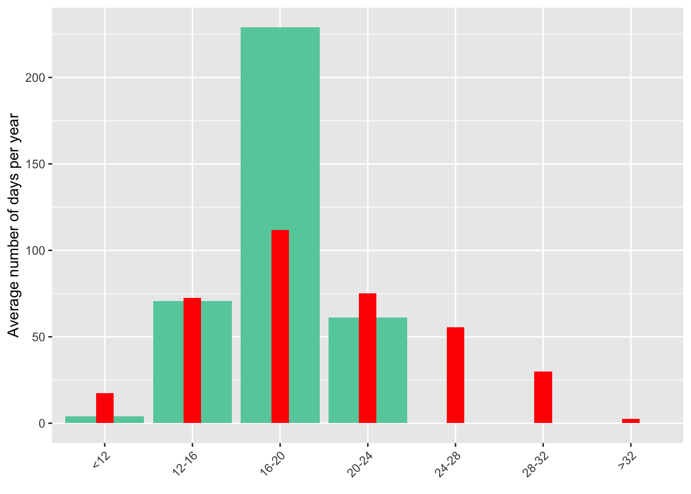
Variation within days of a month
I want to show that there is variation of temperature within a month, across different years.
weather_daily %>%
      filter(year %in% 2016:2023) %>%
  mutate(year = as_factor(year)) %>%
  rename(bins = bins_tmean_two) %>%
  group_by(bins, year, month) %>%
  summarise(days_per_month = n(), .groups = 'drop') %>%
  complete(bins, year, month, fill = list(days_per_month = 0)) %>%
  mutate(avg = mean(days_per_month), .by = c("month", "bins")) %>%
  ggplot(aes(x = bins, y = days_per_month, fill = year)) +
  geom_col(position = position_dodge2(padding = 0.2), width = .7) +
  scale_fill_brewer(palette = "Set2") +
  geom_tile(aes(y = avg),
            color = "black",
            height = 0,
            width = .9,
            linetype = "solid",
            linewidth = .5) +
  scale_x_discrete(guide = guide_axis(angle = 45)) +
  labs(x = element_blank(),
       y = "Days per month") +
  facet_wrap( . ~ month) +
  guides(fill = guide_legend(label.position = "bottom", nrow = 1)) +
  theme(legend.position = "bottom",
        legend.title = element_blank())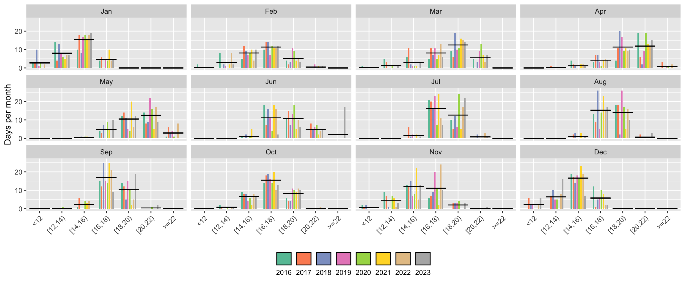
Let us look more closely at one example, the month of May:
weather_daily %>%
    filter(year(date) < 2020) %>%
  mutate(year = as_factor(year)) %>%
  rename(bins = bins_tmean_one) %>%
  group_by(bins, year, month) %>%
  summarise(days_per_month = n(), .groups = 'drop') %>%
  complete(bins, year, month, fill = list(days_per_month = 0)) %>%
  mutate(avg = mean(days_per_month), .by = c("month", "bins")) %>%
  filter(month == "May") %>%
  group_by(bins) %>%
  mutate(days_per_month_per_bin = sum(days_per_month)) %>%
  filter(days_per_month_per_bin > 0) %>%
  ggplot(aes(x = bins, y = days_per_month, fill = year)) +
  geom_col(position = position_dodge2(padding = 0.2), width = .7) +
  scale_fill_brewer(palette = "Set2") +
  geom_tile(aes(y = avg),
            colour = "black",
            height = 0,
            width = .9,
            linetype = "solid",
            linewidth = .8) +
  labs(x = element_blank(),
       y = "Days per month") +
  scale_y_continuous(minor_breaks = seq(0, 50)) +
  guides(fill = guide_legend(label.position = "bottom", nrow = 1)) +
  theme(legend.position = "bottom",
        legend.title = element_blank()) +
  facet_wrap( . ~ month)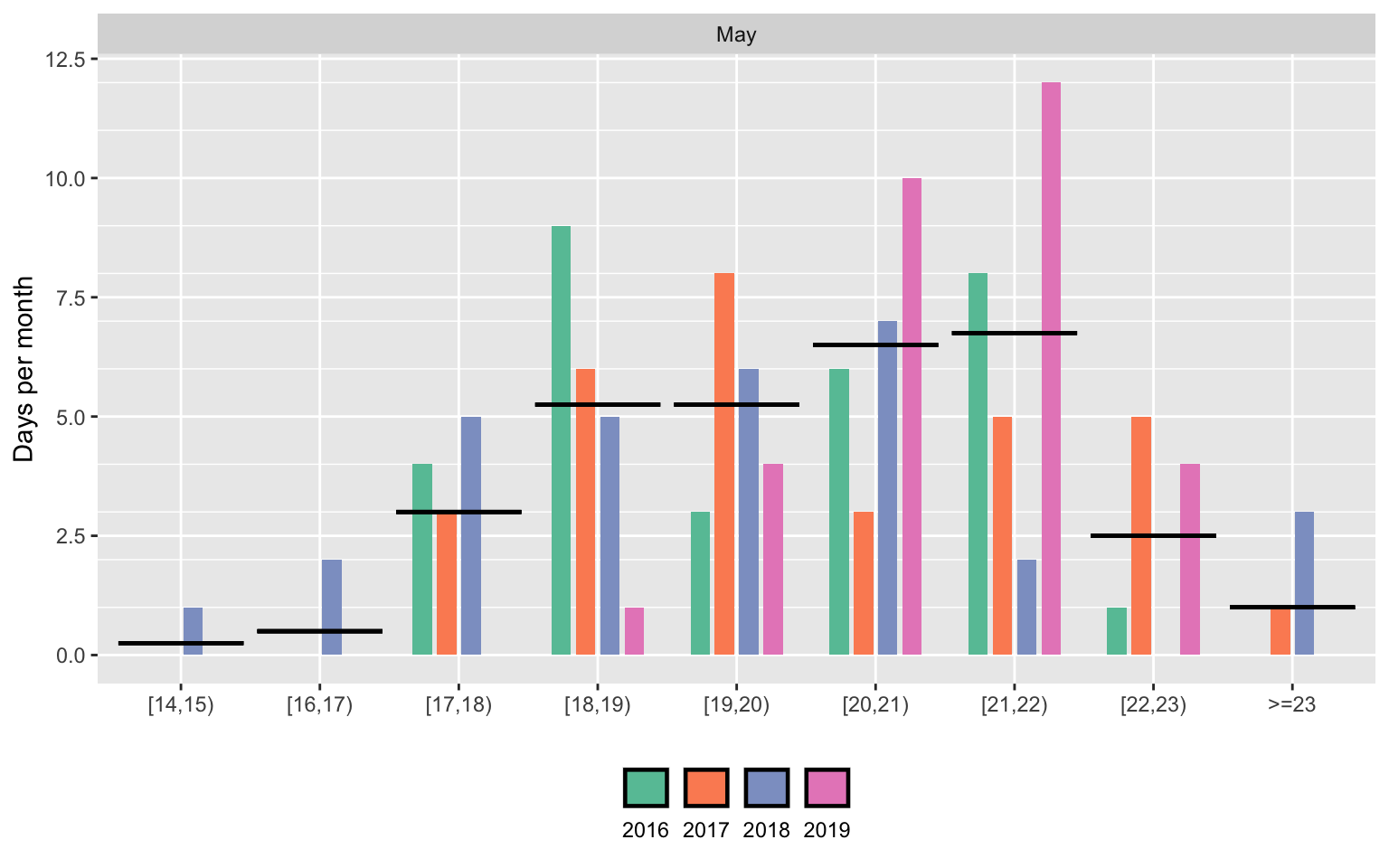
The figure shows the number of days per month falling into each bin, for the month of May. Each vertical bar represents a different year. The horizontal black line represents the 2016-2022 average.
May is the warmest month in Mexico City. The figure shows that there is variation in the number of days in each temperature bin, from year to year. The black horizontal lines represent the average number of days falling in each bin on average in the month of May, while the coloured bars represent the realization of this distribution in each year. Importantly for my identification strategy, there is a large degree of within month variation in temperature. For example, comparing May 2021 and May 2022, we observe no days above 22°C in 2021 and 11 days in 2022.
Variation between days of month
weather_daily %>%
  mutate(year = as_factor(year(date)),
         day = as_factor(day(date))) %>%
  ggplot(aes(x = day, y = tmean)) +
  geom_line(data = . %>% filter(year %in% 2016:2018), aes(group = year, colour = year)) +
  geom_smooth(aes(group = 1), method = "loess", linewidth = .5, color = "black") +
  scale_x_discrete(breaks = seq(0,31, 7)) +
  scale_colour_brewer(palette = "Set2") +
  facet_wrap(~ month) +
  labs(x = "Day of the month", y = "Temperature (°C)",
       title = "Smoothed daily temperatures (for 2016-2022) and realization of some years") +
  guides(color = guide_legend(label.position = "bottom", nrow = 1)) +
  theme(legend.position = "bottom",
legend.title = element_blank()) 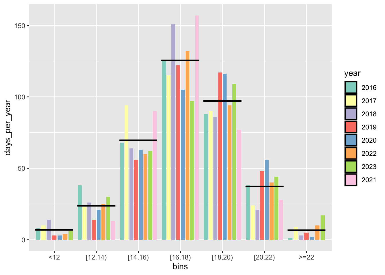
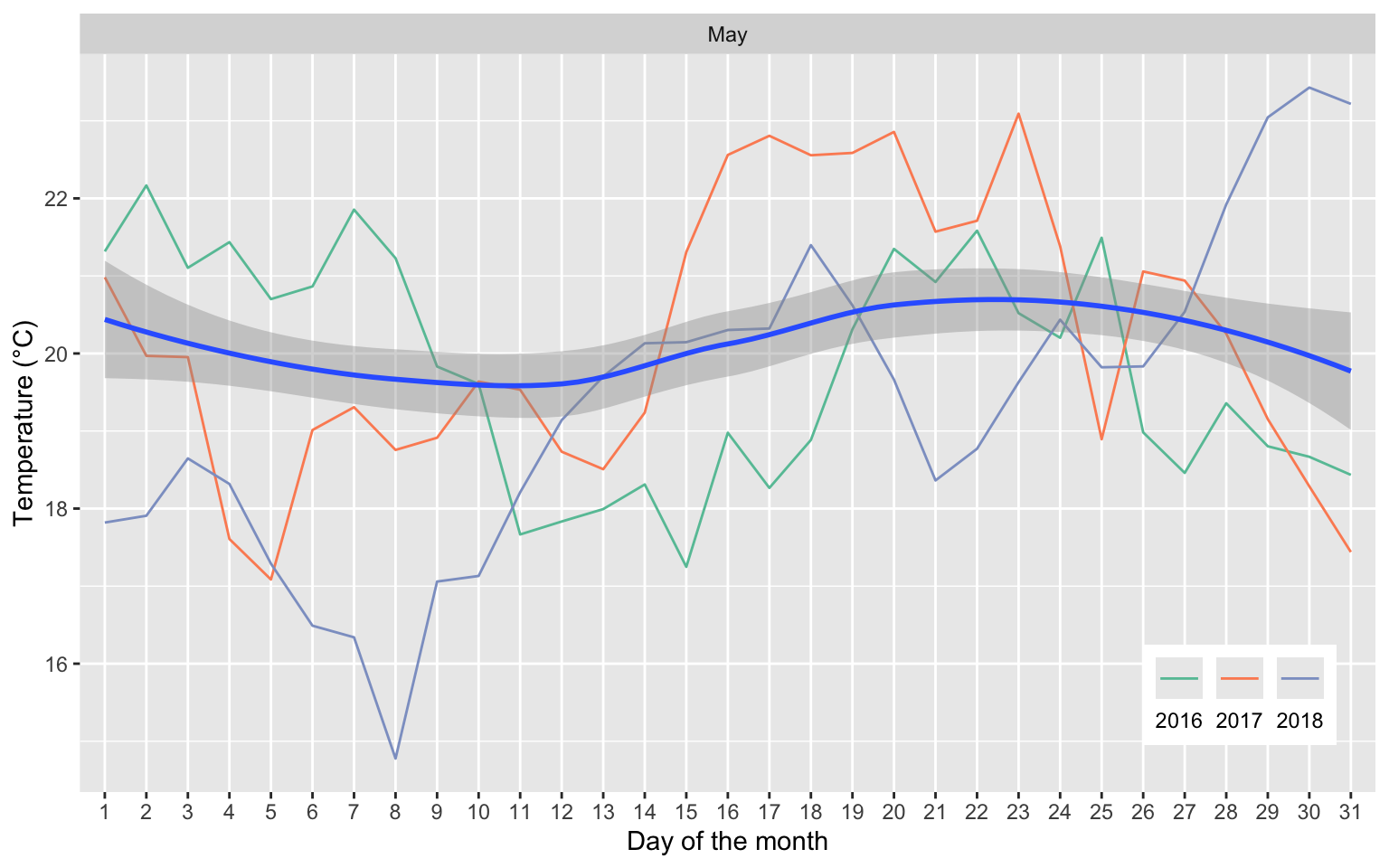
Of for only the month of May:
weather_daily %>%
  filter(month == "May") %>%
  mutate(year = as_factor(year(date)),
         day = as_factor(day(date))) %>%
  ggplot(aes(x = day, y = tmean)) +
  geom_line(data = . %>% filter(year %in% 2016:2018), aes(group = year, colour = year)) +
  geom_smooth(aes(group = 1), method = "loess") +
  scale_x_discrete(breaks = 1:31) +
  scale_colour_brewer(palette = "Set2") +
  facet_wrap(~ month) +
  labs(x = "Day of the month", y = "Temperature (°C)") +
       #title = "Smoothed daily temperatures (for 2016-2022) and realization of some years") +
  guides(color = guide_legend(label.position = "bottom", nrow = 1)) +
  theme(
    legend.position = c(0.97, 0.2),
    legend.justification = c("right", "top"),
    legend.title = element_blank()
  )
Variation between neighborhoods
This is just to check the variation between neighborhoods, and to see if there is any systematic difference between them. Anyways, this is taken care of by the fixed effects.
max = max(weather$tmean, na.rm =T)
min = min(weather$tmean, na.rm =T)

day <- c("2017-03-09")

ageb <-
  read_sf(here("..",
                "output",
                "ageb_poligonos.geojson"),
          quiet = TRUE) %>%
  st_transform(4326)

ageb %>%
  left_join(filter(weather, date == day)) %>%
  ggplot() +
  annotation_scale(location = "br", style = "ticks") +
  geom_sf(aes(fill = tmean), color = "gray40") +
  scale_fill_gradientn(colors = c("blue", "skyblue", "green", "yellow2", "orange", "red2", "red3"),
                       values = scales::rescale(c(min, max)),
                       limits = c(min, max)) +
  labs(title = "Temp = (tmin + tmax) / 2",
       subtitle = paste0(format(ymd(day), " %d %B %Y")),
fill = "Temp (°C)") 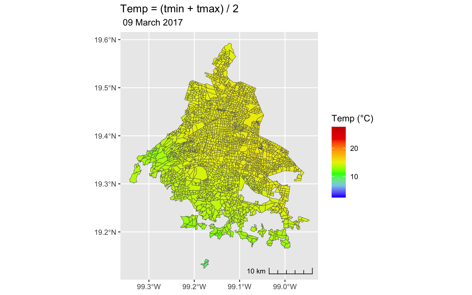
rm(min, max, day)More plots
See this; also nice description of the data, for US https://pubs.aeaweb.org/doi/pdfplus/10.1257/app.3.4.152 Climate Change, Mortality, and Adaptation: Evidence from Annual Fluctuations in Weather in the US
#it works but it's completely pointless. I'll leave it here for future reference.

library(magick)

max = max(weather$temp)
min = min(weather$temp)
days <- weather %>% distinct(date) %>%
  mutate(date_date = ymd(date),
         year = year(date_date),
         month = month(date_date),
         day = day(date_date))
#filter
days <- days %>%
  filter(day == 1,
         month == 3,
         #year == 2017,
         ) %>%
  pull(date)
# create all the images
for (day in days) {
  print(day)

  colonias %>%
    left_join(filter(weather, date == day)) %>%
    ggplot() +
    annotation_scale(location = "br", style = "ticks") +
    geom_sf(aes(fill = temp), color = "gray40") +
    scale_fill_gradientn(colors = c("blue", "skyblue", "green", "yellow2", "orange", "red"),
                         values = scales::rescale(c(min, max)),
                         limits = c(min, max)) +
    labs(title = "Temp = (tmin + tmax) / 2",
         subtitle = print(format(ymd(day), " %d %B %Y")),
         fill = "Temp (°C)")

  ggsave(path = here("..", "output", "gif"),
         filename = paste0(day,".png"),
         device = "png",
         width = 6, height = 6,
         dpi = 150)
}

## list file names and read in
img_list <- lapply(list.files(here("..", "output", "gif"), full.names = TRUE),
                   magick::image_read)

## join the images together
## and animate at 2 frames per second
img_animated <- image_animate(image_join(img_list), fps = 2)

## view animated image
img_animated

## save to disk
image_write(image = img_animated,
            path = here("..", "output", "gif", "temp.gif"))
References
Cohen, François, and Antoine Dechezleprêtre. 2022. “Mortality, Temperature, and Public Health Provision: Evidence from Mexico.” American Economic Journal: Economic Policy 14 (2): 161–92. https://doi.org/10.1257/pol.20180594.