library(tidyverse)
library(here)
library(ggrepel)
library(patchwork)

start_time <- Sys.time()

data_reports <-
  read_rds(here("..", "output",
                "data_reports.rds"))

data_calls <-
  read_rds(here("..", "output",
                "data_calls.rds"))

source(here("fun_dynamic_bins.R"))Raw associations
Note
In this script, I plot some raw associations between temperature and DV.
Raw in the sense that there is no regression, fixed effects etc. Simple averages and scatterplots.
Scatterplot of monthly average DV and temp
I simply want to compute monthly averages, and scatterplot. To see if warmer months have more DV, in general. It is the case.
First, compute avg temp per month, and avg sum of crimes per month
data_monthly <- data_reports %>%
  group_by(year, month) %>%
  summarise(reports = sum(reports_dv),
            tmean = mean(tmean, na.rm = T),
            .groups = "drop")

data_monthly <- data_monthly %>%
  full_join(data_calls %>%
              group_by(year, month) %>%
              summarise(calls = sum(calls),
                        .groups = "drop"))

data_monthly_avg <- data_monthly %>%
  group_by(month) %>%
  summarise(reports = mean(reports),
            calls = mean(calls, na.rm = T),
            tmean = mean(tmean),
            .groups = "drop")
And then plot for both reports and calls.
Warmer months are associated with a higher nr of DV events on avg.
ggplot(data_monthly_avg, aes(x = tmean, y = reports)) +
  geom_point() +
  geom_text_repel(aes(label = month)) +
  geom_line(stat = "smooth", method = "lm", se = FALSE,
            size = 1.5, alpha = 0.3, color = "blue") +
  scale_x_continuous(breaks = seq(0, 30, 1)) +
  labs(y = "Reports for DV", x = "Temperature") +
  theme_light()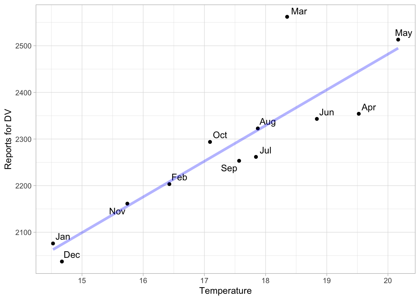
ggsave(here("..", "output", "figures", "assoc_monthly_reports.png"),
       width = 6, height = 4, dpi = 300)

ggplot(data_monthly_avg, aes(x = tmean, y = calls)) +
  geom_point() +
  geom_text_repel(aes(label = month)) +
  geom_line(stat = "smooth", method = "lm", se = FALSE,
            size = 1.5, alpha = 0.3, color = "blue") +
  scale_x_continuous(breaks = seq(0, 30, 1)) +
  labs(y = "Calls for DV", x = "Temperature") +
  theme_light()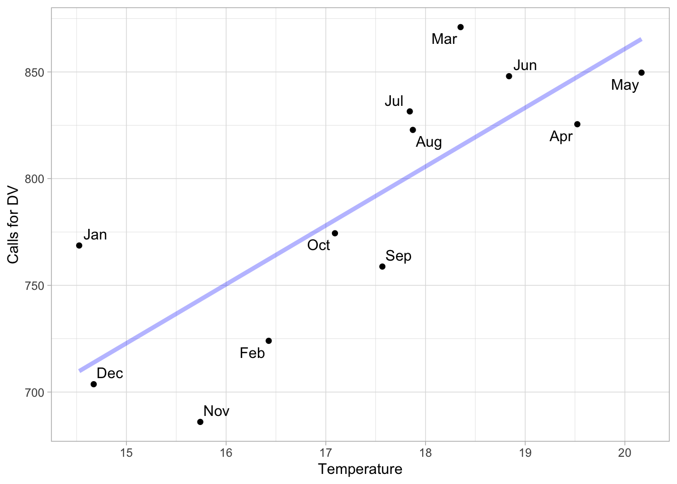
ggsave(here("..", "output", "figures", "assoc_monthly_calls.png"),
       width = 6, height = 4, dpi = 300)
Now we can do the same but facet wrap per year, to see if the trend holds.
Holds in every year but in 2020 pandemic year for reports
ggplot(data_monthly, aes(x = tmean, y = reports)) +
  geom_point() +
  #geom_text_repel(aes(label = month)) +
  geom_line(stat = "smooth", method = "lm", se = FALSE,
            size = 1.5, alpha = 0.3, color = "blue") +
  scale_x_continuous(breaks = seq(0, 30, 1)) +
  labs(y = "Reports for DV", x = "Temperature") +
  theme_light() +
  facet_wrap(~year, scales = "free_y")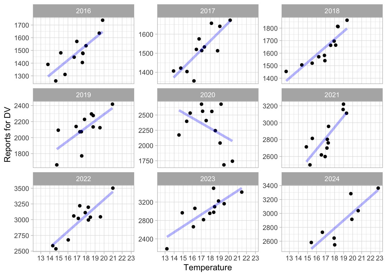
Not quite for calls, but there is still sth.
data_monthly %>% drop_na() %>%
  group_by(year) %>%
  # keep only years for which we have all month
  filter(n() == 12) %>%
  ggplot(aes(x = tmean, y = calls)) +
  geom_point() +
  #geom_text_repel(aes(label = month)) +
  geom_line(stat = "smooth", method = "lm", se = FALSE,
            size = 1.5, alpha = 0.3, color = "blue") +
  scale_x_continuous(breaks = seq(0, 30, 1)) +
  labs(y = "Reports for DV", x = "Temperature") +
  theme_light() +
  facet_wrap(~year)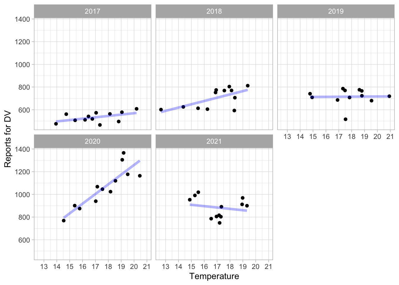
rm(data_monthly, data_monthly_avg)Raw data, AGEB per day
Now, I want the plot the raw data. I want to plot the avg “number of crime per day per AGEB”, by the temperature bin the obs falls in.
First compute the bins in which each observation falls, and then compute the avg number of DV crime by temperature bin. I computed sd, se, and 95% CI so i can plot it. I also computed the support of each bin.
bins_reports <- data_reports %>%
  filter(!is.na(reports_dv)) %>%
  # customize the treshold to have more or less bins
  group_by(bins_tmean_one = create_dynamic_bins(tmean, 1, 0.001)) %>%
  filter(!is.na(bins_tmean_one)) %>%
  summarise(mean = mean(reports_dv),
            count = n(),
            sd = sd(reports_dv),
            se = sd / sqrt(count)) %>%
  filter(!is.na(sd)) %>% #to compute the sd, I need more than 1 crime
  mutate(prop_in_pc = 100*count/sum(count)) %>%
  mutate(lower_ci = mean - qt(0.975, count-1) * se,
         upper_ci = mean + qt(0.975, count-1) * se) %>%
  print(n=100)
# A tibble: 17 × 8
bins_tmean_one mean count sd se prop_in_pc lower_ci upper_ci
<fct> <dbl> <int> <dbl> <dbl> <dbl> <dbl> <dbl>
1 <9 0.0184 13101 0.139 0.00122 0.170 0.0160 0.0208
2 [9,10) 0.0200 18343 0.145 0.00107 0.239 0.0179 0.0221
3 [10,11) 0.0231 36593 0.157 0.000819 0.476 0.0215 0.0247
4 [11,12) 0.0245 83257 0.163 0.000564 1.08 0.0234 0.0256
5 [12,13) 0.0257 177903 0.166 0.000394 2.31 0.0249 0.0264
6 [13,14) 0.0275 321996 0.172 0.000304 4.19 0.0269 0.0281
7 [14,15) 0.0282 543753 0.174 0.000236 7.07 0.0278 0.0287
8 [15,16) 0.0289 878508 0.176 0.000188 11.4 0.0285 0.0293
9 [16,17) 0.0298 1143793 0.179 0.000168 14.9 0.0295 0.0301
10 [17,18) 0.0302 1328646 0.181 0.000157 17.3 0.0299 0.0305
11 [18,19) 0.0314 1189569 0.184 0.000169 15.5 0.0311 0.0318
12 [19,20) 0.0333 847503 0.190 0.000207 11.0 0.0329 0.0337
13 [20,21) 0.0350 523838 0.195 0.000269 6.81 0.0345 0.0355
14 [21,22) 0.0354 325920 0.197 0.000345 4.24 0.0347 0.0361
15 [22,23) 0.0375 151527 0.202 0.000519 1.97 0.0365 0.0385
16 [23,24) 0.0422 71820 0.217 0.000808 0.934 0.0406 0.0438
17 >=24 0.0487 31336 0.237 0.00134 0.408 0.0460 0.0513bins_reports %>%
ggplot(aes(bins_tmean_one, mean, color = prop_in_pc)) +
geom_linerange(aes(ymin = lower_ci, ymax = upper_ci),
#color = "gray50"
) +
geom_point(stat = "identity", size = 2) +
scale_x_discrete(guide = guide_axis(n.dodge = 1, angle = 45)) +
scale_colour_viridis_c(option = "D", direction = -1,
limits = c(0, 5),
na.value = "black",
breaks = c(0, 1, 2, 3, 4, 5),
labels = c("0%", "1%", "2%", "3%", "4%", ">5%")) +
labs(#title = "Avg. count of DV reports per day per neighborhood, by temp. bin",
x = element_blank(), y = "DV reports", color = "Support of temperature bin (% of obs)") +
theme_light() +
theme(legend.position = "bottom") +
guides(colour = guide_colourbar(title.position = "top",
barwidth = 13))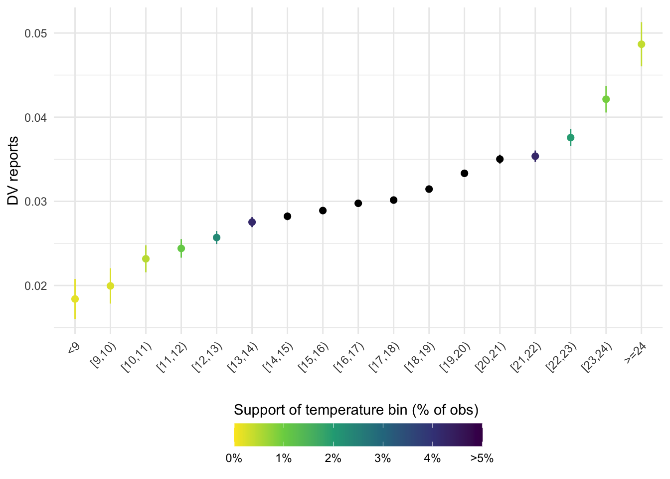
ggsave(here("..", "output", "figures", "assoc_bins_reports_color.png"),
       width = 6, height = 4, dpi = 300)
Same figure with call data:
Note that the bins are not the same because they are created dynamically, based on the data, and the time coverage for calls and reports is different.
bins_calls <- data_calls %>%
  filter(!is.na(calls)) %>%
  # customize the treshold to have more or less bins
  group_by(bins_tmean_one = create_dynamic_bins(tmean, 1, 0.001)) %>%
  filter(!is.na(bins_tmean_one)) %>%
  summarise(mean = mean(calls),
            count = n(),
            sd = sd(calls),
            se = sd / sqrt(count)) %>%
  filter(!is.na(sd)) %>% #to compute the sd, I need more than 1 crime
  mutate(prop_in_pc = 100*count/sum(count)) %>%
  mutate(lower_ci = mean - qt(0.975, count-1) * se,
         upper_ci = mean + qt(0.975, count-1) * se)


bins_calls %>%
  ggplot(aes(bins_tmean_one, mean, color = prop_in_pc)) +
  geom_linerange(aes(ymin = lower_ci, ymax = upper_ci),
                 #color = "gray50"
  ) +
  geom_point(stat = "identity", size = 2) +
  scale_x_discrete(guide = guide_axis(n.dodge = 1, angle = 45)) +
  scale_colour_viridis_c(option = "D", direction = -1,
                         limits = c(0, 5),
                         na.value = "black",
                         breaks = c(0, 1, 2, 3, 4, 5),
                         labels = c("0%", "1%", "2%", "3%", "4%", ">5%")) +
  labs(x = element_blank(), y = "Calls", color = "Support of temperature bin (% of obs)") +
  theme_light() +
  theme(legend.position = "bottom") +
  guides(colour = guide_colourbar(title.position = "top",
                                  barwidth = 13))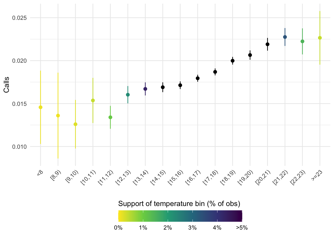
ggsave(here("..", "output", "figures", "assoc_bins_calls_color.png"),
       width = 6, height = 4, dpi = 300)
Same figures; but for different types of crime
To compare to other types of crime, to see if the association is specific to DV.
bins_homicides <- data_reports %>%
  filter(!is.na(reports_homicide)) %>%
  # customize the treshold to have more or less bins
  group_by(bins_tmean_one = create_dynamic_bins(tmean, 1, 0.001)) %>%
  filter(!is.na(bins_tmean_one)) %>%
  summarise(mean = mean(reports_homicide),
            count = n(),
            sd = sd(reports_homicide),
            se = sd / sqrt(count)) %>%
  filter(!is.na(sd)) %>% #to compute the sd, I need more than 1 crime
  mutate(prop_in_pc = 100*count/sum(count)) %>%
  mutate(lower_ci = mean - qt(0.975, count-1) * se,
         upper_ci = mean + qt(0.975, count-1) * se)

bins_thefts <- data_reports %>%
  filter(!is.na(reports_theft)) %>%
  # customize the treshold to have more or less bins
  group_by(bins_tmean_one = create_dynamic_bins(tmean, 1, 0.001)) %>%
  filter(!is.na(bins_tmean_one)) %>%
  summarise(mean = mean(reports_theft),
            count = n(),
            sd = sd(reports_theft),
            se = sd / sqrt(count)) %>%
  filter(!is.na(sd)) %>% #to compute the sd, I need more than 1 crime
  mutate(prop_in_pc = 100*count/sum(count)) %>%
  mutate(lower_ci = mean - qt(0.975, count-1) * se,
         upper_ci = mean + qt(0.975, count-1) * se)

bins_frauds <- data_reports %>%
  filter(!is.na(reports_fraud)) %>%
  # customize the treshold to have more or less bins
  group_by(bins_tmean_one = create_dynamic_bins(tmean, 1, 0.001)) %>%
  filter(!is.na(bins_tmean_one)) %>%
  summarise(mean = mean(reports_fraud),
            count = n(),
            sd = sd(reports_fraud),
            se = sd / sqrt(count)) %>%
  filter(!is.na(sd)) %>% #to compute the sd, I need more than 1 crime
  mutate(prop_in_pc = 100*count/sum(count)) %>%
  mutate(lower_ci = mean - qt(0.975, count-1) * se,
         upper_ci = mean + qt(0.975, count-1) * se)
Plot for the different types of crime
### plots ----

plot_reports <- bins_reports %>%
  ggplot(aes(bins_tmean_one, mean)) +
  geom_linerange(aes(ymin = lower_ci, ymax = upper_ci)) +
  geom_point(stat = "identity", size = 2) +
  scale_x_discrete(guide = guide_axis(n.dodge = 1, angle = 45)) +
  labs(title = "Domestic violence (reports)",
       x = NULL, y = "Reports per day-AGEB") +
  theme_light() +
  theme(plot.title = element_text(hjust = 0.5))

plot_calls <- bins_calls %>%
  ggplot(aes(bins_tmean_one, mean)) +
  geom_linerange(aes(ymin = lower_ci, ymax = upper_ci)) +
  geom_point(stat = "identity", size = 2) +
  scale_x_discrete(guide = guide_axis(n.dodge = 1, angle = 45)) +
  labs(title = "Domestic violence (calls)",
       x = NULL, y = "Calls per day-neighborhood") +
  theme_light() +
  theme(plot.title = element_text(hjust = 0.5))

plot_thefts <- bins_thefts %>%
  ggplot(aes(bins_tmean_one, mean)) +
  geom_linerange(aes(ymin = lower_ci, ymax = upper_ci)) +
  geom_point(stat = "identity", size = 2) +
  scale_x_discrete(guide = guide_axis(n.dodge = 1, angle = 45)) +
  labs(title = "Thefts",
       x = NULL, y = "Reports per day-AGEB") +
  theme_light() +
  theme(plot.title = element_text(hjust = 0.5))

plot_frauds <- bins_frauds %>%
  ggplot(aes(bins_tmean_one, mean)) +
  geom_linerange(aes(ymin = lower_ci, ymax = upper_ci)) +
  geom_point(stat = "identity", size = 2) +
  scale_x_discrete(guide = guide_axis(n.dodge = 1, angle = 45)) +
  labs(title = "Frauds",
       x = NULL, y = "Reports per day-AGEB") +
  theme_light() +
  theme(plot.title = element_text(hjust = 0.5))

plot_homicides <- bins_homicides %>%
  ggplot(aes(bins_tmean_one, mean)) +
  geom_linerange(aes(ymin = lower_ci, ymax = upper_ci)) +
  geom_point(stat = "identity", size = 2) +
  scale_x_discrete(guide = guide_axis(n.dodge = 1, angle = 45)) +
  labs(title = "Homicides",
       x = NULL, y = "Reports per day-AGEB") +
  theme_light() +
  theme(plot.title = element_text(hjust = 0.5))
Patchwork them:
plot_combined <-
  (plot_reports | plot_calls) / (plot_thefts | plot_frauds | plot_homicides)

plot_combined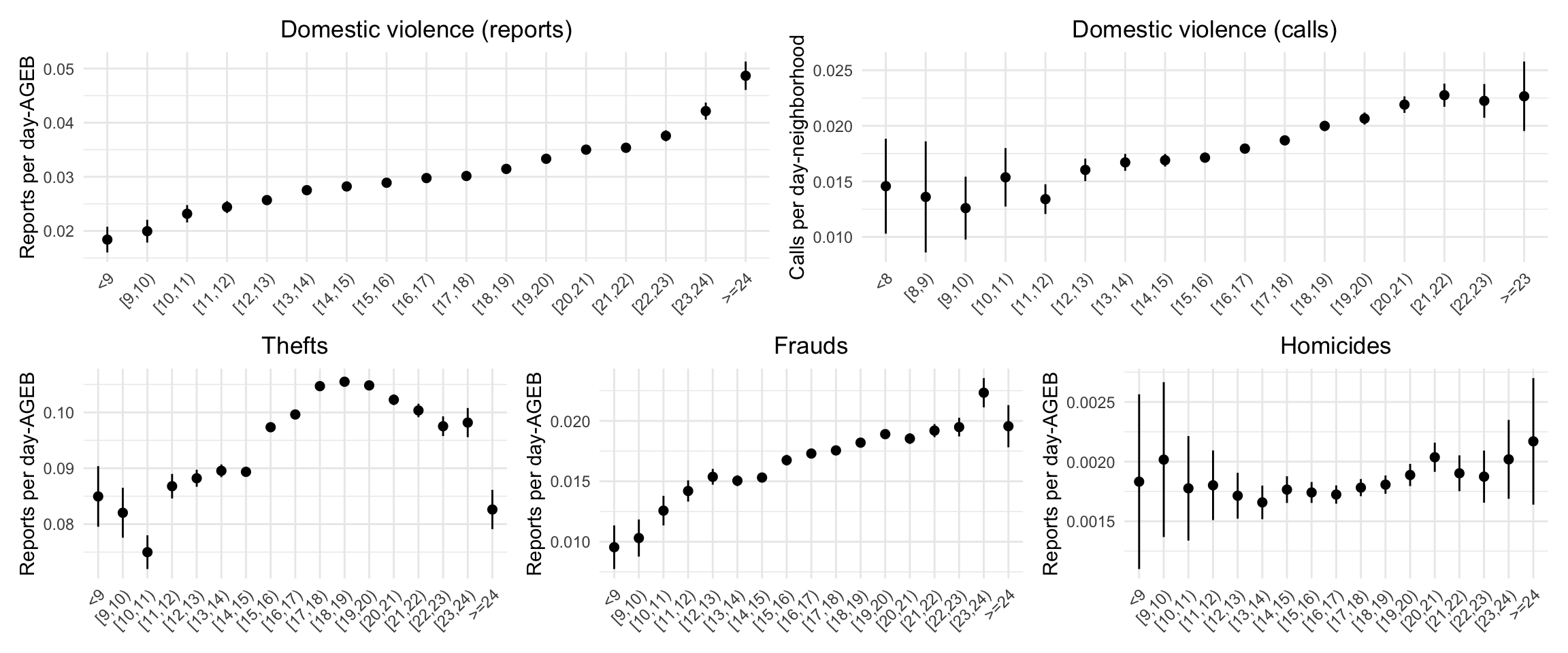
ggsave(plot = plot_combined,
       here("..", "output", "figures", "assoc_bins_type_combined.png"),
       width = 14, height = 8, dpi = 300)