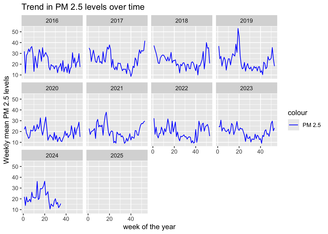
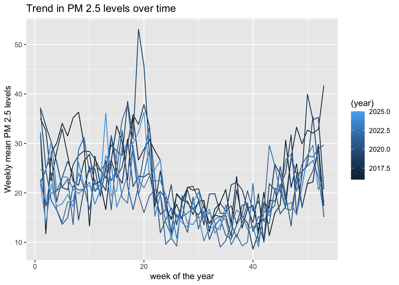
ageb <-
  read_sf(here(
    "..",
    "output",
    "ageb_poligonos.geojson"),
          quiet = TRUE)%>%
  st_transform(4326) %>%
  st_make_valid()

data <-
  readRDS(here(
    "..",
    "output",
    "temporary_data",
    "weather",
    "weather_cdmx.rds"))

thresholds <-
  tribble(
    ~target, ~value_pm25, ~value_pm10,
    "it1", 75, 150,
    "it2", 50, 100,
    "it3", 37.5, 75,
    "aqg", 25, 50,
)Describe pollution
In this script, i want to look at pollution, and how it relates to temperature. I do not save any new data, this is pure descriptive/exploration.
Import the data
Focus on PM2.5 and PM10
I have these variables for pollution: - co - no - no2 - nox - o3 - pm10 - pm25 - pmco
I will focus on PM25 (and PM10).
I created some variables that count the number of hours per day above the WHO thresholds.
thresholds %>% gt()| target | value_pm25 | value_pm10 |
|---|---|---|
| it1 | 75.0 | 150 |
| it2 | 50.0 | 100 |
| it3 | 37.5 | 75 |
| aqg | 25.0 | 50 |
Distribution of PM 2.5 neighborhoods-days
During our study period 2005-2016, across all neighborhoods and days in our sample, pollution in Mexico City and surrounding localities is high. The figure below shows the distribution of the highest hourly PM 2.5 reading per neighborhood-day, relative to the World Health Organization’s Air Quality Guideline (AQG) and 3 Interim Targets (IT1-IT3) for 24-hour concentrations of particulate matter (WHO, 2005). The distribution has wide support with a large share of neighborhoods-days experiencing at least one hour above the recommended pollution levels.
data %>%
  ggplot(aes(x = pm25_max)) +
  geom_density() +
  geom_vline(xintercept = 25, linetype = "dotted", color = "red") +
  annotate("text", x = 25, y = 0.036, label = "AQG") +
  geom_vline(xintercept = 37.5, linetype = "dotted", color = "red") +
  annotate("text", x = 37.5, y = 0.036, label = "IT3") +
  geom_vline(xintercept = 50, linetype = "dotted", color = "red") +
  annotate("text", x = 50, y = 0.036, label = "IT2") +
  geom_vline(xintercept = 75, linetype = "dotted", color = "red") +
  annotate("text", x = 75, y = 0.036, label = "IT1") +
  labs(title = "Distribution of the maximum hourly PM 2.5 reading per neighborhood-day",
       x = "PM 2.5",
       y = "Density") +
  #x ticks
  scale_x_continuous(breaks = seq(0, 150, 25)) +
  coord_cartesian(xlim = c(0, 150)) +
  theme_light()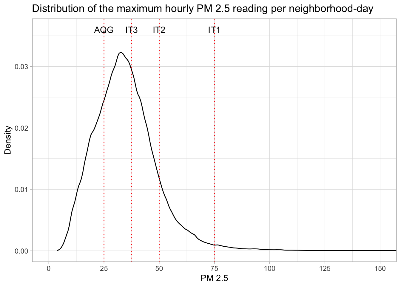
Calendar: one year in one neighborhood
This calendar shows for a “random” year in a “random” AGEB, at least one hour per day was above which threshold.
data %>%
  filter(year(date) == 2017,
         ageb == "0900500012292") %>%
  mutate(year = year(date),
         month = month(date, label = TRUE),
         day = day(date),
         weekday = wday(date, label = TRUE)) %>%
  arrange(pm25_max) %>%
  mutate(pollution_category = case_when(pm25_max <= 25 ~ "Below AQG",
                                        pm25_max <= 37.5 ~ "Above AQG",
                                        pm25_max <= 50 ~ "Above IT3",
                                        pm25_max <= 75 ~ "Above IT2",
                                        pm25_max > 75 ~ "Above IT1"),
         pollution_category = as_factor(pollution_category)) %>%
# Create the calendar heatmap
ggplot(aes(x = weekday, y = -week(date), fill = pollution_category)) +
  geom_tile(color = "white") +
  facet_wrap(~ month, scales = "free_y", ncol = 3) +
  #scale_fill_gradient(low = "green", high = "red") +
  scale_fill_manual(values = c("Below AQG" = "green",
                               "Above AQG" = "yellow",
                               "Above IT3" = "orange",
                               "Above IT2" = "red",
                               "Above IT1" = "brown")) +

  labs(
    title = "Calendar Heatmap for one AGEB in 2017",
    subtitle = "max pm25 daily, this means at least one hour was above a certain threshold",
    x = NULL,
    y = NULL,
    fill = "Hourly max PM 2.5"
  )
Temp and pollution
How do they interact. Since we saw that pollution is lower in winter, is it inversely correlated with temperature?
Maybe first bring the data back to mexico city level, like in weather. I could do the same for the tables above, weighting by population.
data_daily <- data %>%
  left_join(ageb %>% st_drop_geometry(), by = "ageb") %>%
  group_by(date) %>%
  summarise(across(c(tmean, tmin, tmax, prec,
                     pm25_max, pm25_min, pm25_mean,
                     pm10_max, pm10_min, pm10_mean,
                     contains("tmp_h_above"), contains("pm10_h_above"), contains("pm25_h_above")),
                   ~ weighted.mean(.x, pobtot)))
line plot
data_daily %>%
  filter(year(date)<2023) %>%
  ggplot(aes(x = date)) +
  #pollution
  geom_line(aes(y = pm25_mean),
            color = "orange", alpha = .3) +
  geom_smooth(aes(y = pm25_mean), color = "orange",
              method = "loess", span = 0.05, se= F) +
  #temperature
  geom_line(aes(y = tmean),
            color = "blueviolet", alpha = .3) +
  geom_smooth(aes(y = tmean), color = "blueviolet",
              method = "loess", span = 0.05, se = F) +
  labs(title = "Trend in PM 2.5 (orange) and temp (violet) over time",
       x = "Date",
       y = "Mean PM 2.5 and temp levels") +
  #zoom on y axis
  coord_cartesian(ylim = c(0, 40)) +
theme_light() #+ facet_wrap(~ year(date), scales = "free") 
scatter plot
Hard to tell much… But looks like U shape.
This pattern suggest that temperature extremes — both low and high — are associated with relatively higher PM2.5 levels, while moderate temperatures correlate with lower PM2.5 levels.
data_daily %>%
  filter(year(date) < 2023) %>%
  ggplot(aes(x = tmean, y = pm25_mean)) +
  geom_point(color = "green", alpha = 0.5) +  # Scatter plot points
  geom_smooth(method = "loess", span = 0.1, se = FALSE, color = "blue") +  # Smoothed trend line
  labs(title = "Scatter Plot, each dot is one day",
       x = "Temp",
       y = "PM 2.5 levels") +
  theme_light() +
  #ticks every 1 on x axis
  scale_x_continuous(breaks = seq(0, 40, by = 1), minor_breaks = NULL) +
coord_cartesian(xlim = c(10, 24)) 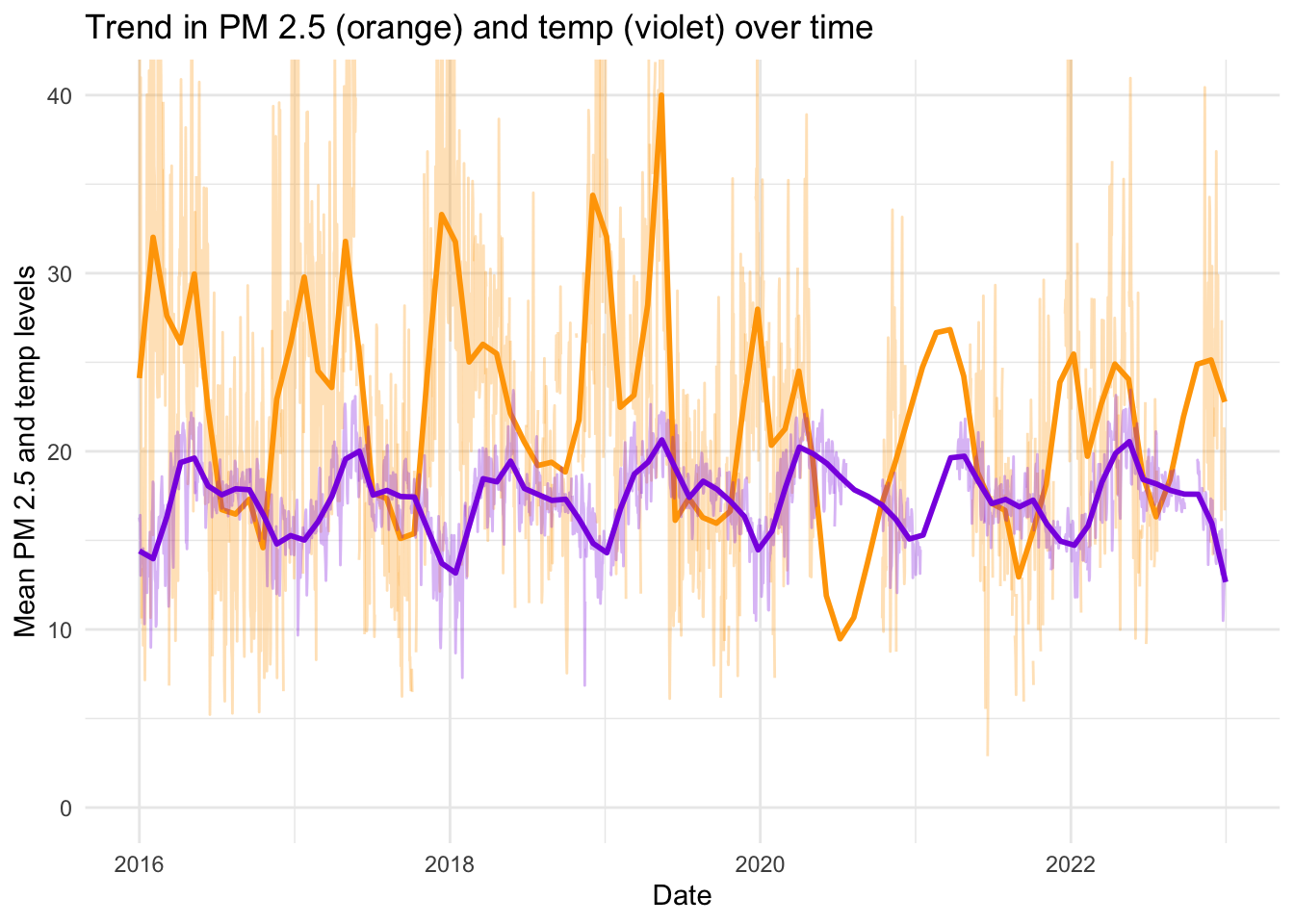
Our measures of daily air pollution leverage our high-frequency air pollution data to capture peaks in air pollution. Relative to the literature that studies daily or weekly average levels of particulate matter, which smooth peaks in air pollution, our measures represent an improvement for studying the non-linear relationship between PM 2.5 and labor supply and estimating the impact of extreme levels of PM 2.5 on labor supply.
data_daily %>%
  filter(year(date) < 2023) %>%
  ggplot(aes(x = tmean, y = pm25_h_above_it3)) +
  geom_point(color = "green", alpha = 0.5) +  # Scatter plot points
  geom_smooth(method = "loess", span = 0.1, se = FALSE, color = "blue") +  # Smoothed trend line
  labs(title = "Scatter Plot, each dot is one day",
       x = "Temp",
       y = "Number of Hours of PM 2.5 above IT3") +
  theme_light() +
  #ticks every 1 on x axis
  scale_x_continuous(breaks = seq(0, 40, by = 1), minor_breaks = NULL) +
  scale_y_continuous(breaks = seq(0, 24, by = 4), minor_breaks = NULL) +
coord_cartesian(xlim = c(10, 25), ylim = c(0, 24)) 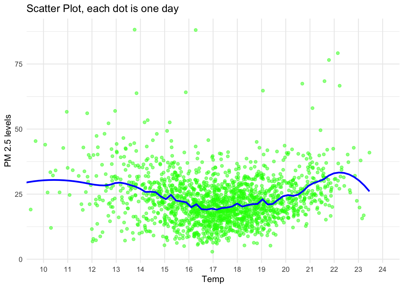
simple regs
Temperature Coefficient (-0.05423, p = 0.463): Not statistically significant; temperature does not predict PM2.5 levels.
# Fit a linear regression model
model <- lm(pm25_mean ~ tmean, data = data_daily)
summary(model)
Call:
lm(formula = pm25_mean ~ tmean, data = data_daily)

Residuals:
    Min      1Q  Median      3Q     Max
-19.344  -5.972  -1.015   4.684  65.976

Coefficients:
             Estimate Std. Error t value Pr(>|t|)
(Intercept) 22.188783   1.368676  16.212   <2e-16 ***
tmean        0.002374   0.077432   0.031    0.976
---
Signif. codes:  0 '***' 0.001 '**' 0.01 '*' 0.05 '.' 0.1 ' ' 1

Residual standard error: 8.914 on 2200 degrees of freedom
  (1142 observations deleted due to missingness)
Multiple R-squared:  4.272e-07, Adjusted R-squared:  -0.0004541
F-statistic: 0.0009398 on 1 and 2200 DF,  p-value: 0.9755
# Quadratic regression of PM2.5 on temperature and temperature squared
data_daily <- data_daily %>%
mutate(tmean_squared = data_daily$tmean^2)
model <-
lm(pm25_mean ~ tmean + tmean_squared, data = data_daily)
# Summary of the quadratic regression model
summary(model)
Call:
lm(formula = pm25_mean ~ tmean + tmean_squared, data = data_daily)

Residuals:
    Min      1Q  Median      3Q     Max
-33.530  -5.549  -0.794   4.404  67.302

Coefficients:
               Estimate Std. Error t value Pr(>|t|)
(Intercept)   105.70004    5.84083   18.10   <2e-16 ***
tmean          -9.88247    0.67787  -14.58   <2e-16 ***
tmean_squared   0.28652    0.01953   14.67   <2e-16 ***
---
Signif. codes:  0 '***' 0.001 '**' 0.01 '*' 0.05 '.' 0.1 ' ' 1

Residual standard error: 8.51 on 2199 degrees of freedom
  (1142 observations deleted due to missingness)
Multiple R-squared:  0.08914,   Adjusted R-squared:  0.08831
F-statistic: 107.6 on 2 and 2199 DF,  p-value: < 2.2e-16
The quadratic regression model significantly improves on the simple linear model, capturing the U-shaped relationship between temperature and PM2.5 levels. Both temperature and its square are highly significant, confirming that PM2.5 levels decrease with rising temperatures up to a point and then increase as temperatures continue to rise.
Plot the original data points and add the fitted quadratic curve.
# Generate predicted values from the model
data_daily$predicted_pm25 <- predict(model, newdata = data_daily)

# Plot the original data and the quadratic model
ggplot(data_daily, aes(x = tmean, y = pm25_mean)) +
  geom_point(color = "green", alpha = 0.5) +  # Original data points
  geom_line(aes(y = predicted_pm25), color = "blue", linewidth = 1) +  # Quadratic model curve
  labs(title = "Scatter Plot with Quadratic Model Fit",
       x = "Temperature",
       y = "PM 2.5 Levels") +
  theme_light()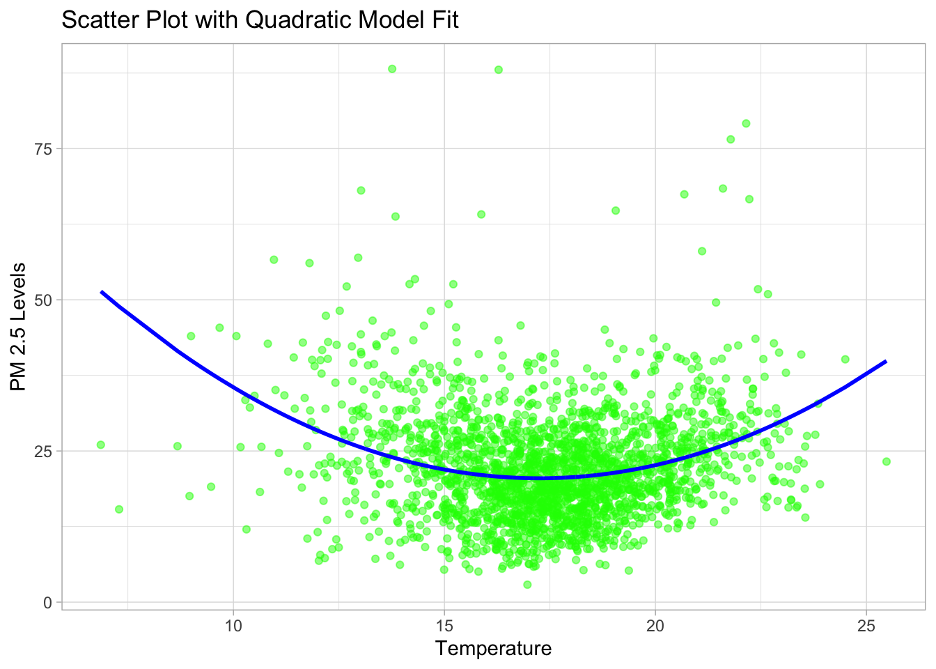
are the very high polluted days those that are very warm?
Hoffmann and Rud (2024) find an effect of pollution on labour for hours above IT2, but esp for hours above IT1, super polluted days.
data_daily %>%
  filter(year(date) < 2023) %>%
  ggplot(aes(x = tmean, y = pm25_h_above_it1)) +
  geom_point(color = "green", alpha = 0.5) +  # Scatter plot points
  #geom_smooth(method = "loess", se = FALSE, color = "blue") +  # Smoothed trend line
  labs(title = "Scatter Plot, each dot is one day") +
  theme_light() +
  #ticks every 1 on x axis
  scale_x_continuous(breaks = seq(0, 40, by = 1), minor_breaks = NULL) +
  scale_y_continuous(breaks = seq(0, 24, by = 4), minor_breaks = NULL) #+
coord_cartesian(xlim = c(0, 12), ylim = c(0, 24)) <ggproto object: Class CoordCartesian, Coord, gg>
aspect: function
backtransform_range: function
clip: on
default: FALSE
distance: function
expand: TRUE
is_free: function
is_linear: function
labels: function
limits: list
modify_scales: function
range: function
render_axis_h: function
render_axis_v: function
render_bg: function
render_fg: function
setup_data: function
setup_layout: function
setup_panel_guides: function
setup_panel_params: function
setup_params: function
train_panel_guides: function
transform: function
super: <ggproto object: Class CoordCartesian, Coord, gg>