start_time <- Sys.time()

library(tidyverse)
library(here)

library(patchwork)
library(gt)
library(kableExtra)
library(scales)

library(sf)
library(ggspatial)Describe and plot data, summary statistics
In this script, I produce a series of plots and tables to describe the data. I export them to the output folder. They go directly in the paper, this is why I gathered them here.
data_reports <-
  read_rds(here("..", "output",
                "data_reports.rds")) %>%
  filter(date < "2024-01-01")

data_calls <-
  read_rds(here("..", "output",
                "data_calls.rds")) %>%
  filter(date < "2024-01-01")
Transform data at daily level for descriptive
Weighting weather data by the population of the neighborhood to reflect exposure
ageb_attributes <-
  read_rds(here("..", "output",
                "ageb_attributes.rds"))

weather_daily <- data_reports %>%
  select(ageb, date,
         tmean, tmin, tmax,
         prec, rh, wsp,
         pm25_mean, pm25_min, pm25_max,
         pm10_mean, pm10_min, pm10_max) %>%
  left_join(ageb_attributes %>%
              select(ageb, pobtot),
            by = "ageb") %>%
  group_by(date) %>%
  summarise(across(!c("ageb", "pobtot"),
                   ~ weighted.mean(., pobtot, na.rm = TRUE))) %>%
  ungroup() %>%
  mutate(year = year(date))
Sum crimes per day, to make it more relatable
reports_daily <- data_reports %>%
  group_by(date, year, month, day, weekend_dummy, covid_phase) %>%
  summarise(across(starts_with("reports"),
                   ~ sum(., na.rm = FALSE)))

calls_daily <- data_calls %>%
  group_by(date, year, month, day, weekend_dummy, covid_phase) %>%
  summarise(across(starts_with("calls"),
                   ~ sum(., na.rm = FALSE))) %>%
  ungroup()
Add all daily data into one df
data_daily <-
  full_join(reports_daily, calls_daily) %>%
  full_join(weather_daily %>% select(-year))
Figure: Data coverage and missing values
# count the share of missing per day and plot timeline
share_NAs_daily <-
  data_reports %>%
  group_by(date) %>%
  summarise(across(c("reports_dv",
                     "tmean", "prec", "rh", "wsp", "pm25_mean"),
                   ~ sum(is.na(.))/n()))

share_NAs_daily <- share_NAs_daily %>%
  left_join(data_calls %>%
              group_by(date) %>%
              summarise(calls = sum(is.na(calls))/n()))

share_NAs_daily %>%
  filter(date < "2024-01-01") %>%
  pivot_longer(cols = -date, names_to = "variable", values_to = "percent_missing") %>%
  mutate(variable = as_factor(variable)) %>%
  ggplot(aes(x = date, y = percent_missing, color = variable, group = variable)) +
  geom_line(linewidth = 1) +
  labs(x = NULL, y = "Share of observations with missing data") +
  scale_x_date(date_breaks = "1 year",
               date_labels = "%Y") +
  #percent format for y scale
  scale_y_continuous(labels = scales::percent_format()) +
  facet_wrap(~variable, ncol = 1, scales = "free_y") +
  theme_light() +
theme(legend.position = "none") 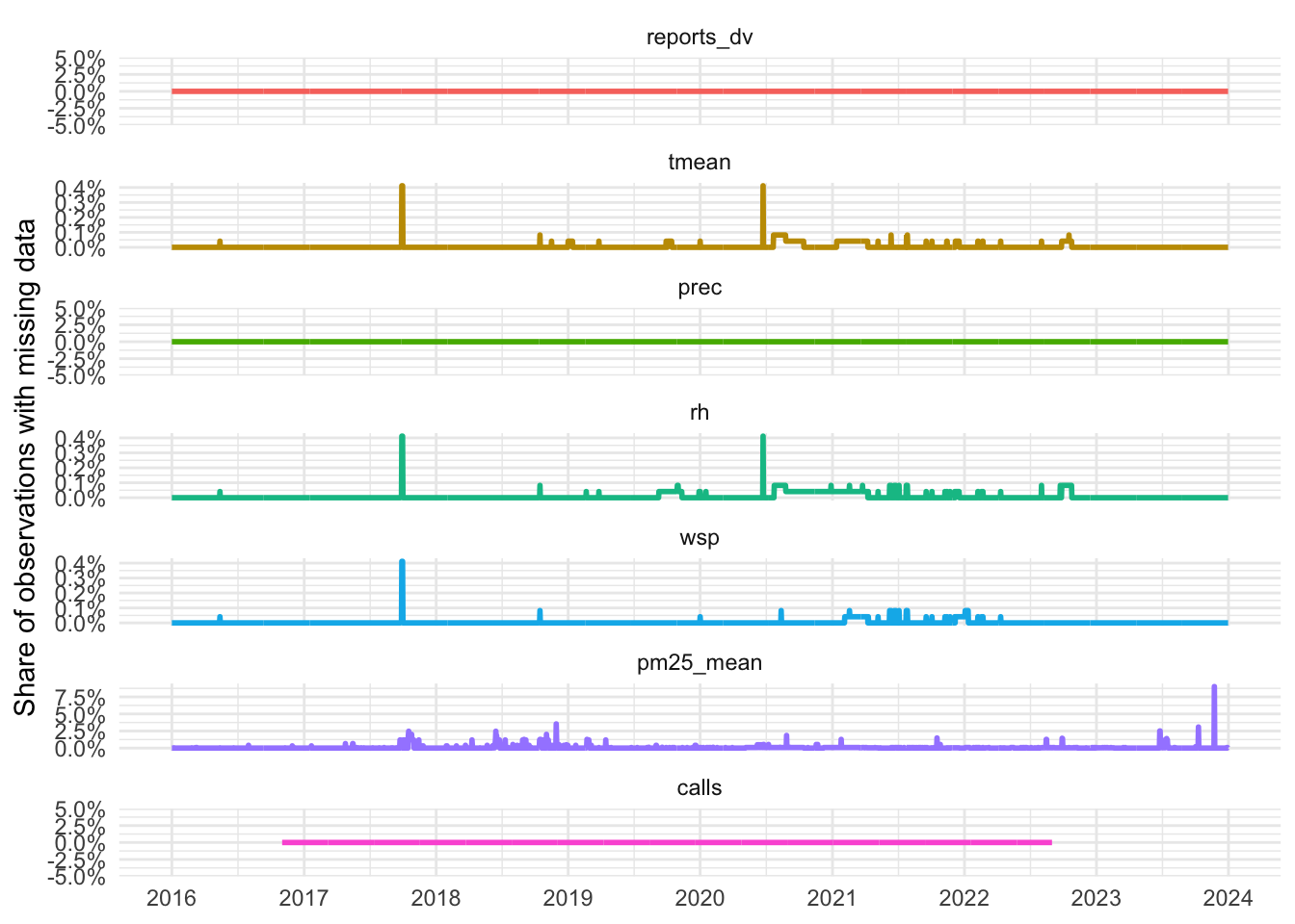
ggsave(here("..", "output", "figures", "timeline_NAs.png"),
       width = 6, height = 8, dpi = 300)

rm(share_NAs_daily)
Figure: Average population exposure to temperature
# First, count the number of days that fall in each bin
binned_weather <- weather_daily %>%
  select(date, tmean, tmin, tmax) %>%
  pivot_longer(cols = c(tmean, tmin, tmax),
               names_to = "variable",
               values_to = "temperature") %>%
  mutate(bins = cut_width(temperature, width = 1, center = .5, closed = "left")) %>%
  count(variable, bins) %>%
  group_by(variable) %>%
  mutate(freq = n/sum(n),
         days_per_year = freq * 365) %>%
  group_by(variable) %>%
  pivot_wider(names_from = variable, values_from = days_per_year,
              names_prefix = "days_per_year_")

#plot min, max, and min together
binned_weather %>%
  ggplot(aes(x = bins)) +
  geom_col(aes(y = days_per_year_tmax, fill = "Max Temperature"), alpha = .3) +
  geom_col(aes(y = days_per_year_tmin, fill = "Min Temperature"), alpha = .3) +
  geom_col(aes(y = days_per_year_tmean, fill = "Mean Temperature"), alpha = 1) +
  xlab(NULL) +
  ylab("Number of days per year") +
  scale_x_discrete(guide = guide_axis(angle = 45)) +
  scale_fill_manual(name = "Temperature",
                    values = c("Max Temperature" = "brown1",
                               "Min Temperature" = "blue1",
                               "Mean Temperature" = "aquamarine3"),
                    breaks = c("Min Temperature", "Mean Temperature", "Max Temperature")) +
  theme_light() +
  theme(legend.position = "bottom",
legend.title = element_blank()) 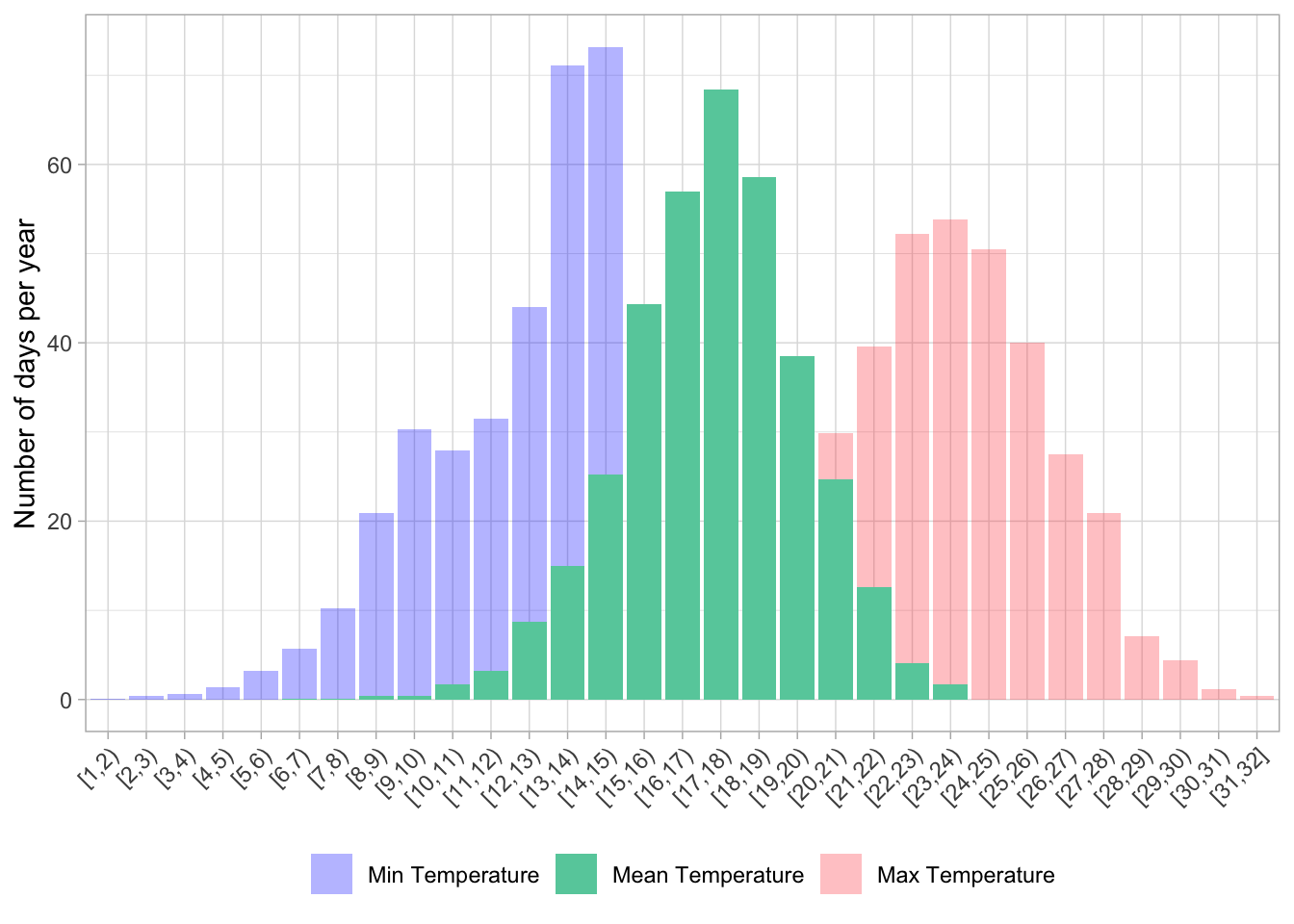
ggsave(here("..", "output", "figures", "temp_days_per_year.png"),
       width = 8, height = 5, dpi = 300)
Figure: Monthly averages of weather and pollution
A patchwork of one figure per env/pollution variable to describe monthly variations
weather_daily <- weather_daily %>%
  mutate(year = year(date),
         month = month(date))
# monthly temps

monthly_tmp <-
  weather_daily %>%
  group_by(month) %>%
  summarise(across(c(tmean, tmax, tmin), \(x) mean(x, na.rm = TRUE))) %>%
  ggplot(aes(x = month)) +
  geom_col(aes(y = tmean, fill = "Mean"), alpha = .8) +
  geom_point(aes(y = tmin, color = "Min"), alpha = 1, shape = 4, size = 2) +
  geom_point(aes(y = tmax, color = "Max"), alpha = 1, shape = 4, size = 2) +
  scale_x_continuous(breaks = 1:12) +
  xlab(NULL) +
  #ylab("Average daily temperature (°C)") +
  ylab("Temperature (°C)") +
  scale_fill_manual(name = "Temperature",
                    values = c("Mean" = "aquamarine3")) +
  scale_color_manual(name = "Temperature",
                     values = c("Max" = "brown1",
                                "Min" = "blue1"),
                     breaks = c("Min", "Max")) +
  theme_light() +
  theme(legend.position = "none")
  # theme(legend.position = "top",
  #       legend.title = element_blank())


# monthly wsp
monthly_wsp <-
  weather_daily %>%
  group_by(month) %>%
  summarise(wsp =  mean(wsp, na.rm = TRUE)) %>%
  ggplot(aes(x = month, y = wsp)) +
  geom_col(fill = "orange", alpha = .5) +
  scale_x_continuous(breaks = 1:12) +
  #ylab("Average daily windspeed (km/h)") +
  ylab("Windspeed (km/h)") +
  xlab(NULL) +
  theme_light()


# monthly prec
monthly_prec <-
  weather_daily %>%
  #summarise(prec =  sum(prec, na.rm = TRUE), .by = c("month", "year")) %>%
  summarise(prec =  mean(prec, na.rm = TRUE), .by = "month") %>%
  ggplot(aes(x = month, y = prec, group = 1)) +
  geom_col(fill = "blue", alpha = .5) +
  scale_x_continuous(breaks = 1:12) +
 # ylab("Total monthly precipitation (mm)") +
  ylab("Precipitation (mm)") +
  xlab(NULL) +
  theme_light()

#monthly rh
monthly_rh <-
  weather_daily %>%
  group_by(month) %>%
  summarise(rh =  mean(rh, na.rm = TRUE)) %>%
  ggplot(aes(x = month, y = rh, group = 1)) +
  geom_col(fill = "purple", alpha = .5) +
  scale_y_continuous(limits = c(0, 100)) +
  scale_x_continuous(breaks = 1:12) +
 # ylab("Average daily relative humidity (%)") +
  ylab("Relative humidity (%)") +
  xlab(NULL) +
  theme_light()

monthly_pm25 <-
  weather_daily %>%
  group_by(month) %>%
  summarise(pm25_mean = mean(pm25_mean, na.rm = TRUE)) %>%
  ggplot(aes(x = month, y = pm25_mean)) +
  geom_col(fill = "gray") +
  scale_x_continuous(breaks = 1:12) +
  labs(x = NULL, y = "PM2.5 (µg/m³)") +
  theme_light()

monthly_pm10 <-
  weather_daily %>%
  group_by(month) %>%
  summarise(pm10_mean = mean(pm10_mean, na.rm = TRUE)) %>%
  ggplot(aes(x = month, y = pm10_mean)) +
  geom_col(fill = "gray50") +
  scale_x_continuous(breaks = 1:12) +
  labs(x = NULL, y = "PM10 (µg/m³)") +
  theme_light()

# all the monthly plots together
monthly_tmp + monthly_prec + monthly_rh + monthly_wsp + monthly_pm25 + monthly_pm10 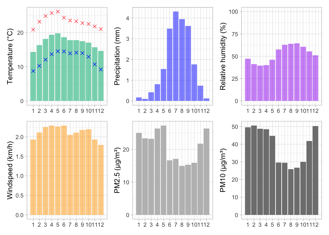
ggsave(here("..", "output", "figures", "weather_monthly_averages.png"), width = 10, height = 6, dpi = 300)Figure: Daily evolution of DV crimes and calls
I do not save those pictures, but interesting
# daily evolution of DV crimes
reports_daily %>%
  ggplot(aes(x = date, y = reports_dv, color = factor(year))) +
  geom_line() +
  labs(title = "Daily evolution of reports of domestic violence",
       x = "Date",
       y = "Number of reports") +
  theme_light() +
  #legen position bottom
theme(legend.position = "bottom") 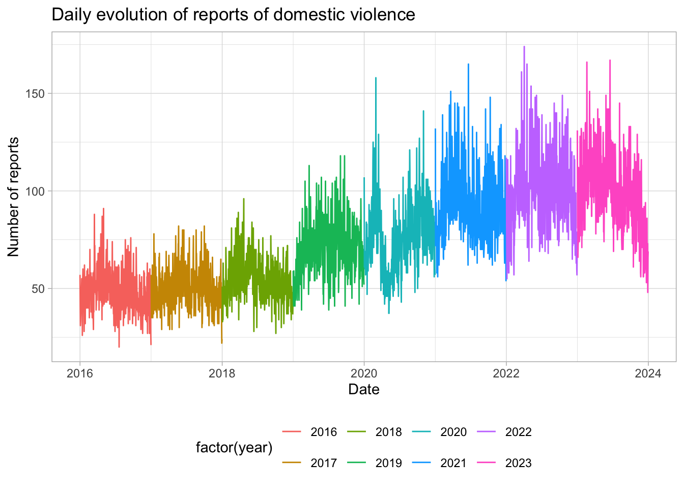
# daily evolution of DV calls
calls_daily %>%
  ggplot(aes(x = date, y = calls, color = factor(year))) +
  geom_line() +
  labs(title = "Daily evolution of calls for domestic violence",
       x = "Date",
       y = "Number of reports") +
  theme_light() +
  #legen position bottom
  theme(legend.position = "bottom")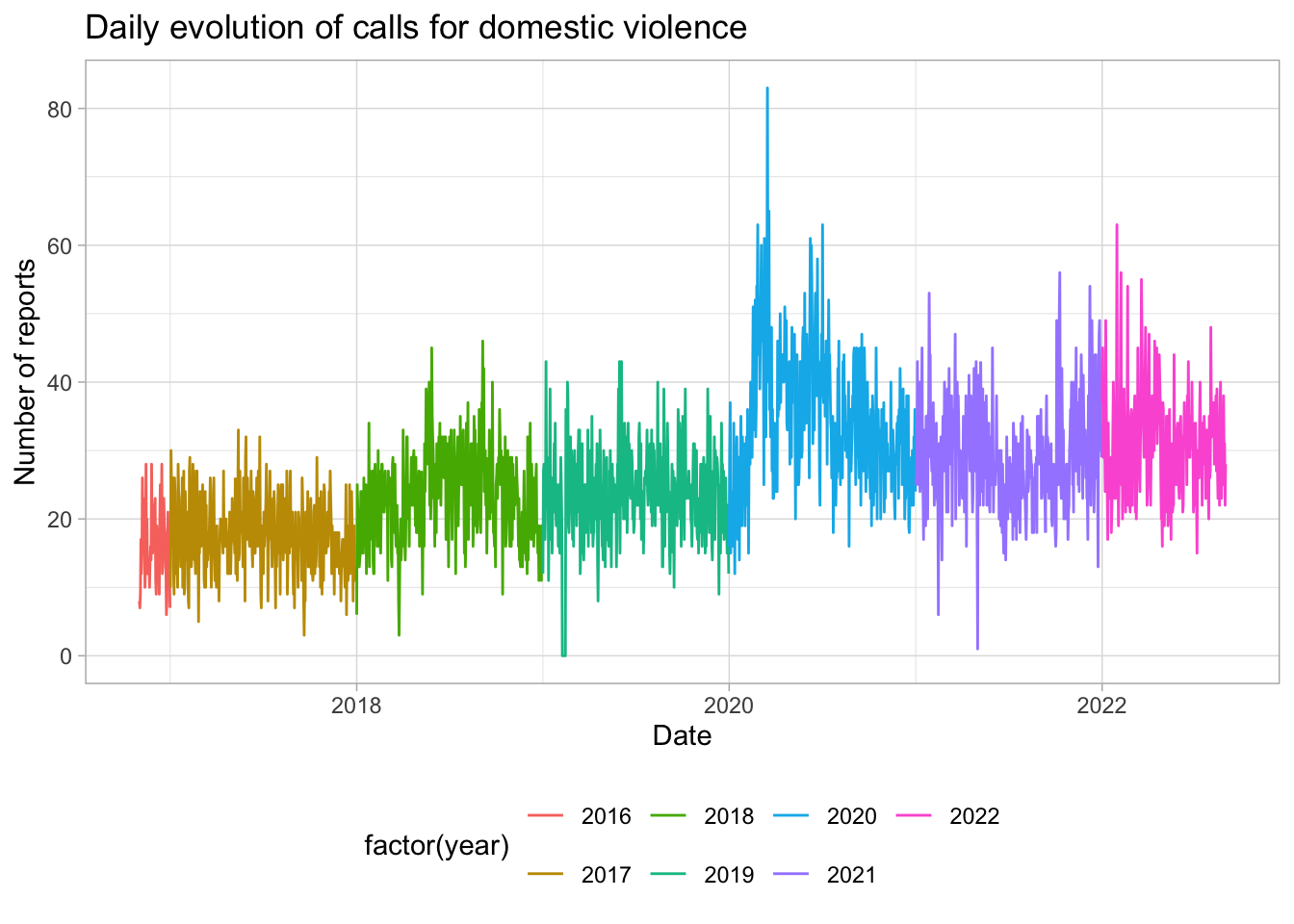
Table: Summary statistics – DV crime and environment
Create a nice summary table with descriptive at disctinct levels
First compute for the distcint levels
summary_table_daily <- data_daily %>%
  ungroup() %>%
  summarize(
    across(
      c(`Reports for DV`= reports_dv,
        `Reports for DV in daytime`= reports_dv_day,
        `Reports for DV in nighttime`= reports_dv_night,
        `Calls for DV`= calls,
        `Calls for DV in daytime`= calls_day,
        `Calls for DV in nighttime`= calls_night),
      list(N = ~sum(!is.na(.x)),
           Mean = ~mean(.x, na.rm = TRUE),
           `Std Dev` = ~sd(.x, na.rm = TRUE),
           Min = ~min(.x, na.rm = TRUE),
           Max = ~max(.x, na.rm = TRUE)),
      .names = "{.col}___{.fn}")) %>%
  pivot_longer(cols = everything(), names_to = c(" ", "variable"), names_sep = "___") %>%
  pivot_wider(names_from = variable, values_from = value)

summary_table_reports_ageb <- data_reports %>%
  summarize(
    across(
      c(`Reports for DV`= reports_dv),
      list(N = ~sum(!is.na(.x)),
           Mean = ~mean(.x, na.rm = TRUE),
           `Std Dev` = ~sd(.x, na.rm = TRUE),
           Min = ~min(.x, na.rm = TRUE),
           Max = ~max(.x, na.rm = TRUE)),
      .names = "{.col}___{.fn}")) %>%
  pivot_longer(cols = everything(), names_to = c(" ", "variable"), names_sep = "___") %>%
  pivot_wider(names_from = variable, values_from = value)


summary_table_calls_col <- data_calls %>%
  summarize(
    across(
      c(`Calls for DV`= calls),
      list(N = ~sum(!is.na(.x)),
           Mean = ~mean(.x, na.rm = TRUE),
           `Std Dev` = ~sd(.x, na.rm = TRUE),
           Min = ~min(.x, na.rm = TRUE),
           Max = ~max(.x, na.rm = TRUE)),
      .names = "{.col}___{.fn}")) %>%
  pivot_longer(cols = everything(), names_to = c(" ", "variable"), names_sep = "___") %>%
  pivot_wider(names_from = variable, values_from = value)


summary_table_daily_weather <- data_daily %>%
  ungroup() %>%
  summarize(
    across(
      c(`Mean temperature (°C)` = tmean,
        `Minimum temperature (°C)` = tmin,
        `Maximum temperature (°C)` = tmax,
        `Precipitation (mm)` = prec,
        `Relative humidity (%)` = rh,
        `Windspeed (km/h)` = wsp,
        `Mean PM2.5 (µg/m³)` = pm25_mean),
      list(N = ~sum(!is.na(.x)),
           Mean = ~mean(.x, na.rm = TRUE),
           `Std Dev` = ~sd(.x, na.rm = TRUE),
           Min = ~min(.x, na.rm = TRUE),
           Max = ~max(.x, na.rm = TRUE)),
      .names = "{.col}___{.fn}")) %>%
  pivot_longer(cols = everything(), names_to = c(" ", "variable"), names_sep = "___") %>%
  pivot_wider(names_from = variable, values_from = value)
Bind into the same table and format the numbers
# bind and scales for comma and format
summary_table <-
  rbind(summary_table_daily,
        summary_table_reports_ageb,
        summary_table_calls_col,
        summary_table_daily_weather) %>%
  mutate(
    N = scales::comma(N, accuracy = 1),
    Mean = if_else(Mean < 0.1,
                   scales::number(Mean, accuracy = 0.001),
                   scales::number(Mean, accuracy = 0.1)),
    `Std Dev` = scales::number(`Std Dev`, accuracy = 0.01),
    Min = ifelse(round(Min, 2) == round(Min),
                 scales::comma(Min, accuracy = 1),
                 scales::comma(Min, accuracy = 0.1)),
    Max = ifelse(round(Max, 2) == round(Max),
                 scales::comma(Max, accuracy = 1),
                 scales::comma(Max, accuracy = 0.1))
  )
Customize and prettify, and export to a latex file. Goes direclty in the paper.
# Customize and export the table using kableExtra
summary_table %>%
  kbl(format = "latex", booktabs = TRUE, align = "lccccc",
      caption = "Summary Statistics: Domestic Violence, Weather, and Pollution \\label{summary_statistics}") %>%
  #label for latex
  kable_styling(latex_options = c("hold_position", "scale_down"),
                position = "center") %>%
  pack_rows("Domestic violence -- Daily", 1, 6,
            latex_gap_space = "0.5em", italic = T, bold = F) %>%
  pack_rows("Domestic violence -- Day × AGEB", 7, 7,
            latex_gap_space = "1em", italic = T, bold = F) %>%
  pack_rows("Domestic violence -- Day × Neighborhood", 8, 8,
            latex_gap_space = "1em", italic = T, bold = F) %>%
  pack_rows("Weather and pollution -- Daily", 9, 15,
            latex_gap_space = "1em", italic = T, bold = F) %>%
  footnote(
    #general_title = "",
    general = "The number of observations varies across variables due to shorter coverage of DV call data compared to reports.
Domestic violence reports are aggregated by day and AGEB (a census block–level unit), while domestic violence calls are aggregated by day and neighborhood. This distinction reflects differences in the underlying geographic identifiers of the two datasets.",
    footnote_as_chunk = TRUE,
    threeparttable = TRUE,
    fixed_small_size = TRUE,
    escape = FALSE
  ) %>%
  save_kable(here::here("..", "output", "tables", "summary_statistics.tex"))
Figure: Pollution - Distribution of maximum daily PM 2.5 reading per neighborhood
# save WHO targets (2021 version)
thresholds <- tribble(~ target, ~ pm25, ~ pm10,
                      "IT1", 75, 150,
                      "IT2", 50, 100,
                      "IT3", 37.5, 75,
                      "IT4", 25, 50,
                      "AQG", 15, 45)
# WHO targets, old version, the one that applies to the period we study
thresholds <- tribble(~ target, ~ pm25, ~ pm10,
                      "IT1", 75, 150,
                      "IT2", 50, 100,
                      "IT3", 37.5, 75,
                      "AQG", 25, 50)

# density plot for pollution
ggplot() +
  geom_density(data = data_reports %>% filter(covid_phase == "Pre-pandemic"),
               aes(x = pm25_max),
               fill = "lightblue", alpha = .5) +
  geom_vline(data = thresholds, aes(xintercept = pm25), color = "red", linetype = "dotted") +
  geom_label(data = thresholds, aes(x = pm25, y = 0.0335, label = target),
             color = "white", fill = "red", size = 5, fontface = "bold") +
  scale_x_continuous(breaks = seq(0, 500, 25)) +
  # limit x axis
  coord_cartesian(xlim = c(0, 115)) +
  labs(x = "PM2.5 (µg/m³)", y = "Density") +
theme_light() 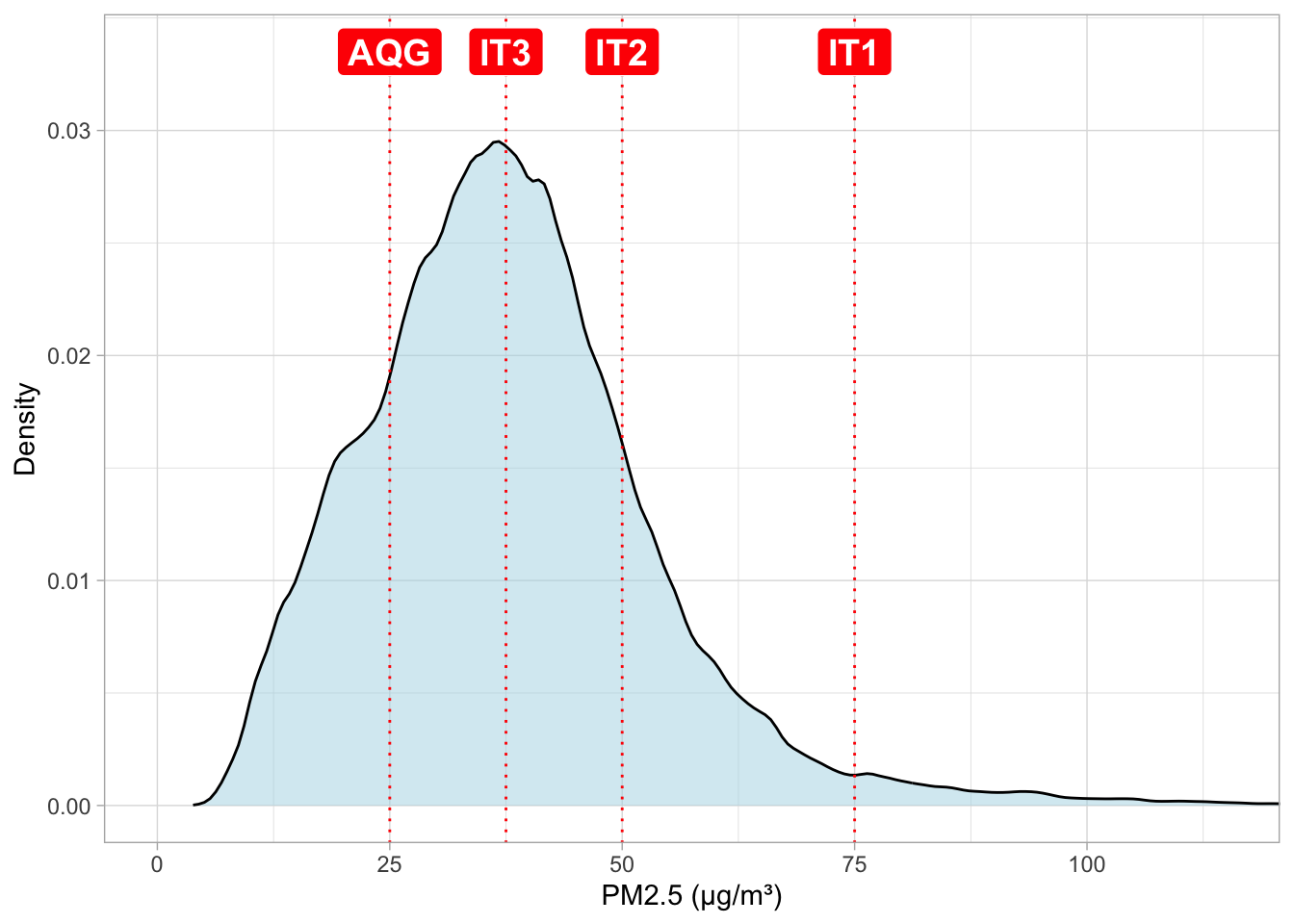
ggsave(here("..", "output", "figures", "pm25_density.png"),
       width = 6, height = 4, dpi = 300)
Table: Pollution - WHO Air Quality Guidelines for PM 2.5 and Pollution Incidence
Share of hours in all locality-days above each target and share of days by neighborhood that have at least one hour above the target.
I do not export the table, I just fill it once in the latex doc.
# share of hours in all locality-days above each target
data_reports %>%
  filter(covid_phase == "Pre-pandemic") %>%
  select(ageb, date,
         pm25_h_above_it1, pm25_h_above_it2, pm25_h_above_it3, pm25_h_above_aqg) %>%
  summarise(across(starts_with("pm25_h"), ~ mean(., na.rm = T)/24))
# A tibble: 1 × 4
pm25_h_above_it1 pm25_h_above_it2 pm25_h_above_it3 pm25_h_above_aqg
<dbl> <dbl> <dbl> <dbl>
1 0.00538 0.0327 0.115 0.358# share of days by neighborhood that have at least one hour above the target
data_reports %>%
filter(covid_phase == "Pre-pandemic") %>%
select(ageb, date,
pm25_h_above_it1, pm25_h_above_it2, pm25_h_above_it3, pm25_h_above_aqg) %>%
mutate(across(starts_with("pm25_h"), ~ . > 0)) %>%
summarise(across(starts_with("pm25_h"), ~ mean(., na.rm = T)))# A tibble: 1 × 4
pm25_h_above_it1 pm25_h_above_it2 pm25_h_above_it3 pm25_h_above_aqg
<dbl> <dbl> <dbl> <dbl>
1 0.0265 0.178 0.478 0.802Figure: Map of stations and AGEB borders
Import borders of AGEBs (and colonias)
poligonos <-
  read_sf(here(
    "..", "output",
    "ageb_poligonos.geojson")) %>%
  st_transform(4326)

col_shp <-
  read_sf(here(
    "..", "output",
    "colonias.gpkg")) %>%
  st_transform(4326)
Import stations within 20kms
stations_weather <-
  read_rds(here("..", "output",
                "temporary_data",
                "weather",
                "distances_weather.rds")) %>%
  filter(distance <= 20) %>%
  distinct(station, lon = sta_lon, lat = sta_lat) %>%
  st_as_sf(coords = c("lon", "lat"), crs = 4326) %>%
  arrange(station)

# from the station activity plot, i select manually those that are really used (and within distance, from the pull)
stations_weather <- stations_weather %>%
  filter(
    station %in%
      c("AJM", "AJU", "BJU", "CHO", "CUA", "CUT", "FAC", "FAR", "GAM", "HGM",
        "INN", "LAA", "MER", "MGH", "MON", "MPA", "NEZ", "PED", "SAC", "SAG",
        "SFE", "TAH", "TLA", "UAX", "UIZ", "VIF", "XAL")
  )

stations_pollution <-
  read_rds(here("..", "output",
                "temporary_data",
                "weather",
                "distances_pollution.rds")) %>%
  st_drop_geometry %>%
  filter(distance <= 20) %>%
  distinct(station, lon = sta_lon, lat = sta_lat) %>%
  st_as_sf(coords = c("lon", "lat"), crs = 4326) %>%
  arrange(station)

stations_pollution <- stations_pollution %>%
  filter(
    station %in%
      c("AJM", "AJU", "BJU", "CAM", "CCA", "COY", "FAR", "GAM", "HGM",
        "INN", "MER", "MGH", "MON", "MPA", "NEZ", "PED", "SAC", "SAG",
        "SFE", "SJA", "TLA", "UAX", "UIZ", "XAL")
  )


stations_prec <-
  read_rds(here("..", "output",
                "temporary_data",
                "weather",
                "distances_precipitation.rds")) %>%
  filter(distance <= 20) %>%
  distinct(station = station, lon = sta_lon, lat = sta_lat) %>%
  st_as_sf(coords = c("lon", "lat"), crs = 4326)
Now, plot everything on top of each other, not very clear, but OK for the appendix
ggplot() +
  annotation_scale(location = "br", style = "ticks") +
  geom_sf(data = poligonos, fill = NA, color = scales::alpha("black", 0.3)) +  # Polygon with borders and transparency
  #geom_sf(data = col_centroids, color = "black", size = .02) +  # Centroids
  geom_sf(data = stations_pollution, size = 3, color = "green4", shape = 3, stroke = 2) +
  geom_sf(data = stations_weather, size = 3, color = "red", shape = 4, stroke = 2) +
  geom_sf(data = stations_prec, size = 2, color = "blue", shape = 4) +
  theme_light() +
  coord_sf(xlim = c(-99.34, -98.96),
           ylim = c(19.14, 19.575))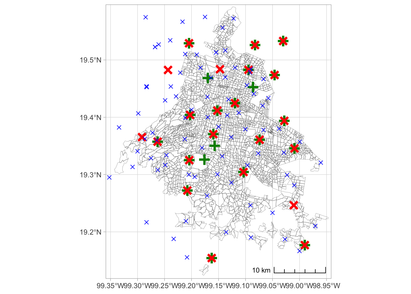
ggsave(here("..", "output",
            "figures",
            "stations_map.png"),
       width = 10,
       height = 10,
       dpi = 300)